Blogs
UX Approach: Phase-5: Define experiences
Durga Prasad
Posted On May 29, 2023
Clarity is precursor to creativity.
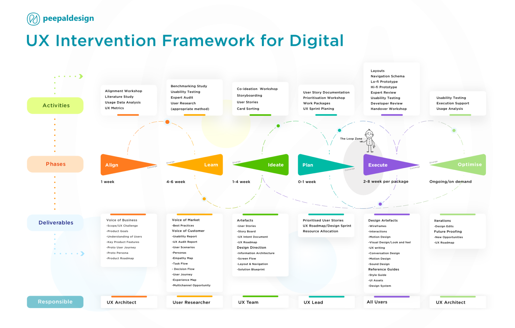
In this phase, it’s all about bringing together all out put from alignment, user research and ideation phase and simulating the real experience that end users are going to engage with.
Simply speaking, this phase is all about taking each problem one by one and sketching the user experience piece by piece, working towards the grand vision/concept formulated during the ideation phase and planned during planning phase.
Wireframes and Interactive Grey Prototype
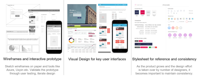
Based on each user story/use case represented in the wireflow format, low fidelity wireframes are sketched using paper, Powerpoint or Axure. There are lot of tools available in the market. It’s up-to the designer to find her comfort tool and go cracking with the design challenges in hand. Designers use placeholder texts and images to represent the thought and idea. It is suggested to use grey scale sketches to avoid discussions around visual appeal and focus on the invisible interactive experiential aspects. This is a highly iterative process and requires constant collaboration with product owner and technology team to validate the ideas in terms of vision fitment, content appropriateness and technical suitability.
Validating the prototype with end users at a very early stage helps in informing the design towards closure. This also helps in avoiding design misdirection and ego clashes with stakeholder. Because data is mightier than opinions.
The final output is usually a well validated and aggressively iterated click through prototype with detailed interactions that cover all user stories in question.
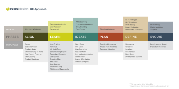
#DesignThinking cheat sheet as seen here can be referred as a conversation starter and used to sensitise clients and newbies. I have kept it as visual as possible and the cheat sheet covers my favourite methods under each phase.
Follows some more cheat sheets for each phase of DT.
Design Assets
Visual Design
Visuals have strong effect on people. It drives attraction, association and engagement.
Imagine wireframes as skeletons. What attraction or association can it drive without a beautiful skin? By understanding product brand guidelines, user context, design trends, visual designers create mood boards and extract the right schema that fits the product description.
However, instead of drawing pixel perfect user interface for each and every screen, key user interfaces are identified from the grey prototype and pixel perfect interfaces are rendered.
Here too, conducting user testing helps in avoiding opinionated design misdirection. One can deploy one or multiple of the following methods such as expert review, A/B testing and eye tracking studies to identify and plug design loopholes that might impact the overall experience.
Style-sheet
Having a well written style-sheet helps the entire team to access the interface guidelines quickly and apply the same across the product and ancillary offerings.
Now that the user experience is defined, it doesn’t mean that, it’s the end of the road. With time technologies, user needs and motivations change, so does the impact of predefined experiences. Here is when constant evolution becomes critical for sustained positive user experience.
To be continued
UX Process

An experienced CEO with a demonstrated history of creating a business in the design industry that delivers sustained growth, industry-leading profits through an unerring focus on customers & employees. With deep expertise in UX research across diverse sectors, he offer invaluable insights on customer-centricity and fostering success in business.


