Case Studies
Upgrading cloud based ERP solutions for retail and sales management
Elevating Efficiency and Performance through user friendly interface.
Challenge
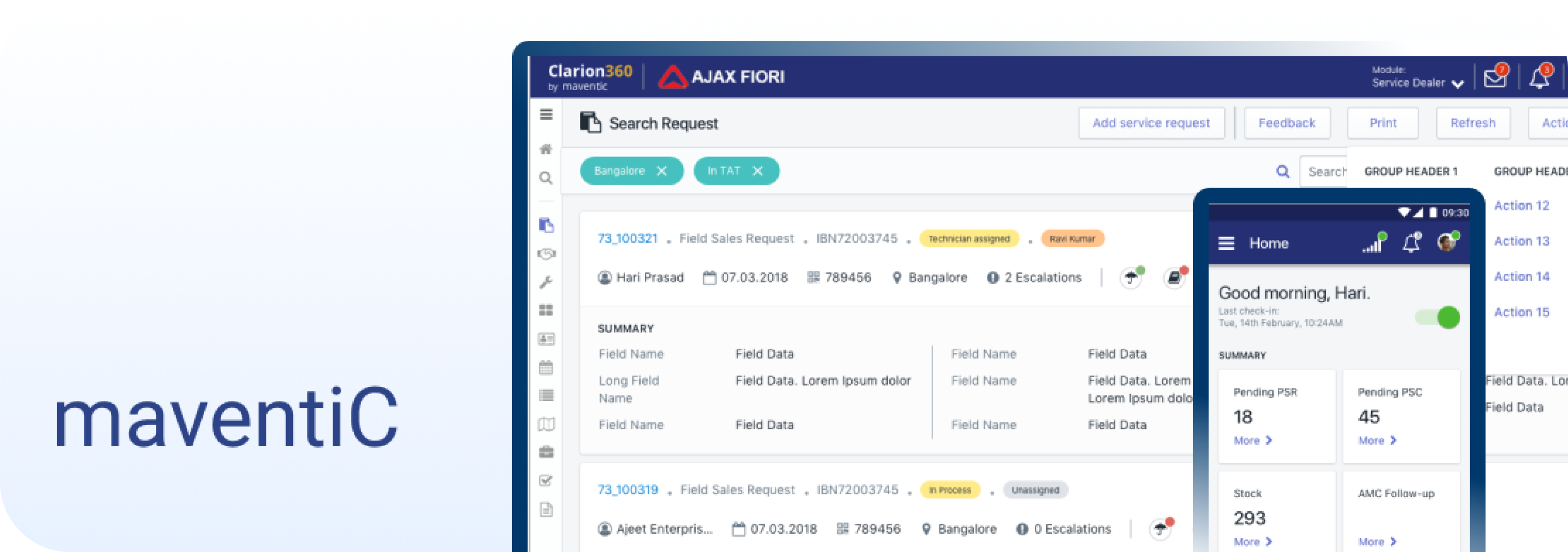
Clarion 360 faced usability issues, inconsistent UI, and an outdated interface.
Clarion 360, as an aging legacy software, exhibits usability issues due to an inconsistent and outdated user interface. Its old-fashioned appearance and lack of user-friendliness hinder efficient operation and usability for users.
High Level goal
The goal is to upgrade the platform for enhanced functionality, user-friendliness, and improved satisfaction.
Project Approach
From definition to delivery
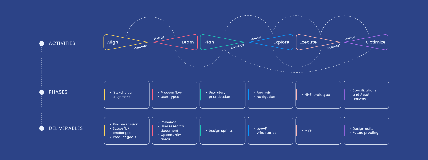

Alignment Workshop
The workshop was done to achieve consensus between all stakeholders and understand the business goals along with the expectations from the UX intervention.
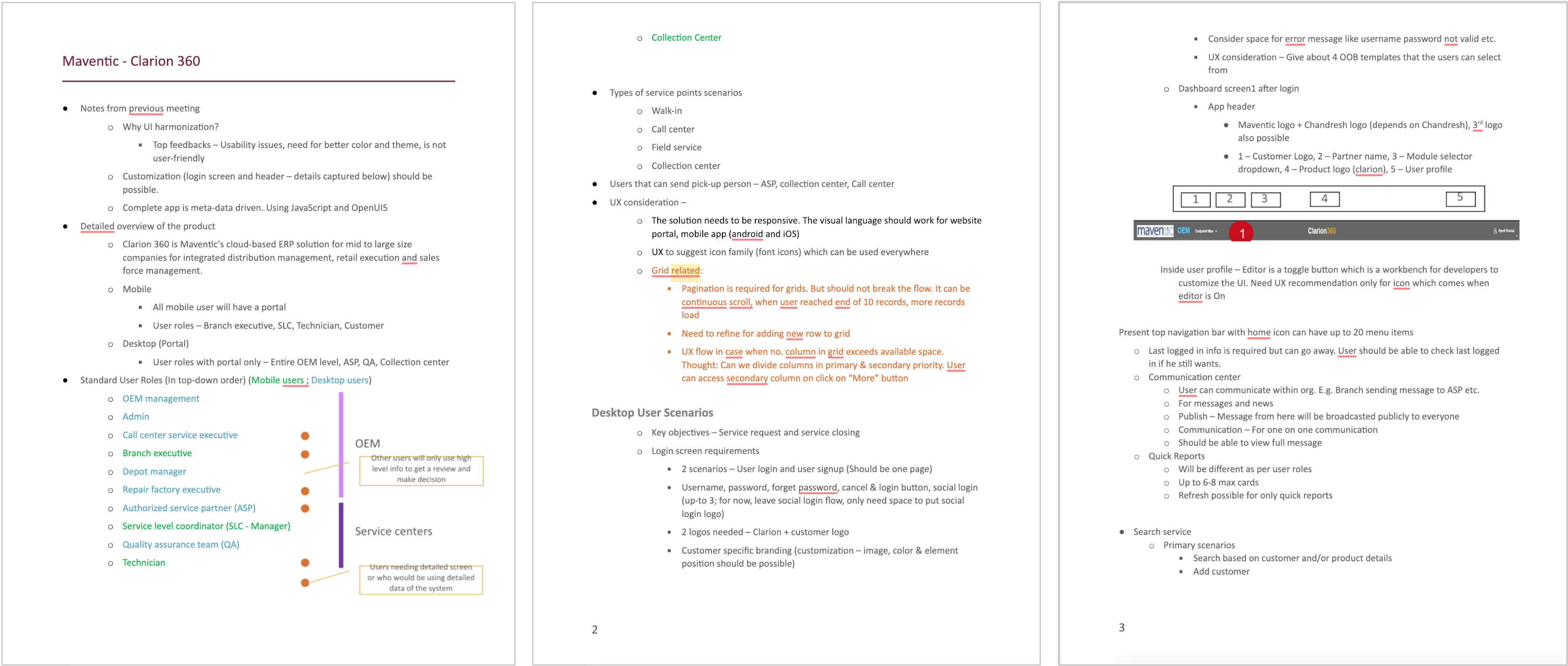

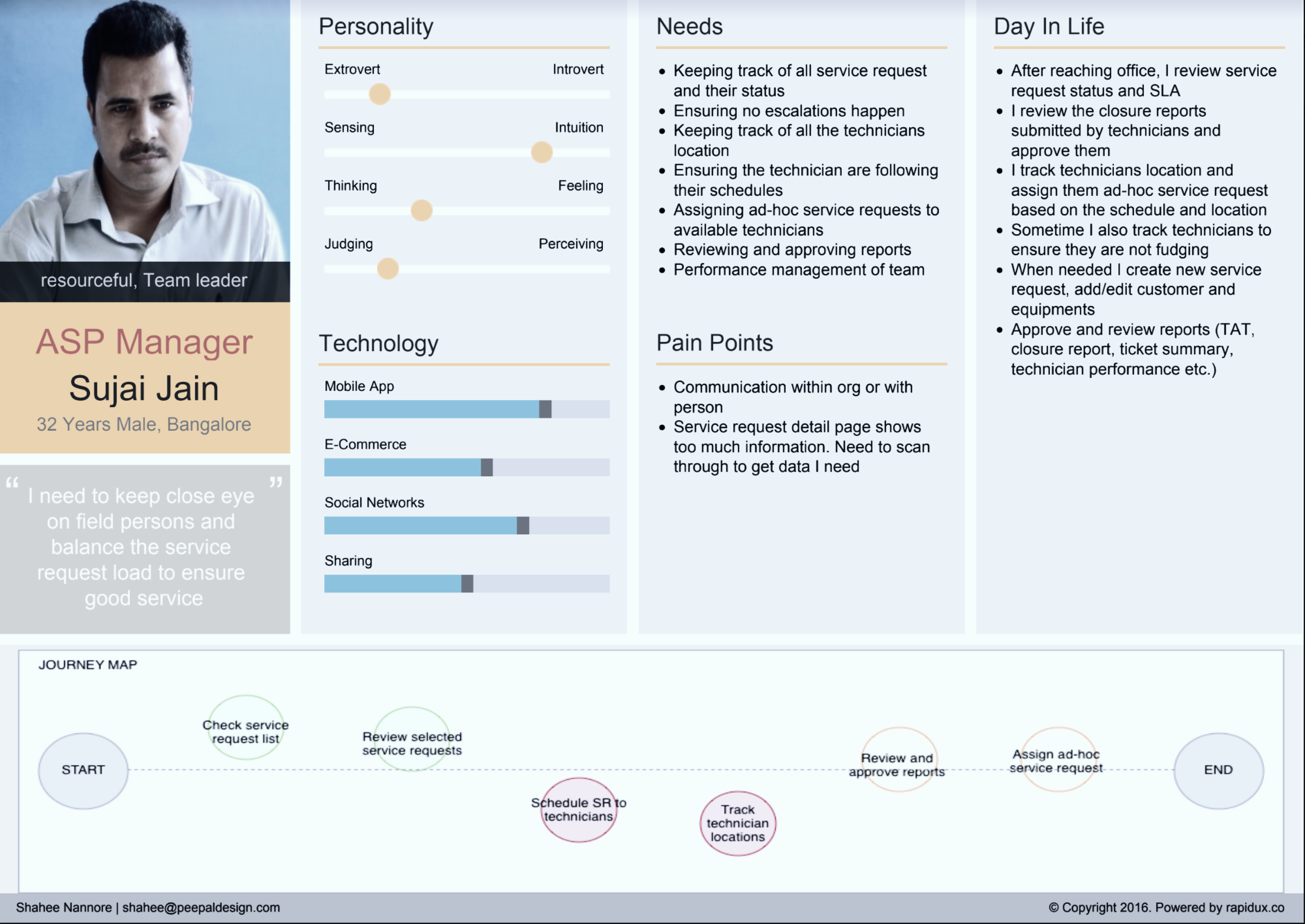
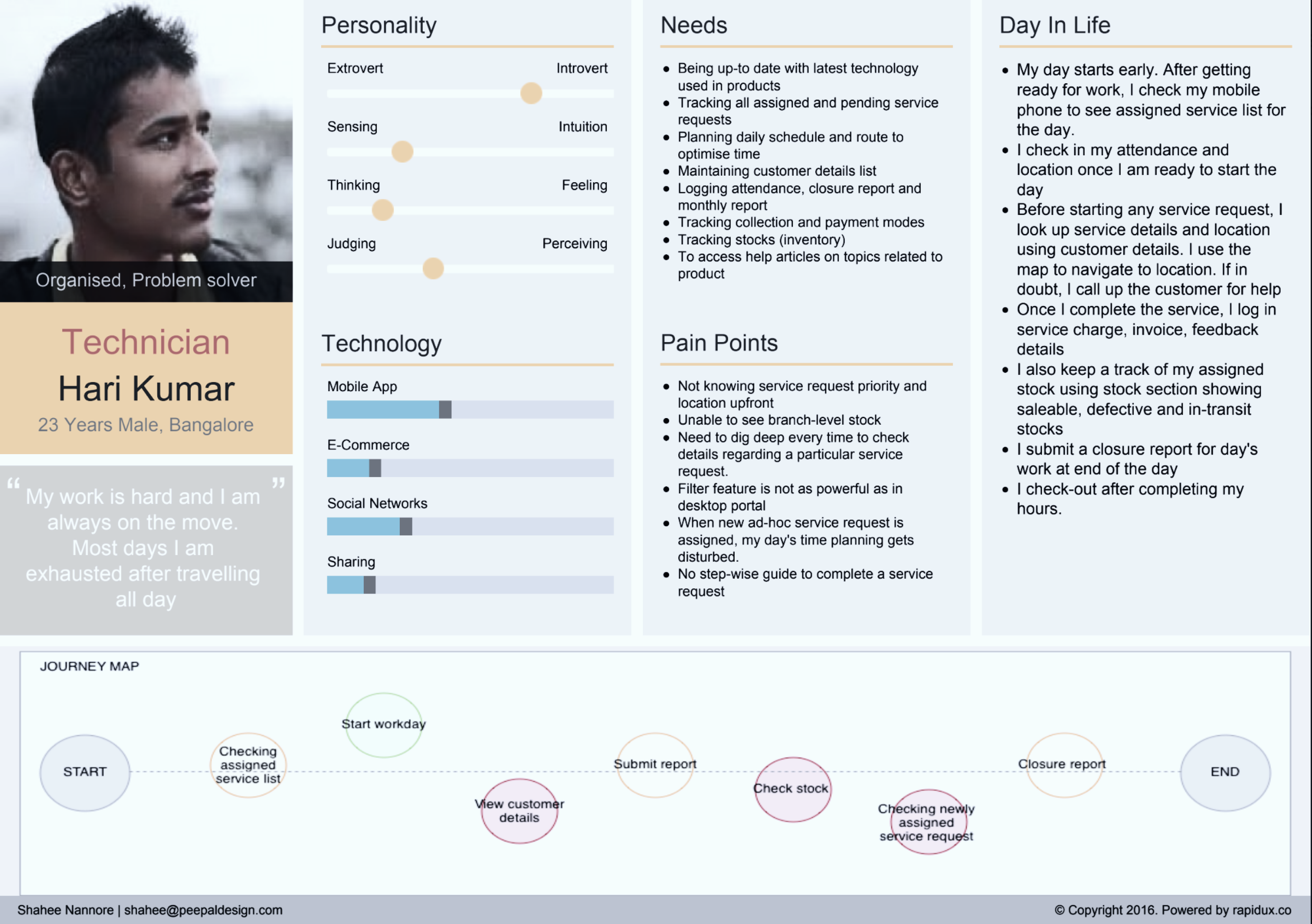
Personas
All the inputs from workshop were collected and organised into post it notes to create the proto persona cards. This gave us better direction and scope for our project.
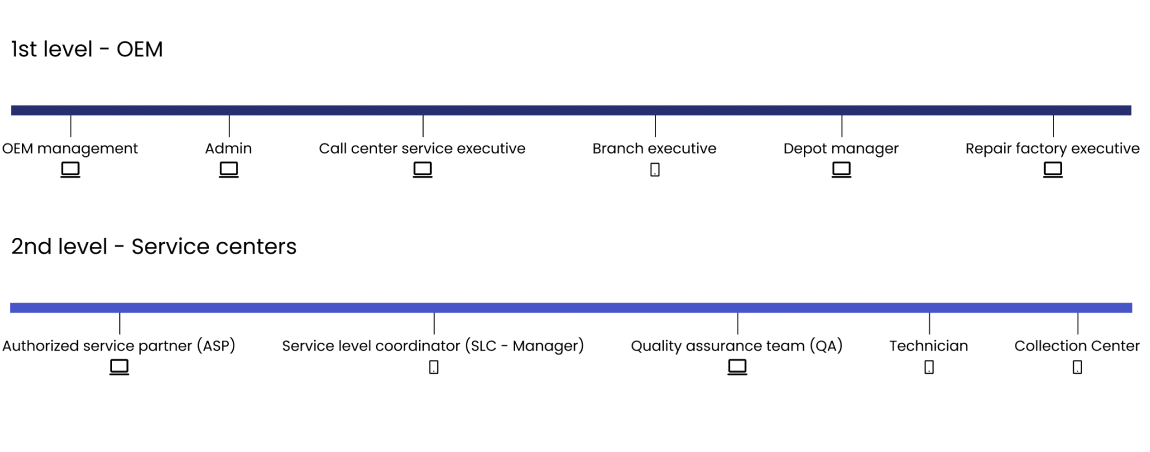
User Roles
Hierarchy in left to right order


Wireframes
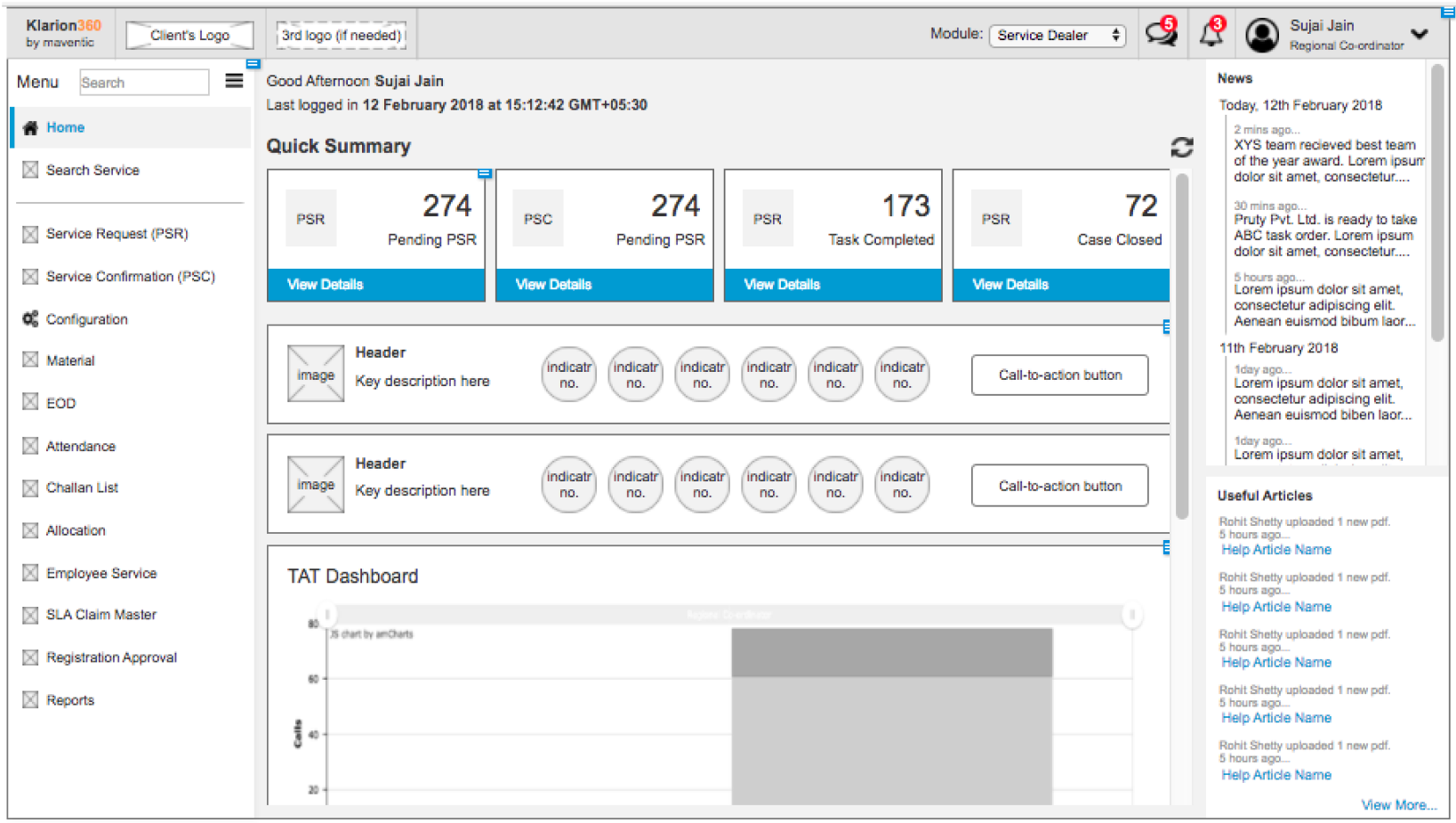
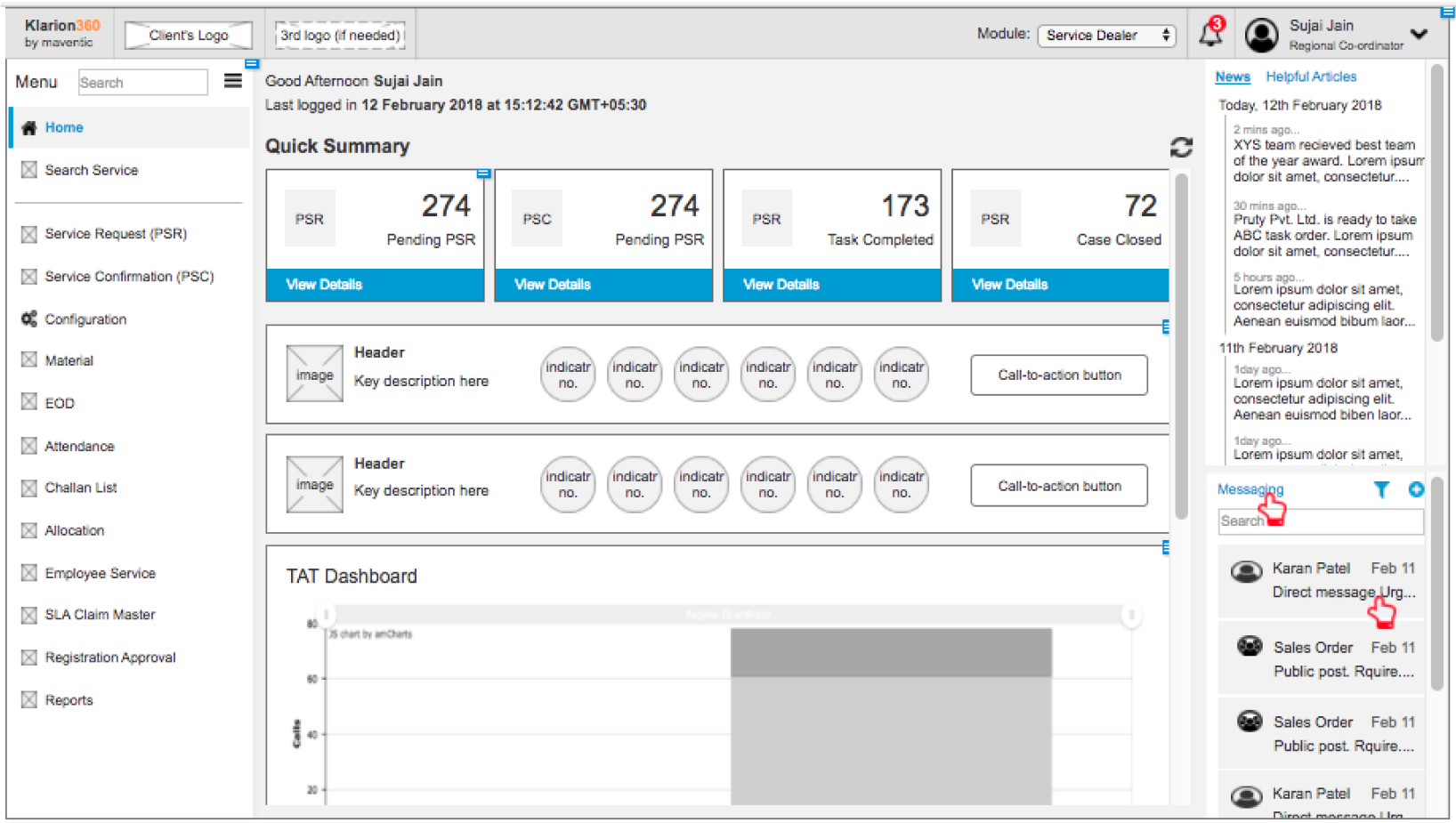
After looking at the information gathered we started exploring with the following points in mind :
- Quick reports to take center as this is the main focus area for the user.
- Vertical nav menu on leftmost of screen – By default will be expanded, user can collapse it to have more workable screen area
- Message & communication section to occupy rightmost part of screen
Option 1
Option 2

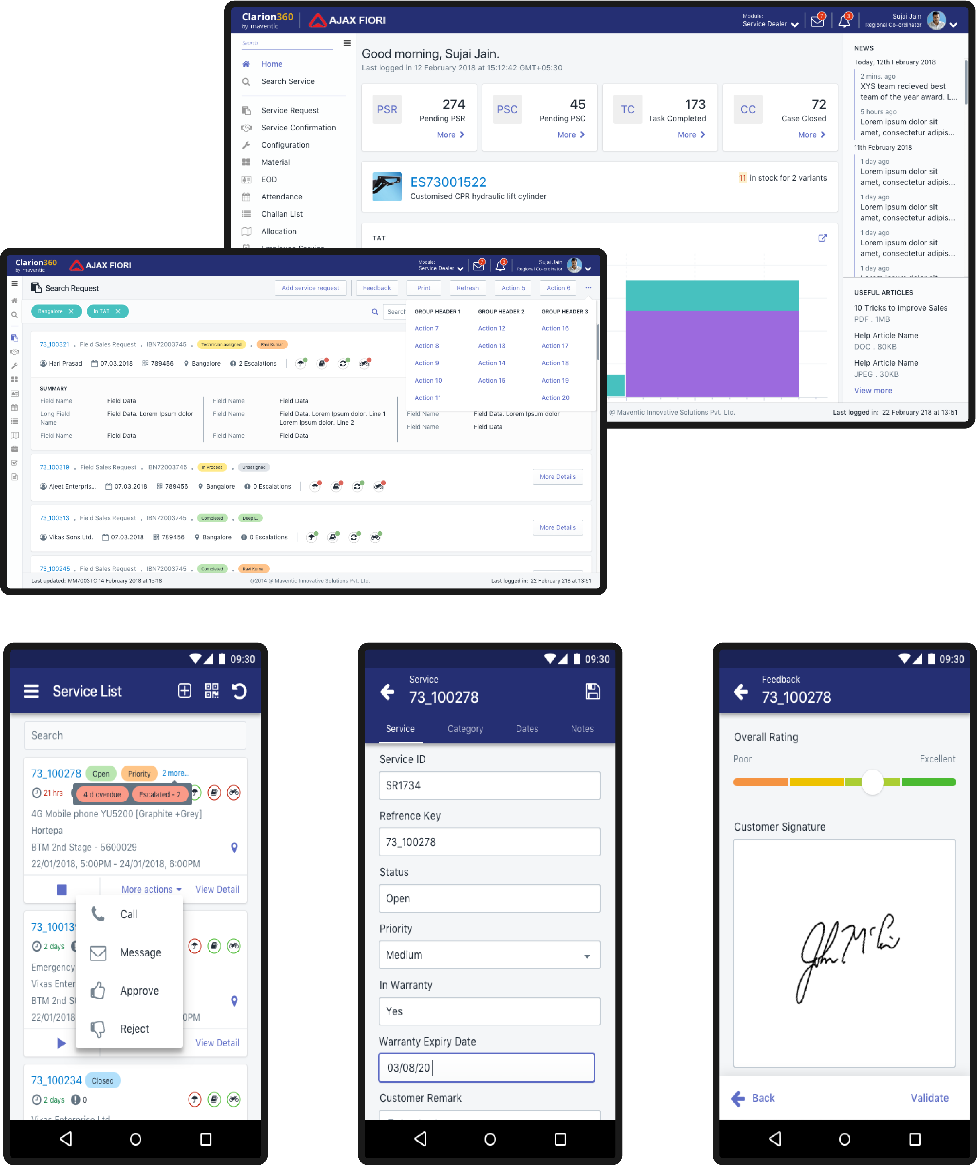
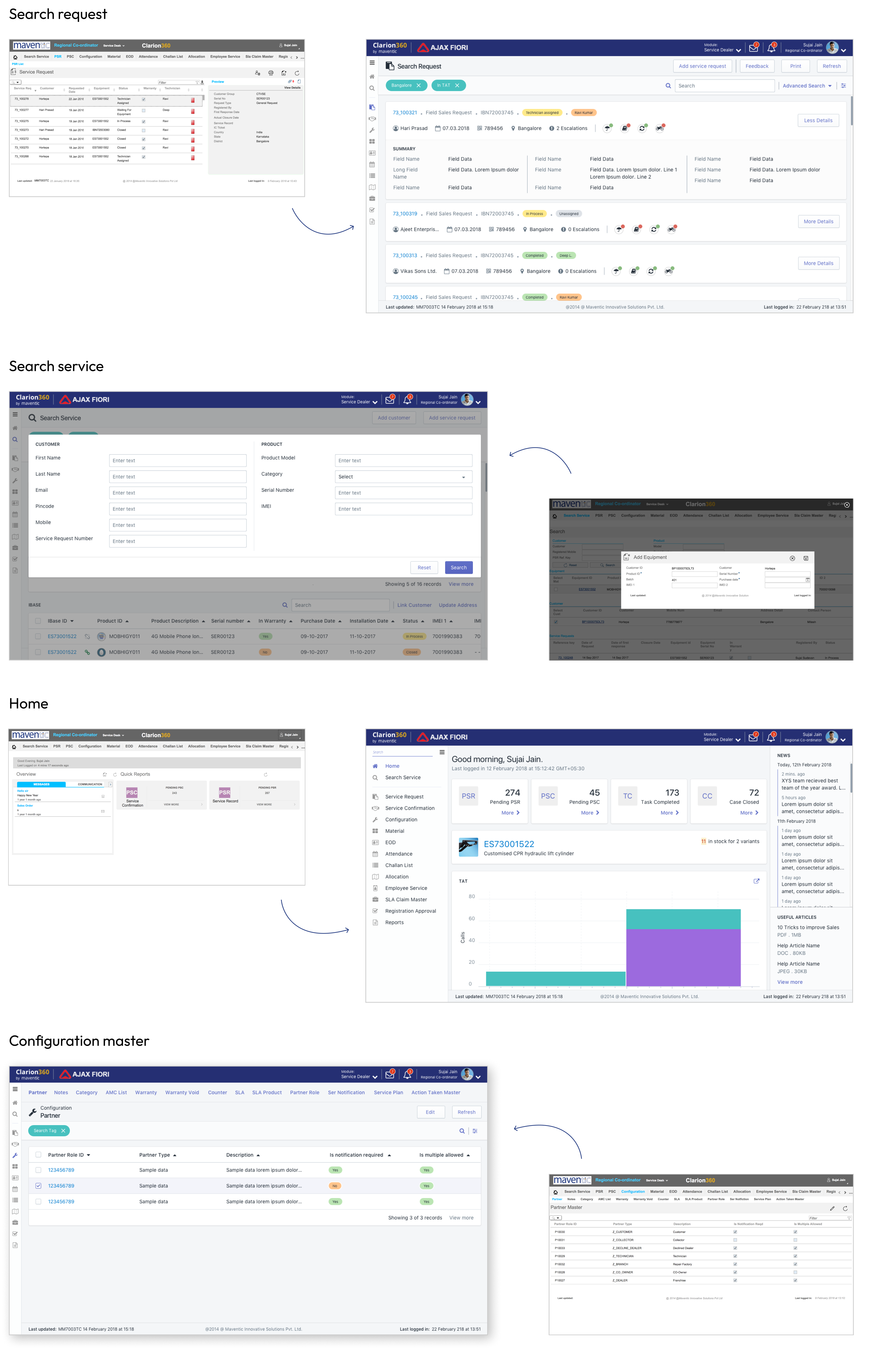
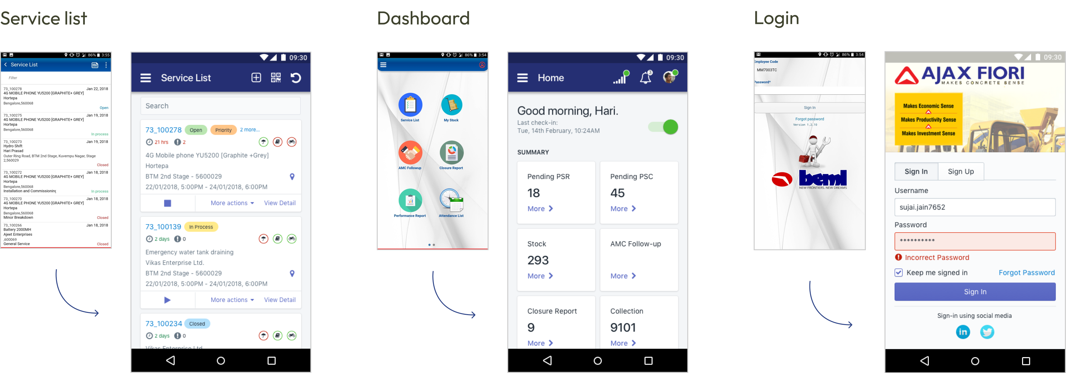
Before – After
A side to side comparison of the value added through design
Desktop
Mobile
Visual Design
After considerable evaluation best suited colour pallet and visual system was derived.
