Case Studies
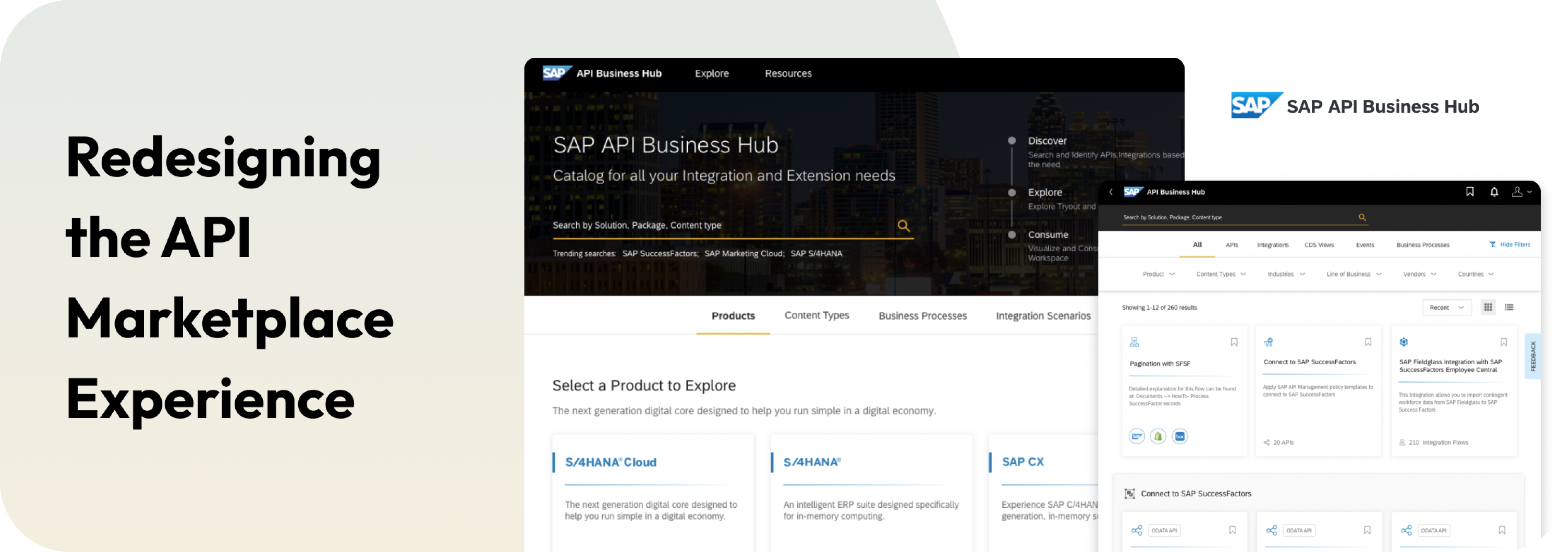
Redesigning the API Marketplace Experience
Enhance content accessibility through advanced search and filtering.
Challenge
To make the content consumable and relevant to multiple stakeholders
Currently, the platform is accessed most widely by developers, for whom a mental model of searching testing a particular type of content on a regular basis is built in. However SAP wanted to expand it’s user base on this platform, to allow business users or architects to visit the platform, understand what kind of content was available to them and then consume what was relevant to them.
Enhanced search and filter mechanism
While the existing platform has a search section for developers who know what they want to find, the goal was to make the new search and filter mechanism more intuitive and contextual for the user. The user should be suggested content based on their needs, find their previously searched content easily and should also be able to get into a deep search mechanism to find specific results.
Personalisation
The user should be able to easily set their preferences based on their role, industry, line of business and products they are working on. Based on theis the platform should be to able remember this and curate their content and only provide what their are interested in. The user should also be able to switch back to see all the general content in case they want.
High level goal
The goal is to expand the user base through improved search and filtering, enabling business users and architects to access relevant content.
Project Approach
From definition to delivery
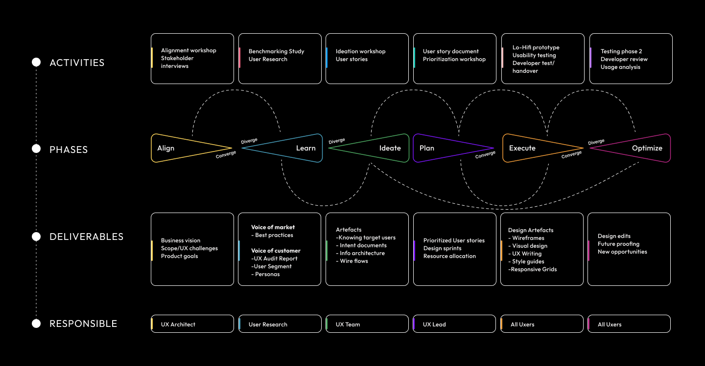

Benchmarking
Task Agenda
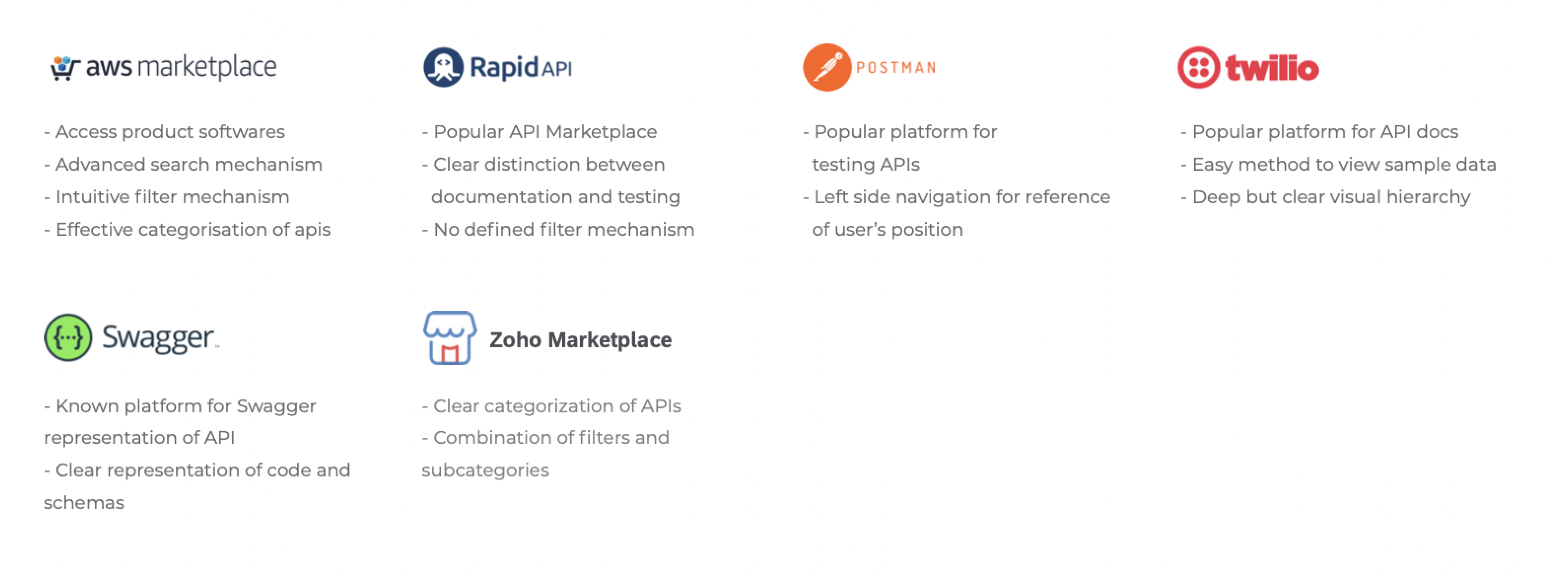
We studied some of the leading market competitors of the client and gathered their best attributes. We analyzed the salient features, pain points and opportunities for improvement/innovation to understand the user and the existing user-flows better. As a result we were able to study their processes and filtered out the best practices which we wanted to adopt/ innovate upon.
Insights
UX Metrics
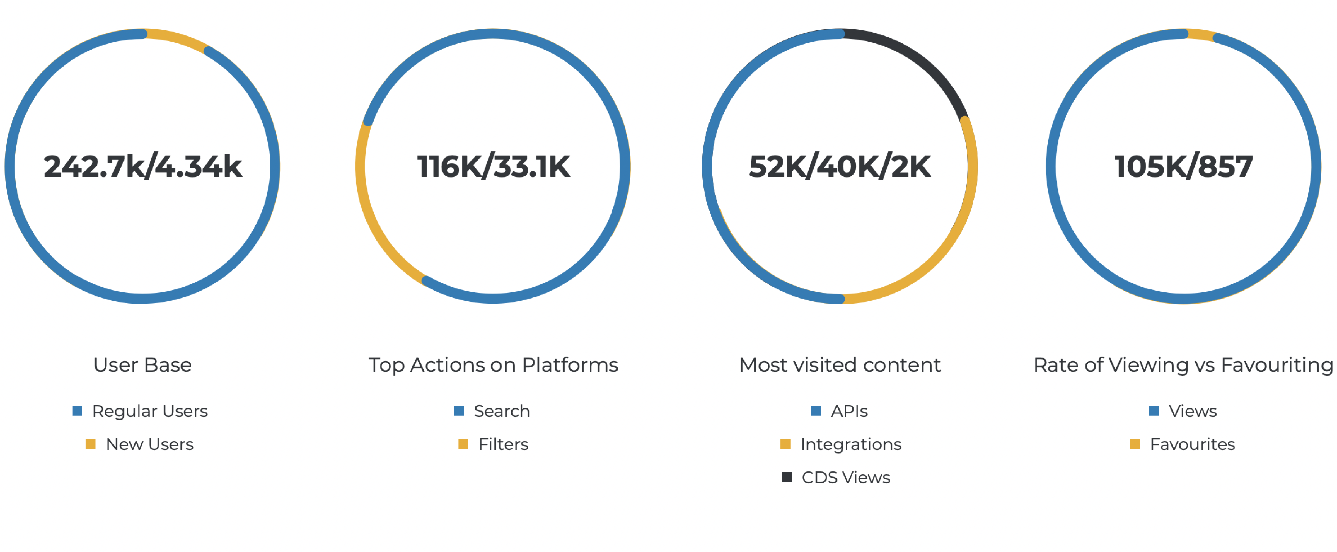
Top Positives of Platform
- API Hub has evolved as an important platform providing content for stakeholders like developers, business users, solution architects etc., to discover the content. They are now looking forward for more enhancements for better usage.
- Users found overall experience pleasant, simple and easy to use.
- Users are happy to find all types of content easily on a single platform
Top Negatives of Platform
- Users need personalised search experience based on persona.
- Users are looking for a way to consume artefacts directly from API Hub
- Users are looking for suggestive guidance to easily find the content they are looking for
Expert Audit
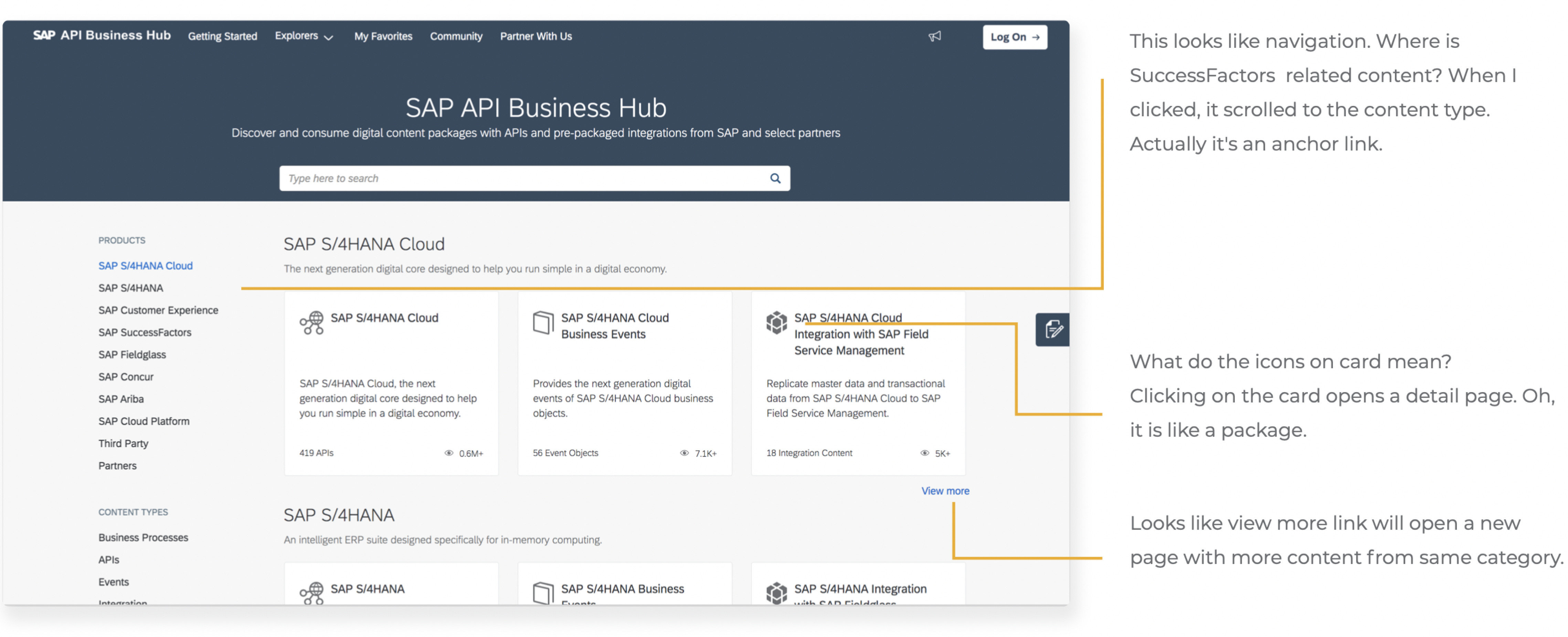
Landing Page
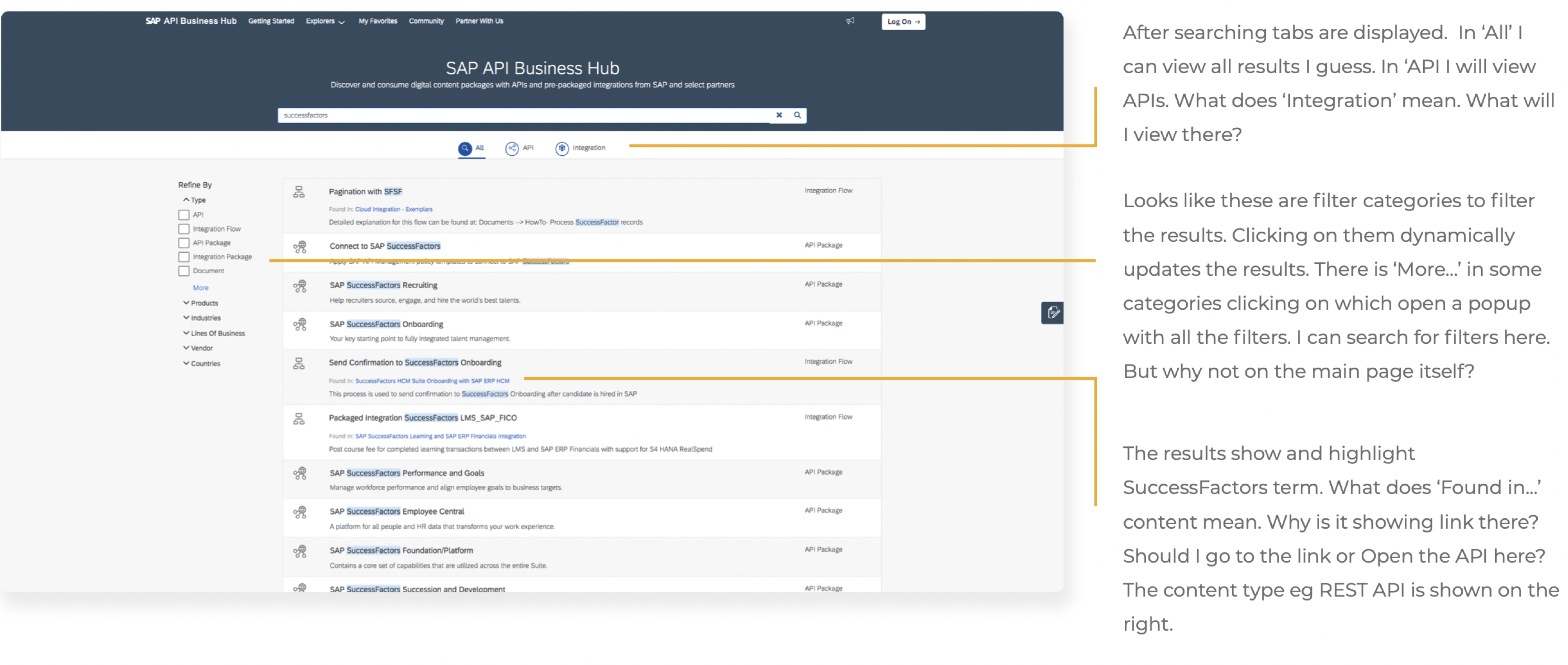
Search Results
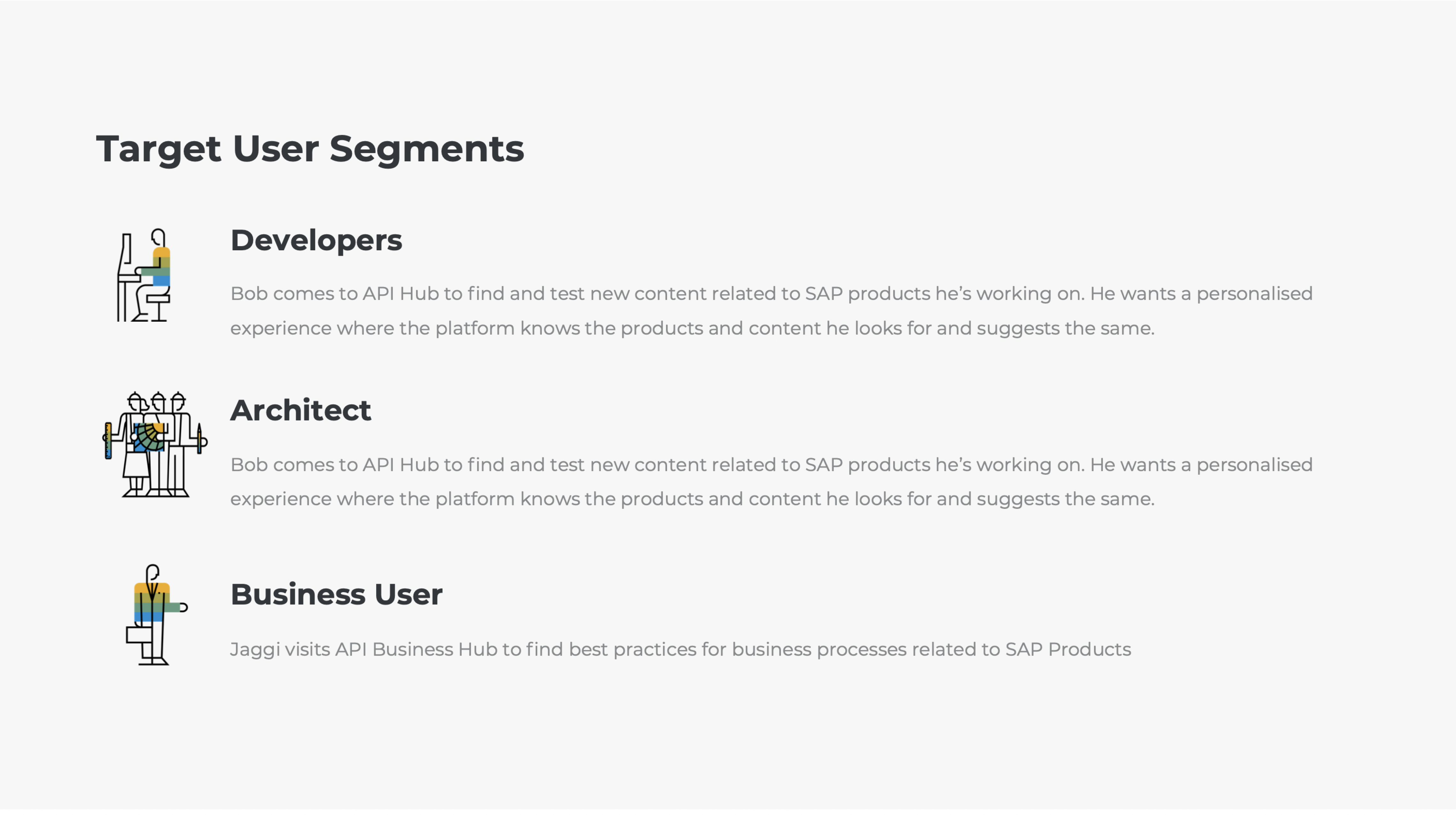
User Segments
User segmentation is the process of separating users into distinct groups, or segments, based on shared characteristics.
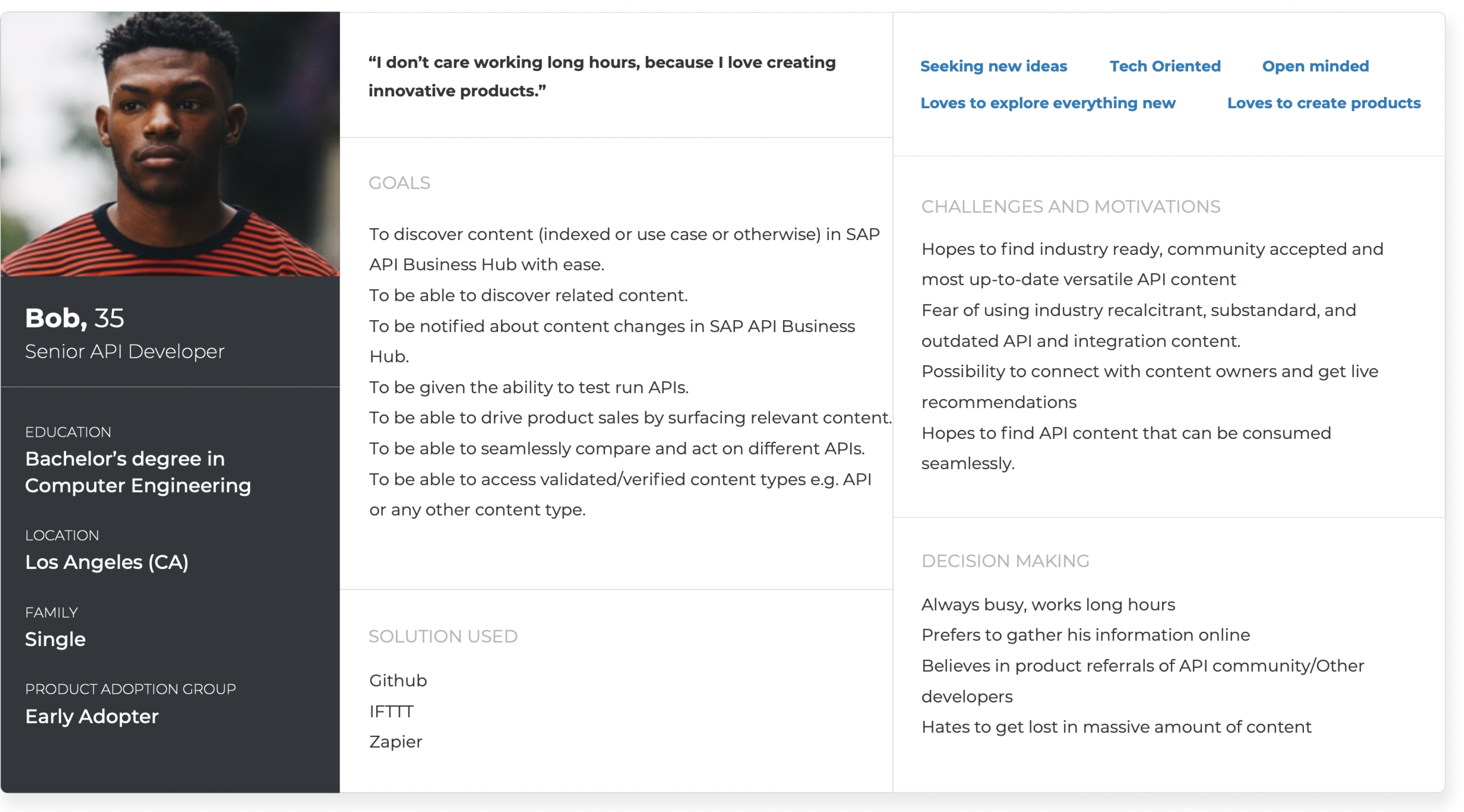
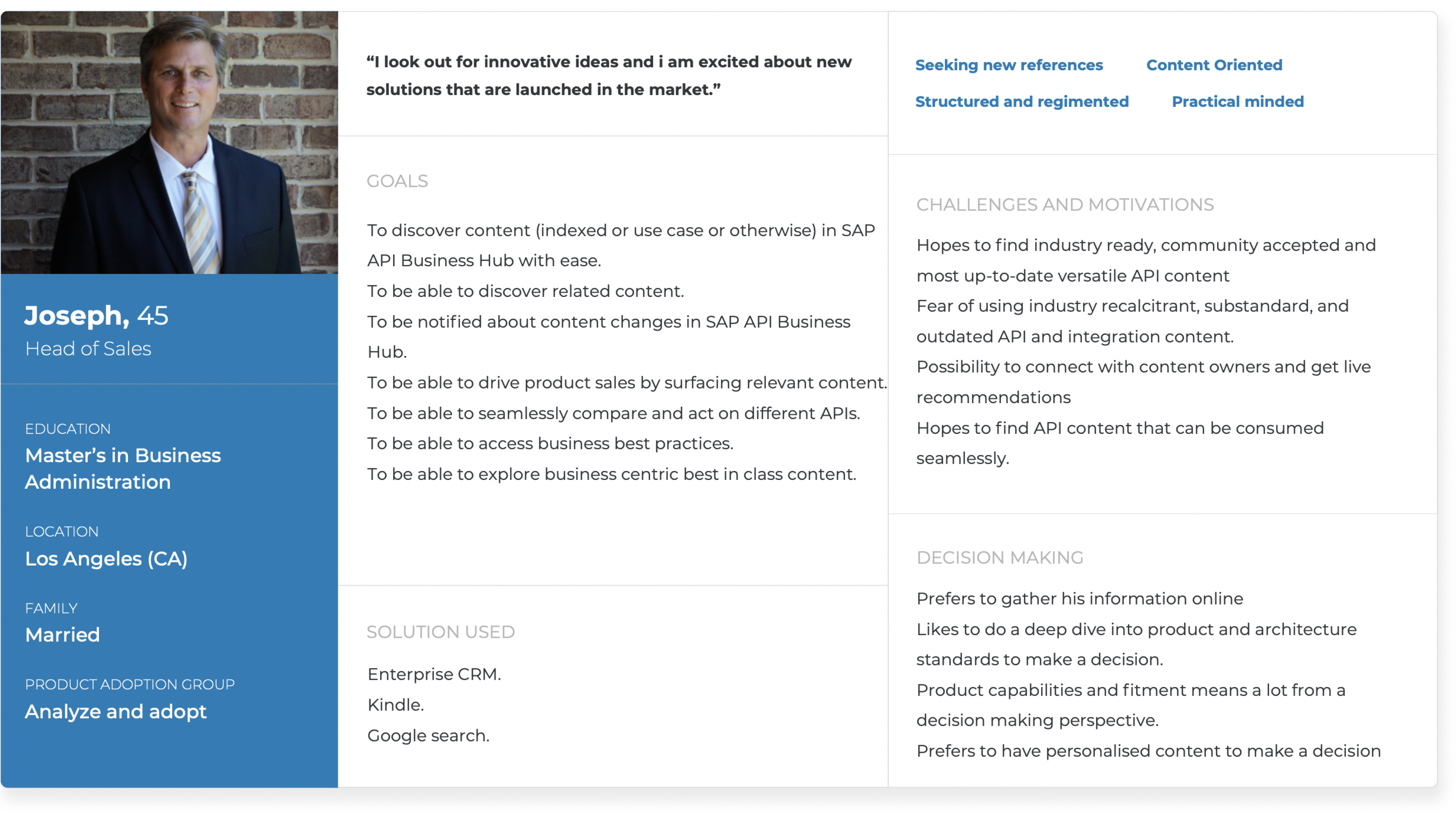
Proto Personas
The personas covered the needs, painpoints, fears and goals of two main user types. This helped to empathize with the user and thereby ideate well.

Information Architecture
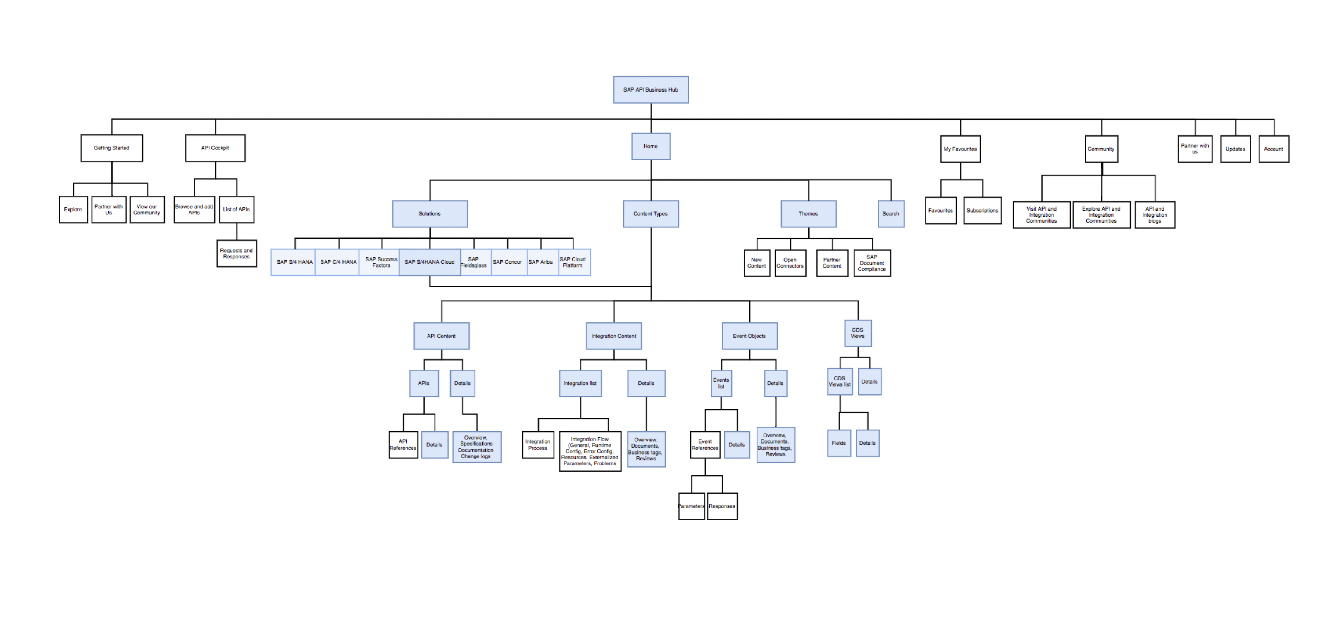
Through Information Architecture, we were able to enhance user navigation, improve content discoverability, and optimize the overall user experience.
Key Features
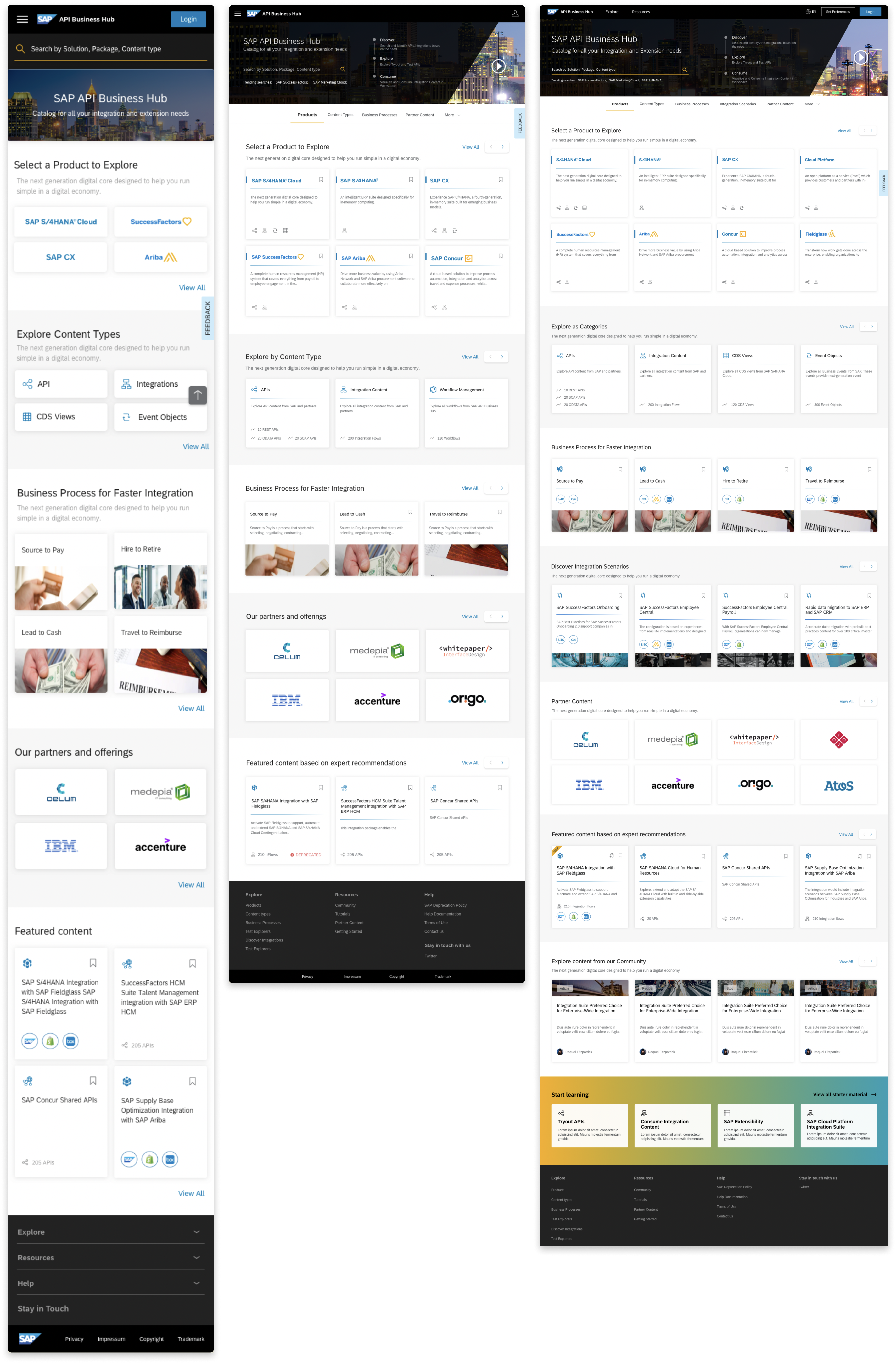
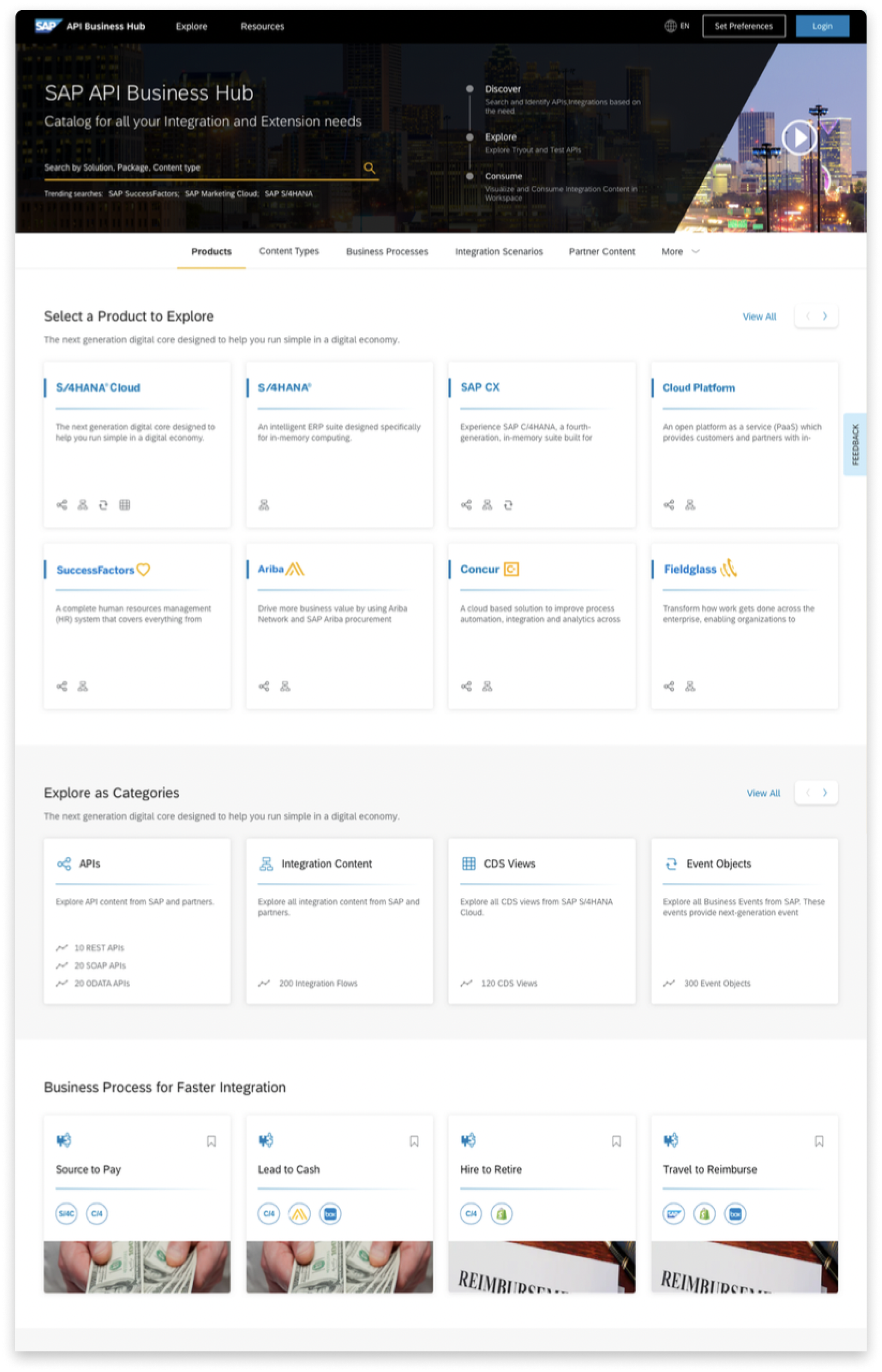
Landing Page
Top Banner
Since the banner is the first thing users will see on coming to API Hub, we used it to give them an introduction to the platform. We also incorporated a key search section for the user to quickly find what they need
Content
We used an anchor link mechanism to let the user scroll through and explore the different content that is available on API Hub. Each of the content categories have subtle separators between them.
Cards
Since there are different types of content, we had to make sure the cards for each category were visually different. Existing users of API Hub are ccustomed to their icons, so we used that as a key method of indication for the cards.
Search Mechanism
Search Suggestions
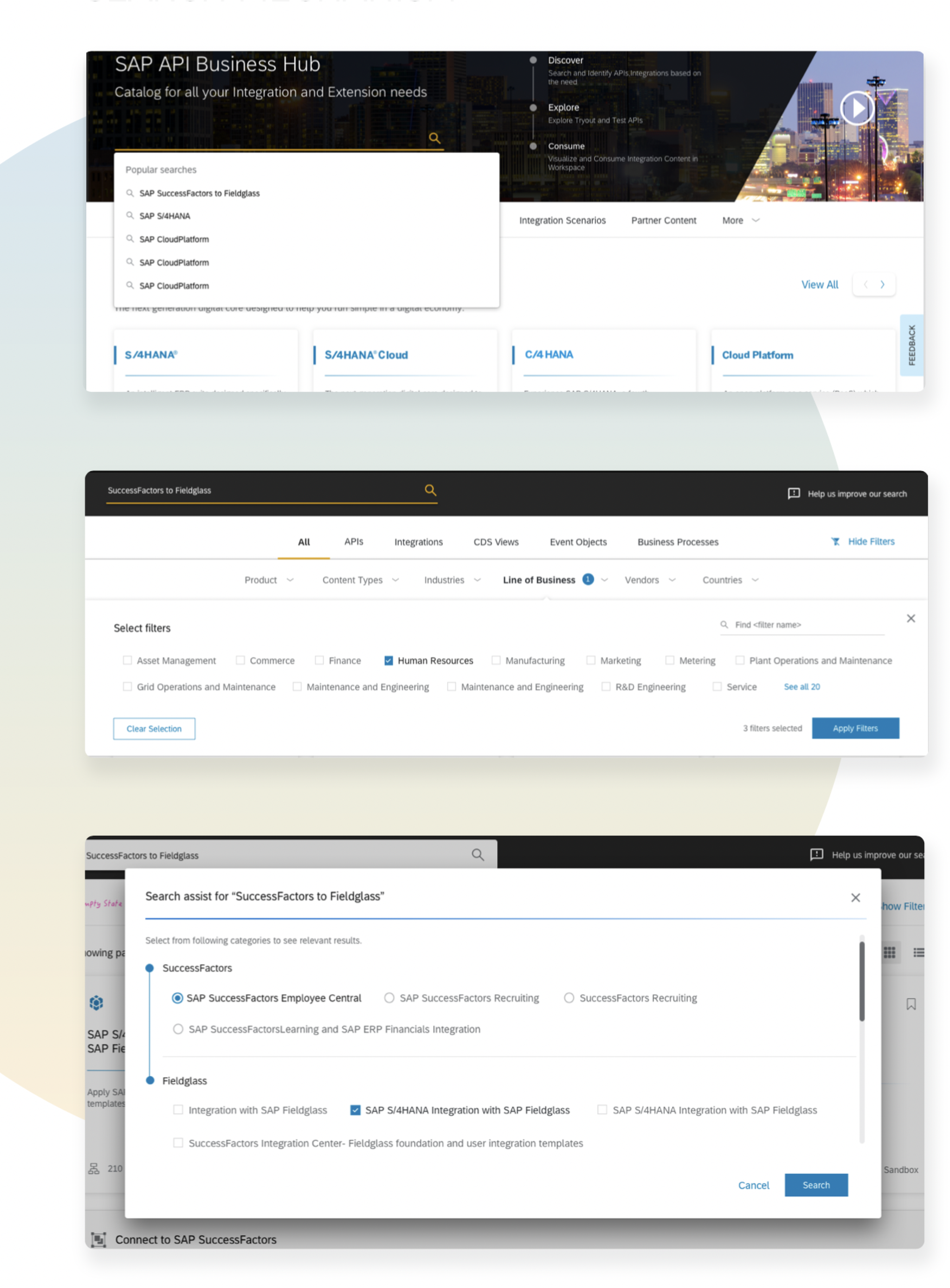
For the search mechanism, we designed it to be similar to the usual search interactions we see. A user will get suggestions on clicking the search bar, and based on what they are typing the get more contextual searches.
Filters
API Hub needed to have an exhaustive but on demand filter section. Keeping this in mind, a top filter mechanism was designed which could be shown and hidden when needed. The user could see and select different categories and filter results through Multi Select option
Deep Search
A special requirement was that users search for content that is related to two products or packages. Eg: SuccessFactors to Fieldglass. And this was a widely used format, and for this they needed to have a mechanism to drill down their search further. For this we designed a deep search model where on choosing two Products, users could also select which packges they were interested in as well, all in the search section itself
Product and Package Pages
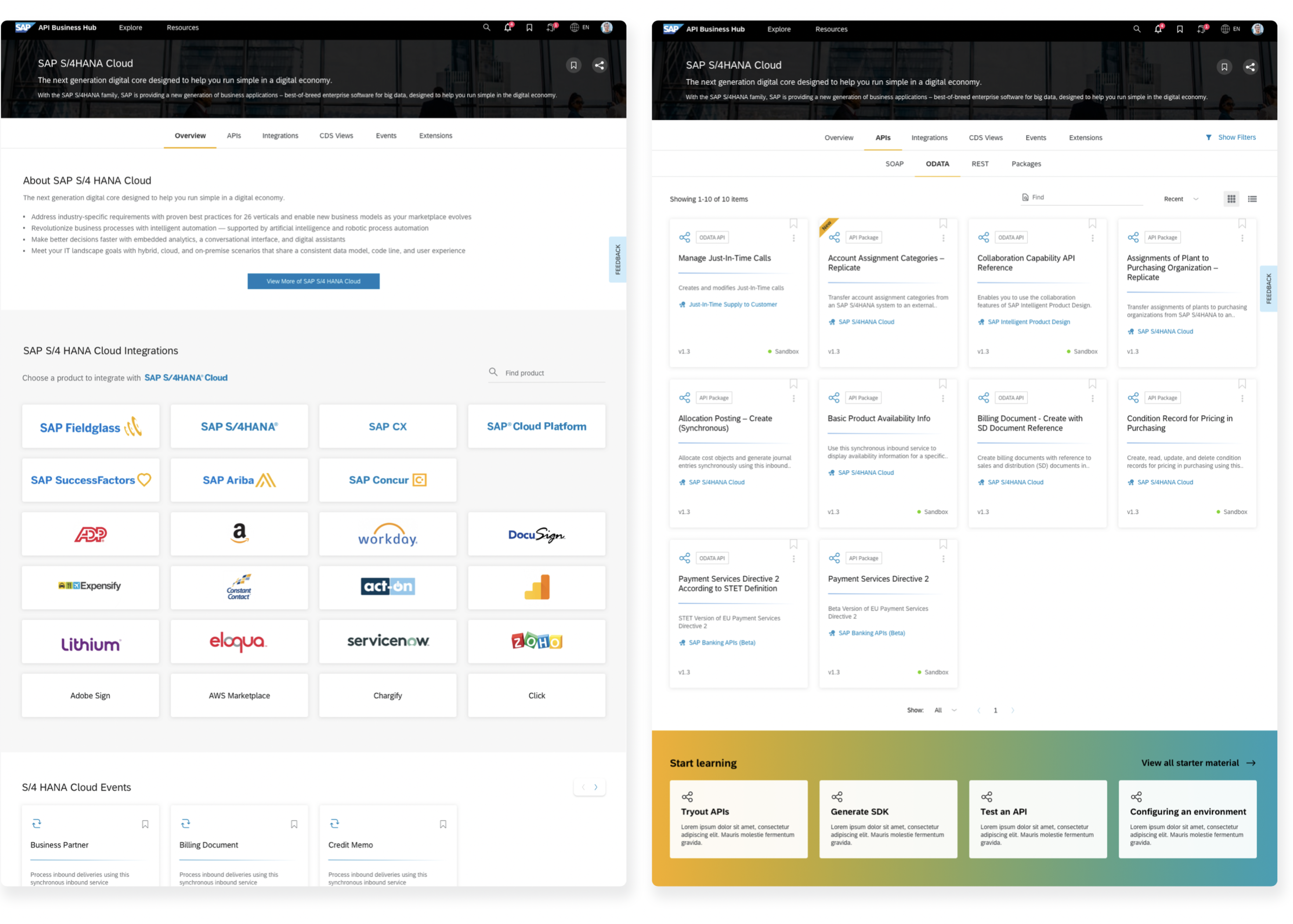
When users visited a Product page, they needed to get an Overview of what that product was about, some important specifications,guides for where and how that product/ package can be used and other important documentation.
To make all these easily accessible to users while they were viewing Artefacts, we followed a tab mechanism. At the package level, we designed a double tab structure for the user to easily drill down into the next section as well.
The users would be able to see the list of artefacts related to the product or package. They would also be able to filter, sort and contextually search by name with the package.
Content Viewers
Users who are developers come to API Hub to extract content od a certain type and use it in the SAP or SAP related products they are working on. In order to facilitate this, we designed a structure to make this content easily consumable by both new and regular users.
We provided an Overview Section upfront that would give users a basic idea about API Hub. It also includes details like specifications and documentation.
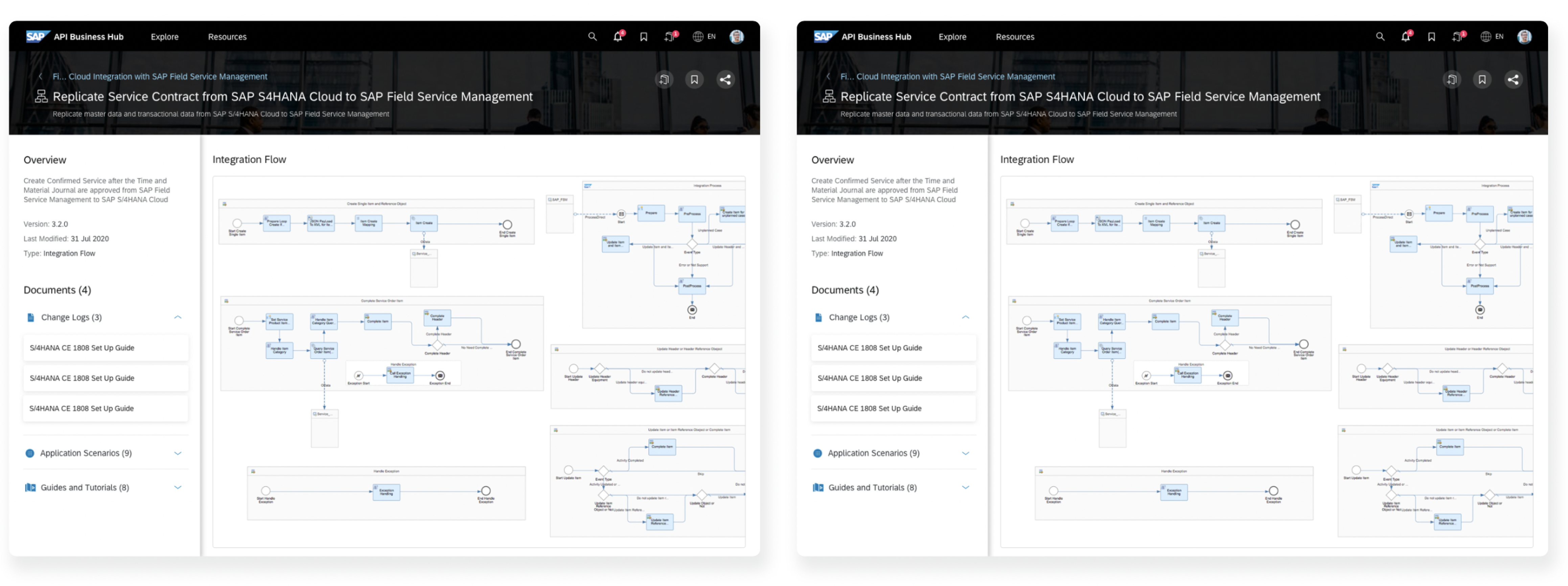
Another challenge was that certain content like Integration flows and Business Processes had a long loading time. In cases like that, users would first see a preview of the content which on clicking would lead the to the full screen view.
API Viewer
Overview
On viewing an API, the user first gets an understanding of the API, it’s documentation, features and Use Cases etc. before diving deep into testing or reading about it
API References
Here, a user can view all the endpoints and operations associated with an API and understand their capabilities. The user can also view example values and responses for diffeent parameters.
Test View
The Test View is where developers would actually test out the API. If it is an API that has been previously tested, they can view those responses. For a new API, they can also add sample data and get results as well.


Wireframes
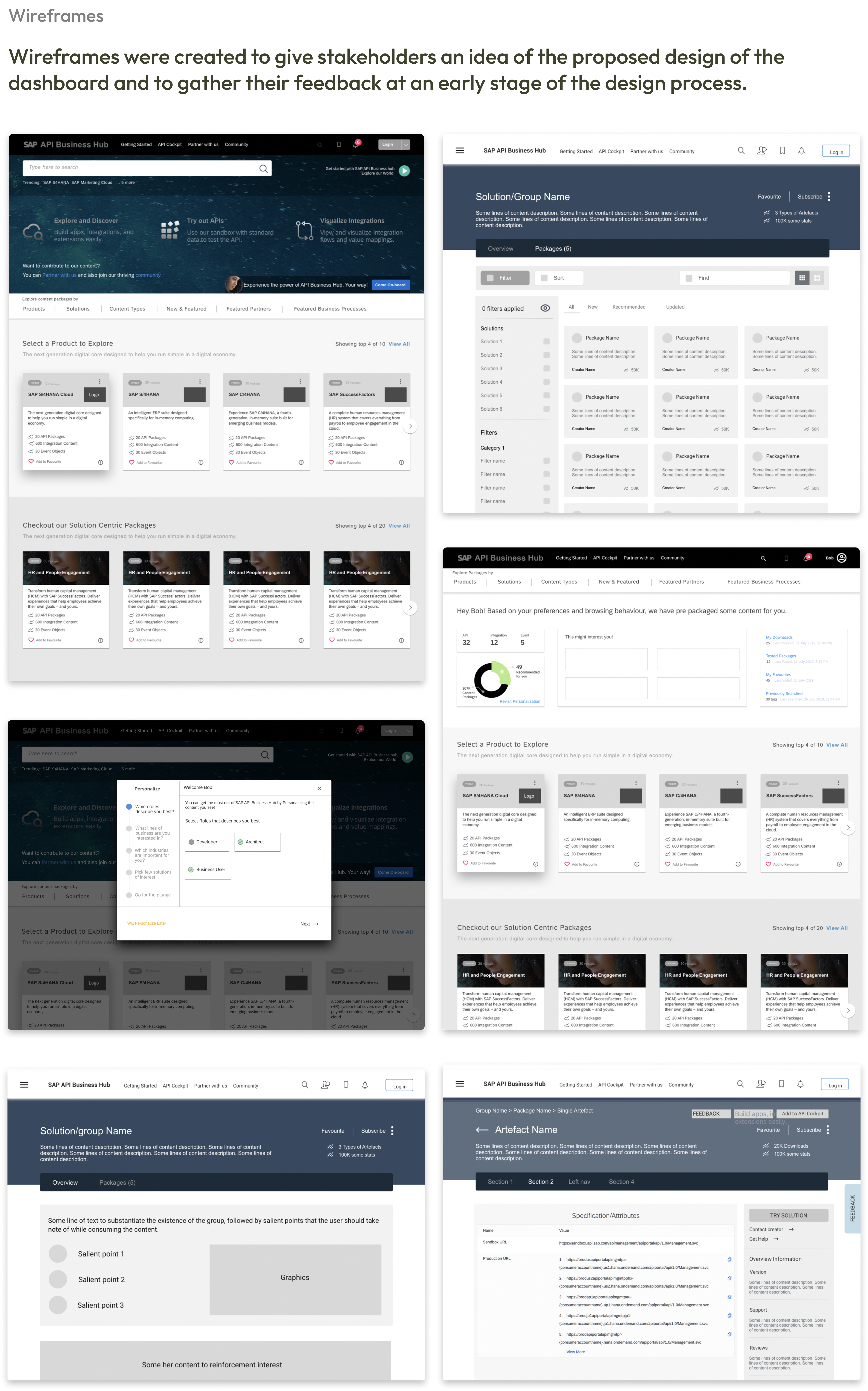
Wireframes were created to give stakeholders an idea of the proposed design of the
dashboard and to gather their feedback at an early stage of the design process.
Visual Design
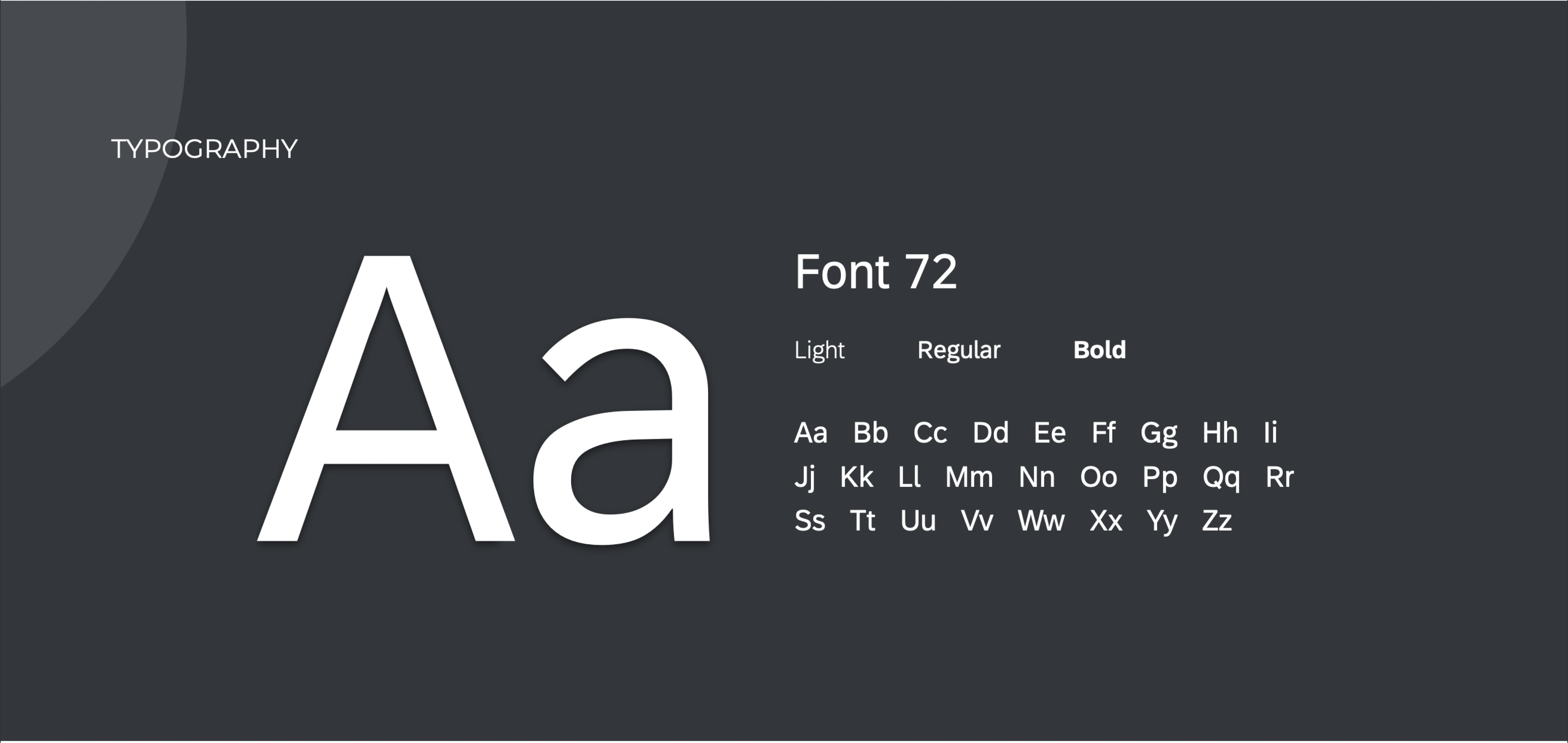
The visual style of new design is inspired by the theme from www.sap.com. It involved a migration from the previous design system: Nimbus.
Colors

Visual Elements
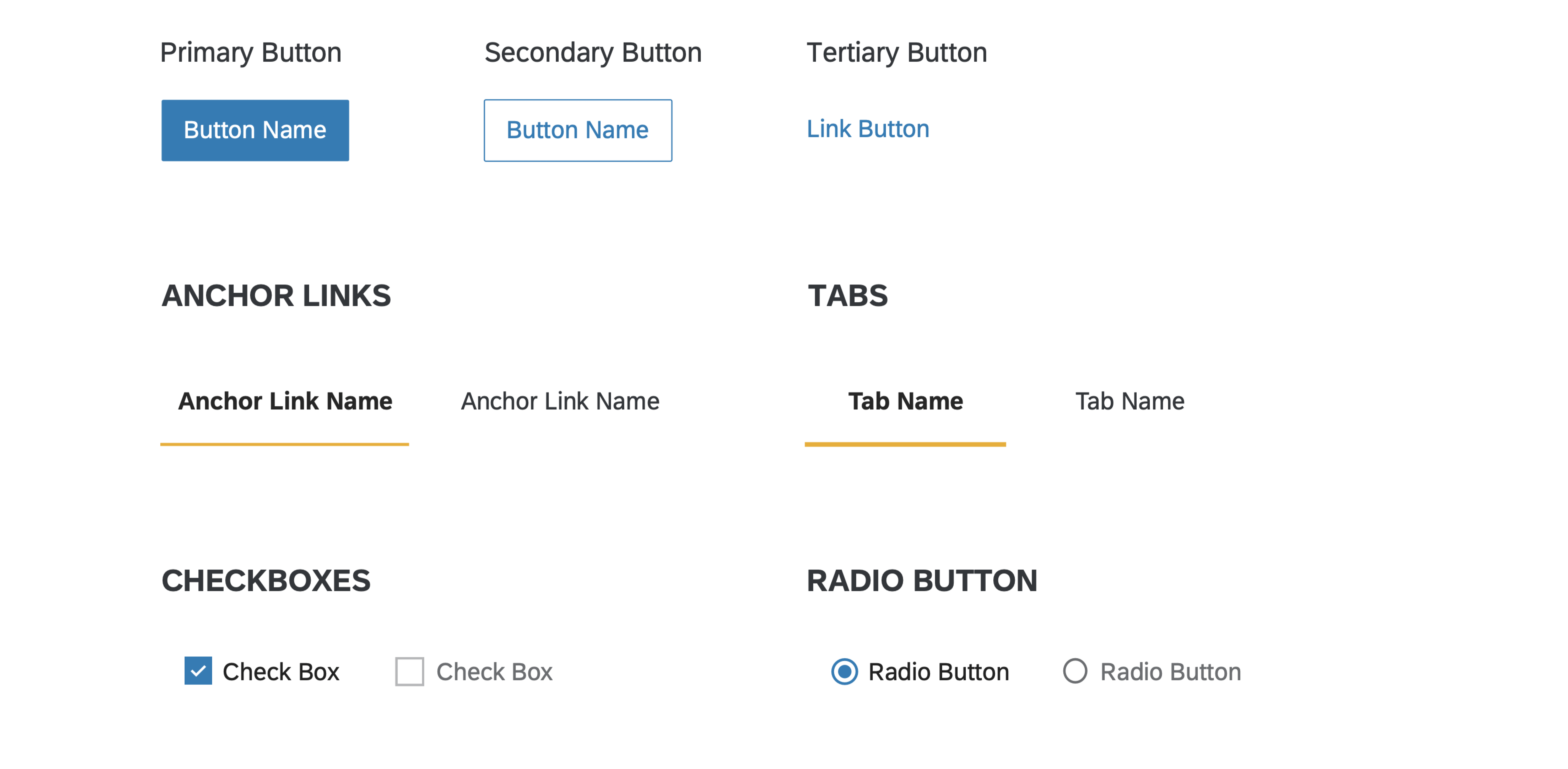
Buttons
Interface Design
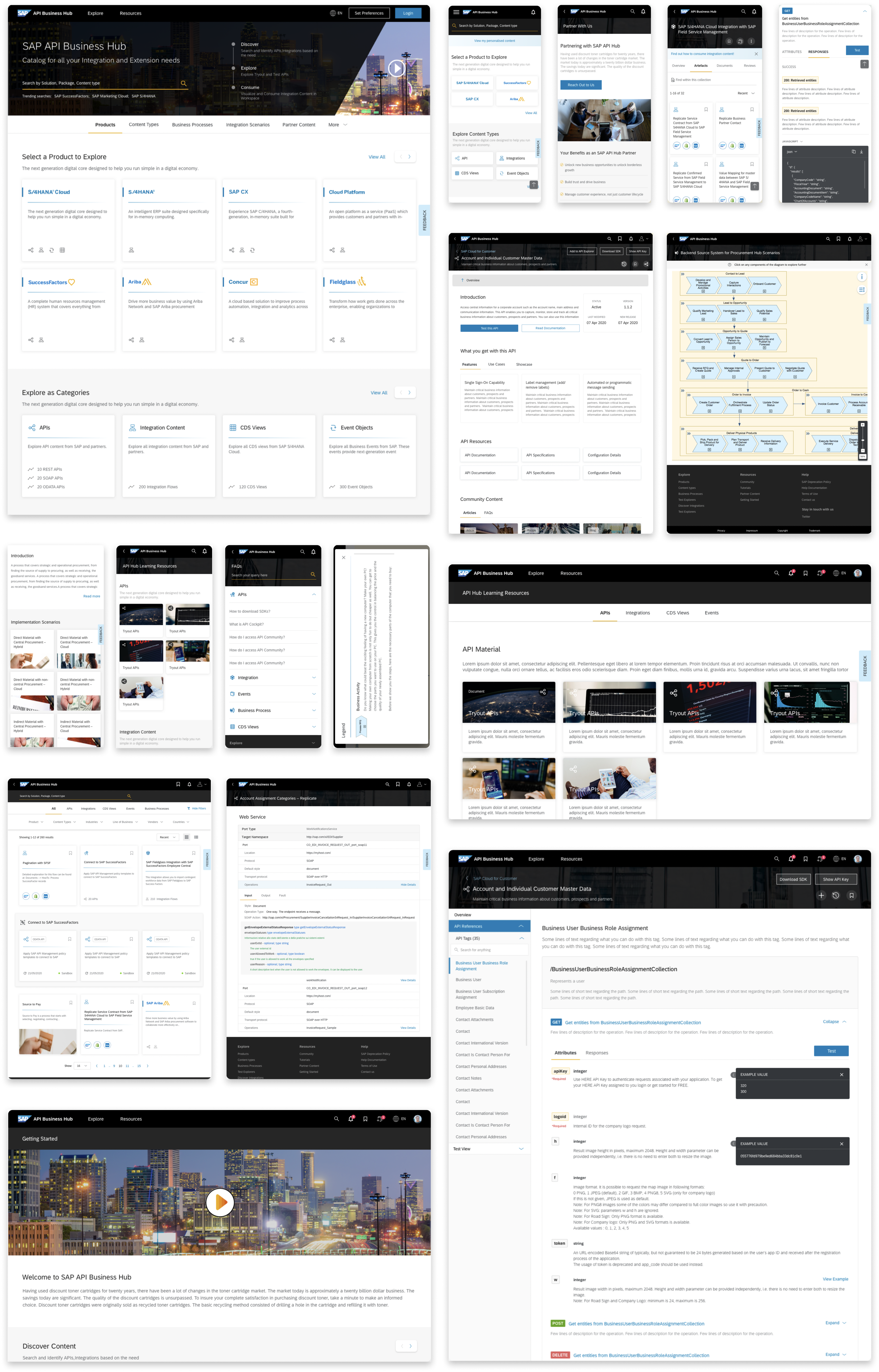
The interface design focused on creating a intuitive user interface that accommodates the needs of users, facilitates easy navigation, and promotes an engaging user experience.
Responsive Design
While we started designing for Web, we designed keeping Responsive Design guidelines in mind. However, as time passed we realised that the way users used API Hub on different platforms was very different. On Web, a user would come to search, save and extract code or the content they were looking for. In Tab and Mobile howver, they can with a purpose to explore API Hub and save content they were interested in.
This requeired us to tweak certain interactions for optimal use. In mobile, content was more crisp, with cards showing only names. The viewer section in mobile was also slightly different, with lesser actions but more Overview and Previews.
