Case Studies
Improving online ride booking experience across demographics
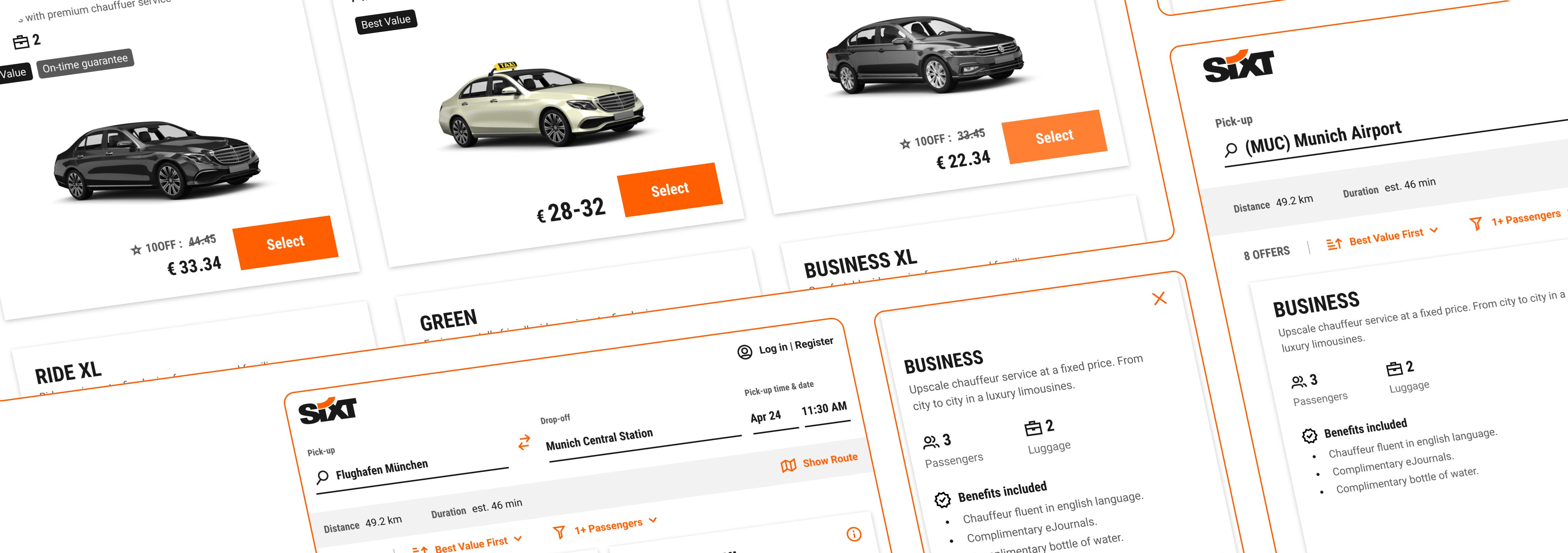
Redesigning the Sixt ride listings page for better user conversion
Challenge
The existing offers page for Sixt ride was outdated, both visually and functionally, and needed a refresh.
The existing Healthasyst platform faces several challenges. The outdated look and feel of the standard spagoBI reports template make it difficult to navigate and understand the information. The lack of proper information hierarchy leads to confusion in accessing relevant data. The large volume of daily recorded information makes it hard to focus on important details. The folder-based organization of reports is not user-centric, requiring users to remember specific locations. Additionally, the UI lacks essential functionality and has an outdated appearance.
High level goal
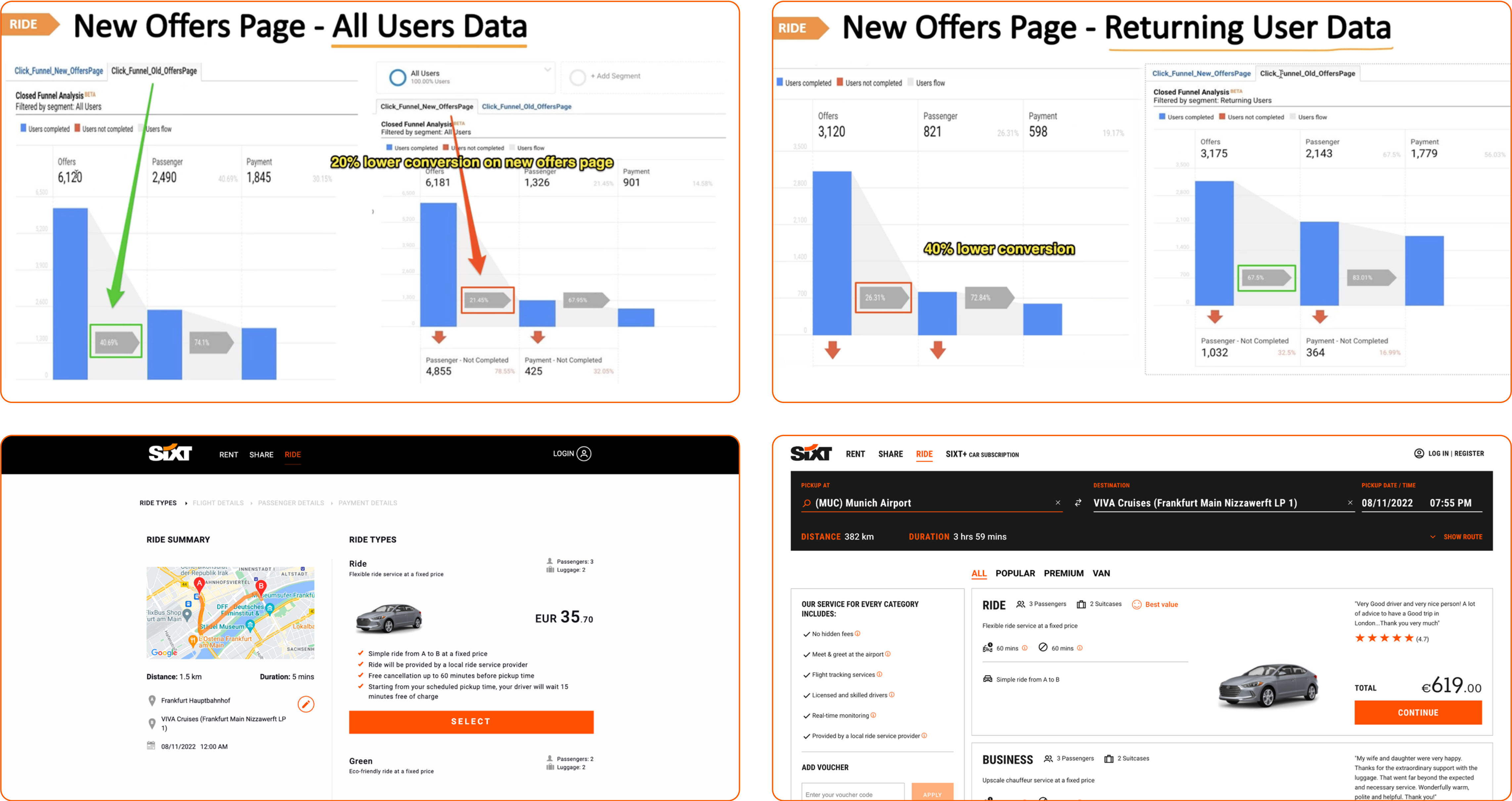
The Ride offers pages needed a modern redesign, while maintaining or improving the existing user conversion rates.
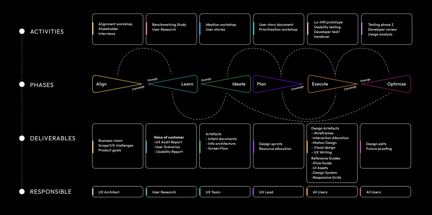
Project Approach
From definition to delivery

Expected Outcomes
Business Needs
- Showcase Sixt premium service
- Showcase service affordability and market competitiveness.
- Maintain or improve existing conversion rates\
- Update design and UX to modern standards
Challenges
- Multiple demographics with varying user needs and expectations
- Variations in service features and targets between demographics
- Balancing “premium” with “pocket-friendly”.

Analysis
Heuristics
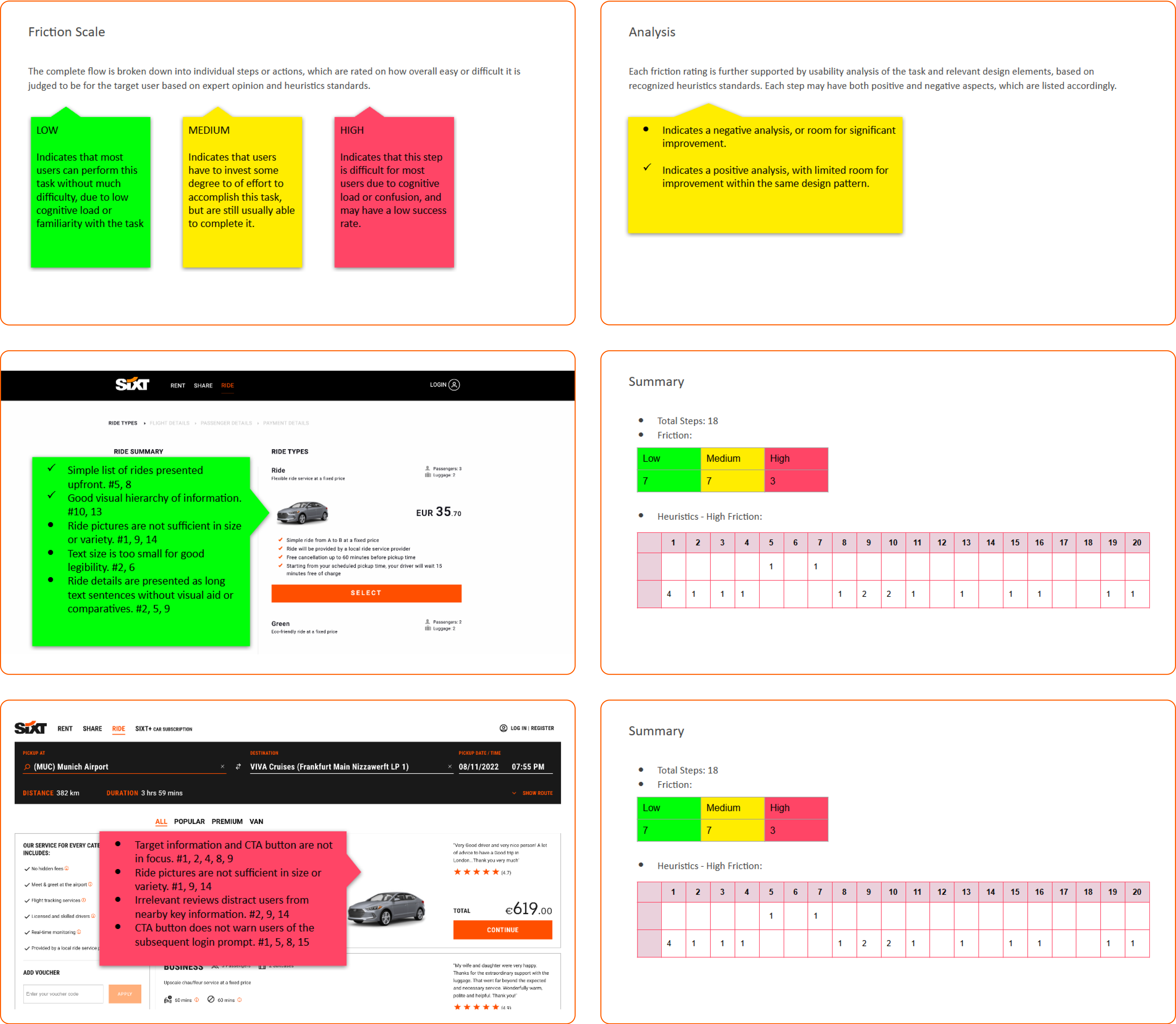
Detailed heuristic analysis of the the current and rolled-back versions of the page design was performed, with a focus on usability supported by recognized heuristics standards. The aim is to identify possible points of friction that may contribute towards the loss of user conversion due to task failure or abandonment.
Suggestions
- Overall number of steps needed to complete the task needs to be reduced to lower accumulated friction.
- Information presented to the user needs to be tailored to fit the target personas for reduced cognitive load and better task familiarity.
- The amount of data and interactions presented overall and at a time needs to be kept lower than the cognitive load threshold for the target users.
- The visual design and interactions need to remain error free and strictly consistent throughout the flow, for maintaining familiarity and user expectation in-between steps.
- Typography and intractable elements need to maintain accessibility standards for ease of use and legibility. Ideally this should exceed the requirements of the target users.
Analysis
Competitive Benchmark
A general UX analysis of the ride booking pages was performed for most major competitors in the market. For each competitor, the task flow till from landing page till actual list of available rides was considered, with a special focus on parallels with Sixt website.

Summary
- No actual ride listing page was possible to access for about half of the competitors websites.
- Where ride booking was actually possible, most competitors provided relatively poor user experience, with a general lack of task transparency, design consistency, and technical implementation quality.
- Some competitors provided more functionality in the location pickers than Sixt, with categorized suggestion lists and special info cards for airports.
- Ride visuals and photographs are noticeable as a key branding and familiarity element.
- Blacklane in particular has direct parallels with Sixt, with similar branding and utility positioning.
Analysis
Content Data
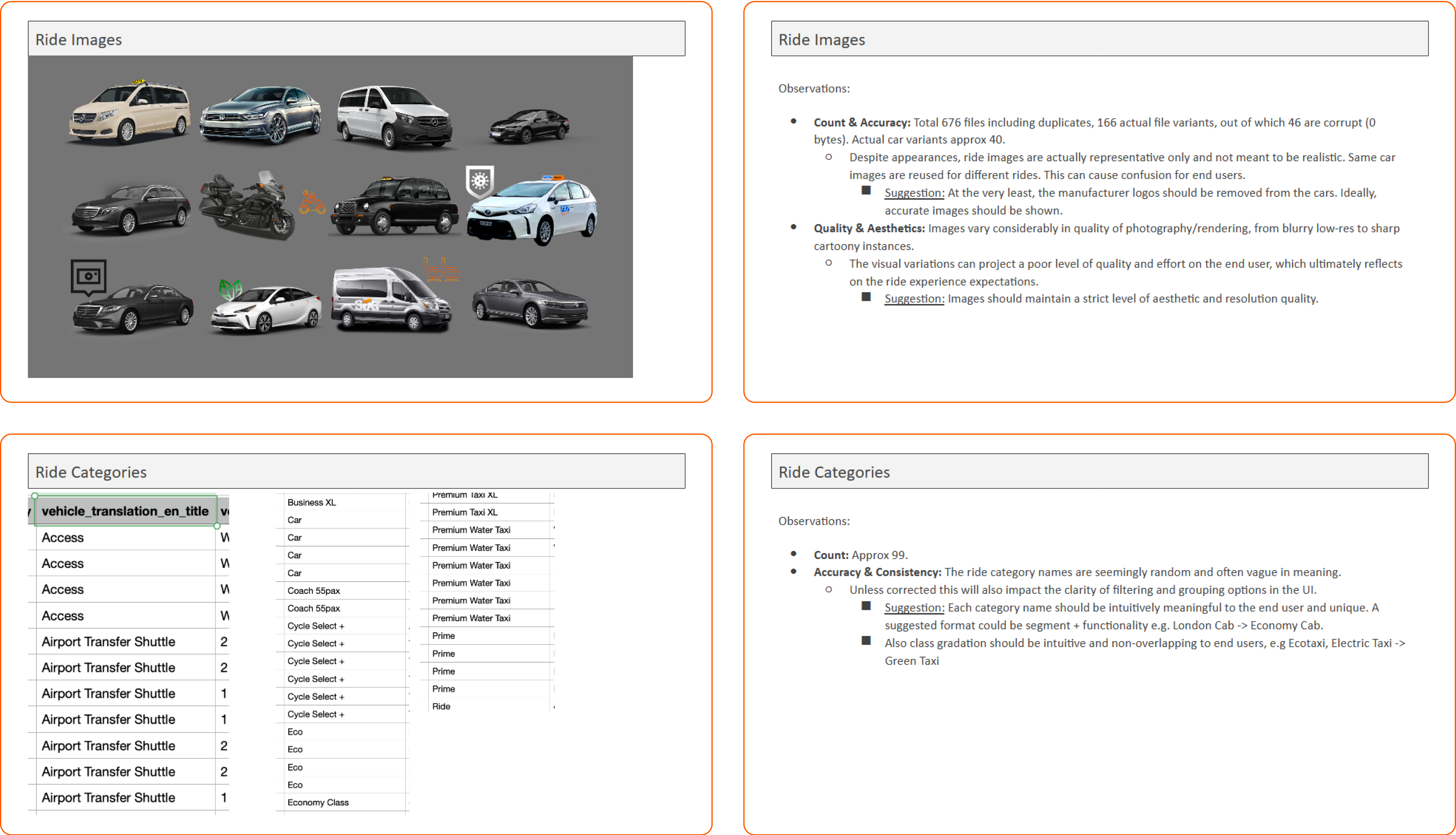
Detailed analysis of the Ride page population dataset was performed for identifying existing issues and areas of potential improvement that can impact final UI/UX.
Summary
Severity scale based on expected negative impact on page design:
- High: Ride Benefits
- Suggestion: Needs to be consolidated and rewritten.
- Moderate: Ride Images, Ride Description
- Suggestion: Images need to be altered or regenerated. Descriptions needs to be rewritten.
- Low: Ride Categories
- Suggestion: Need to be consolidated.
Analysis
Design System
The existing design system used by Sixt was analysed for understanding it’s limitations and influence on the overall overall aesthetics and user experience. This would allow the visual design approach to follow the overall brand identity and user expectations.
Analysis
Brand, Proto-Personas & Scenarios
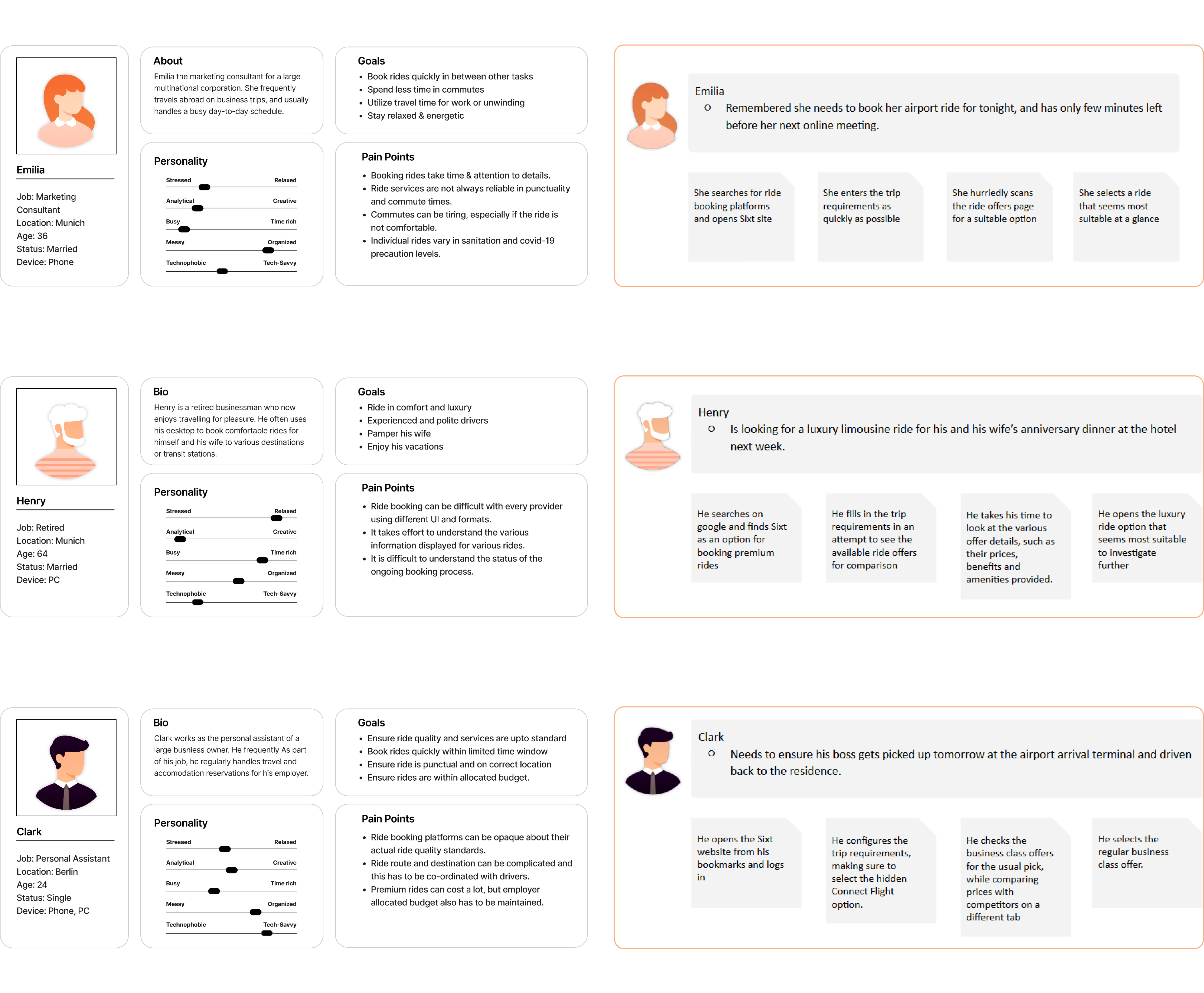
Existing brand guidelines and user data was analysed for mapping target personas, scenarios and moodboard, which ensures the design solutions are effective and targeted.

Target
Design Goals
Based on the conducted UX analysis, and existing business and user data, primary goals were set for the redesign.
Shortest possible task flow for users
- Quick selection of offer
- Quick understanding of ride features → Simplicity
- Effortless comparison of available offers → Prediction
- Learnable behavior for repeat customers → Consistency and Accessibility
Showcase Sixt advantage
- Premium cars → Luxury limousines and eco-friendly sedans
- Ride benefits & cost → Competitive rates for premium service
- Friendly & Reliable service → Professional chauffeurs & service guarantee
Exploration
Wireframes
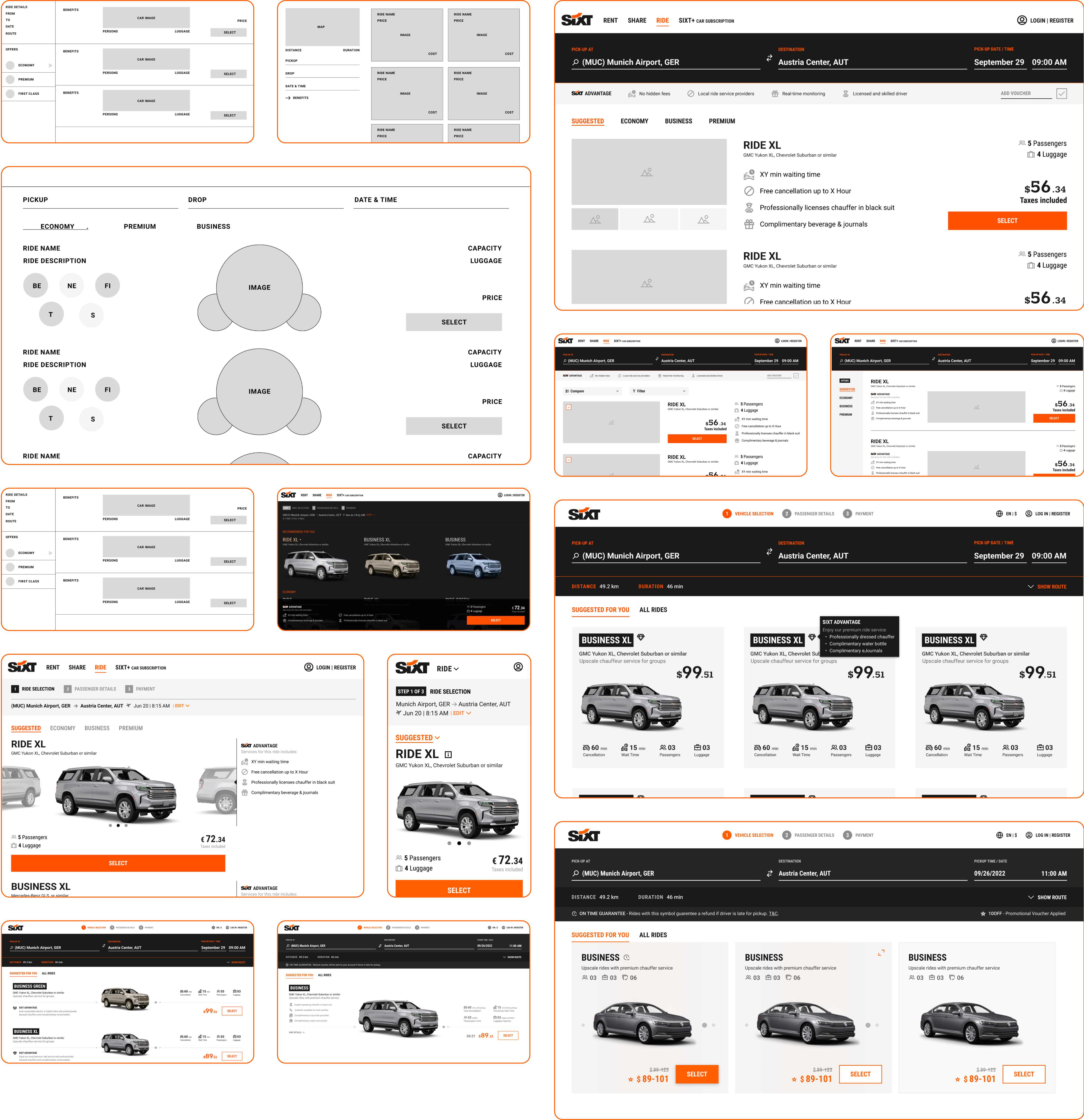
Rapid iterations of low-fidelity wireframes were performed in conjunction with stakeholder alignment sessions, to approach a common consensus while exploring design solutions. As the final design was being zeroed in upon, the mockup went through numerous iterations of increasing detail and complexity.

Design
Final Mockup
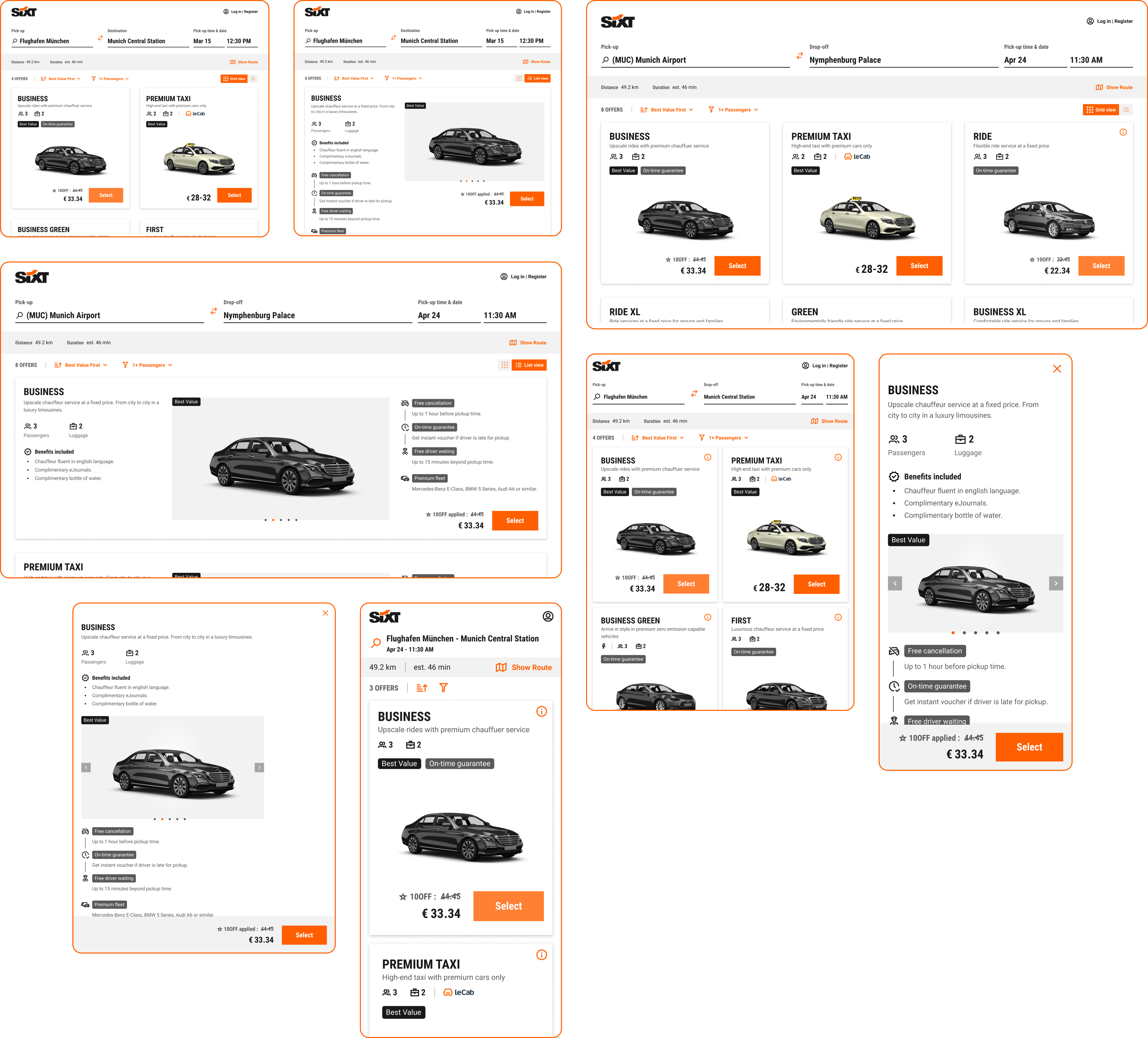
Once all the necessary functional details were met along with stakeholder consensus, the final design iteration was fleshed out into a detailed high-fidelity mockup and prototype, along with necessary deliverables such as assets, guidelines and usecase maps.

Validation
User Testing
Finally, the new design was tested with users for usability validation, which resulted in a few minor updates to the copy text and micro interactions.
Design
Content Guidelines
As a companion to the new design, detailed guidelines and assets for the page copy and images was created to mitigate some of the major content related issues identified in the analysis stage, and further validated during testing.
