Case Studies
How to prepare your kids for a screen routine?
Introduce PARENTAL CONTROLS without the drama.
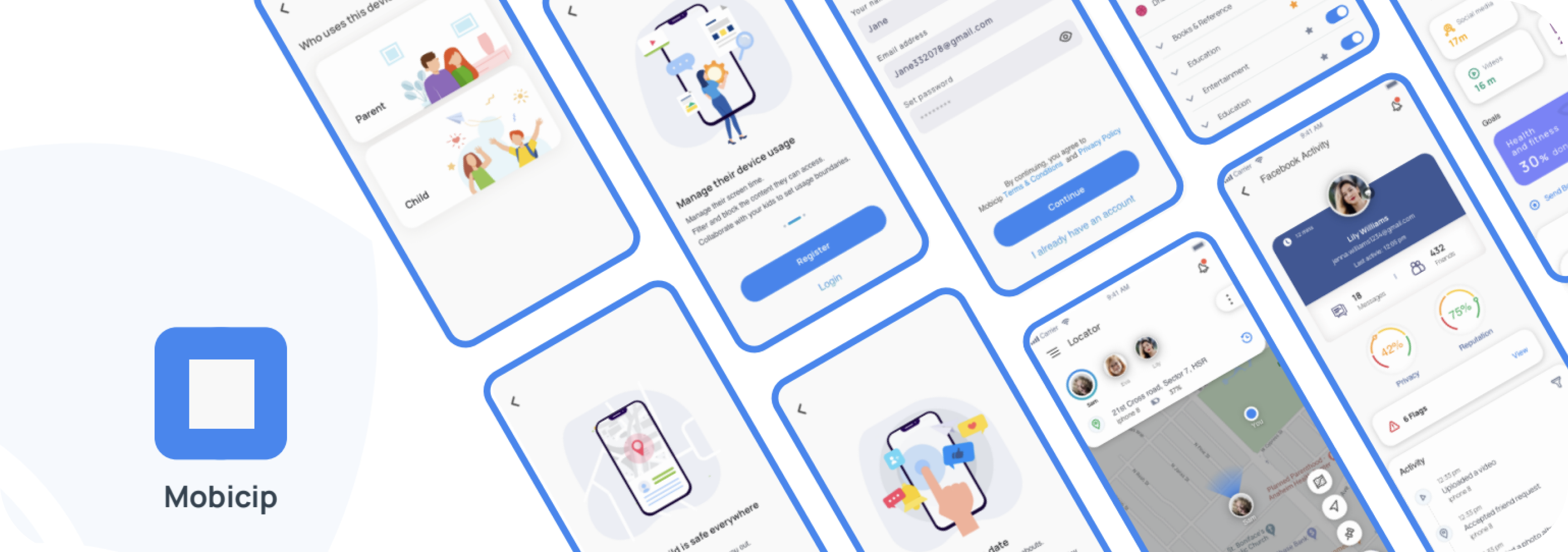
Challenge
Lack of unique features to stand out in the market with an outdated design made it hard to sell.
The existing product missed fresh outlook on the design standards both on functional and visual end. It lacks many relevant features provided by competitors, at the same time it needed unique signature features to create a required product differentiator.
High Level goal
Providing joyful digital well-being and responsible digital consumption in every household.
Project Approach
From definition to delivery


Alignment Workshop
Workshop Expectations
- To achieve consensus between all stakeholders.
- To understand the long-term and short-term business goals.
- To gather all existing knowledge about the company, including customer
- reviews, perceptions about the company, and challenges.
- To identify the current and expected user segments.
- To understand the aspirations, fears, and hopes related to the UX
- intervention.
- To consider any benchmarks or design standards that may be applicable.

Workshop Insights
Product Goals
“One stop solution to parenting needs”, “trust and reliability”, “unique signature feature”, “refreshing, and stylish look and feel”
Business Vision
“Market leader in the online safety space”, “perfect partner for families and educational institute”, “a trend setter and expert”, “distinctly recognizable and trustworthy parental control brand”.
Expectations
“Establish the brand, create magic!”, “A stellar product with a wow factor”,”Satisfaction to the users and business”,“Best product in parental control space”,”Product which cannot be copied easily”, “A product which has its own personality”,
“great value for money”.
Challenges
Increase retention rates, user sign up for free trials (dismissal conversion rate, 90% churn), and reduce trial and renewal cancellations per week.

Benchmarking
Task Agenda
We studied some of the leading market competitors of Mobicip and gathered their best attributes. As a result we were able to compare mobicip with these brands and calculated where we stood and how far we had to go.

Several features that caught our attention.
Sample kid: It allows you to check out all of the application features and displays how all
reported information is presented in the app.
Expert Advice: Automatic alerts when Bark detects potential issues, along with expert recommendations from child psychologists for addressing them. Also helps in giving tips on breaking ice for different topics related to sexuality, parent separations, etc.
SOS: Single tap from kids to get instant alerts when they’re in danger.
Time bank: Displays the time that children saved from their Daily Limit and deposited in their TimeBank.
Stay up to date library: Contains all the trending apps that children might use, apps that are harmful, recommended apps to keep non tech savvy parents up to date.
Expert Audit
Existing System
Mobicip has 2 applications – PARENT and CHILD available on various platforms.

Mobile App- PARENT

Findings
- Inconsistent design – all screens look different, throwing users off.
- The Overall design (look and feel) lacks of contrast and a fresh color pallette.
- Information architecture can be placed well.
- Accessibility issues – font styles are not impactful enough, Distribution of weightages throughout the design are not very clear.
- Parent has to look back to the app everytime they have to see screen time, and go in layers to edit it.
- Segragated reports on different children screen usage patterns are missing.
- Carousel approach only works till the time user is aiming for data of one child only.
- Customer support is misplaced or missing.
Web App- PARENT
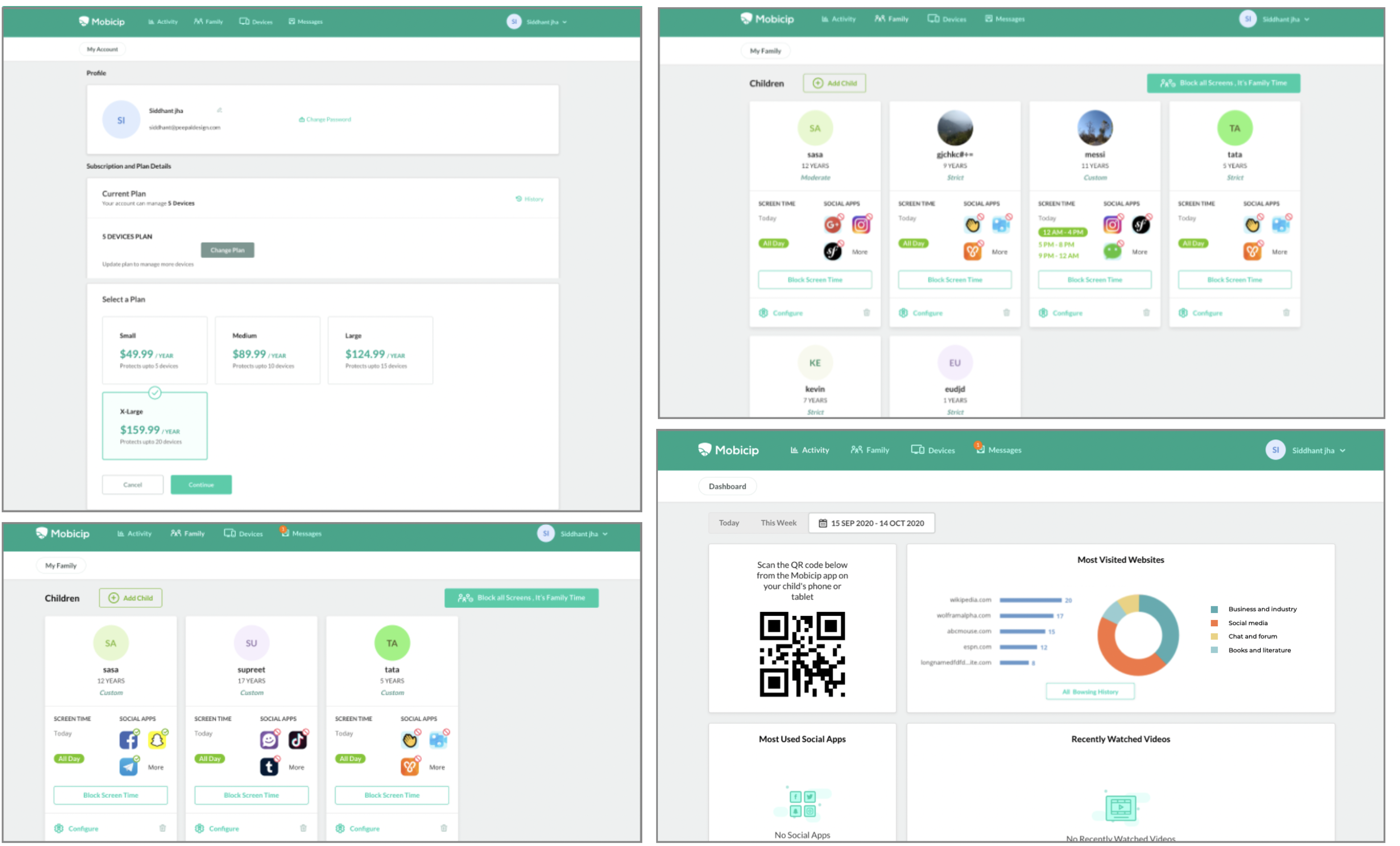
Findings
- Navigating between different child screens is hidden and missing from the landing page.
- Effective navigational tools like tabs, hover tooltips, in app guides are missing making it difficult to use the app with ease. Breadcrumbs approach does not work properly.
- Hand Holding is missing.
- Guided Task Completion could have made features like setting screen time more easier to set up.
- Entire look and feel looks very dull and outdated.
Mobile App- CHILD

Findings
- Child app has nothing in it for children, no engagement.
- There is no child proofing hence children can delete this app anytime from their system.
Summary

User Segments
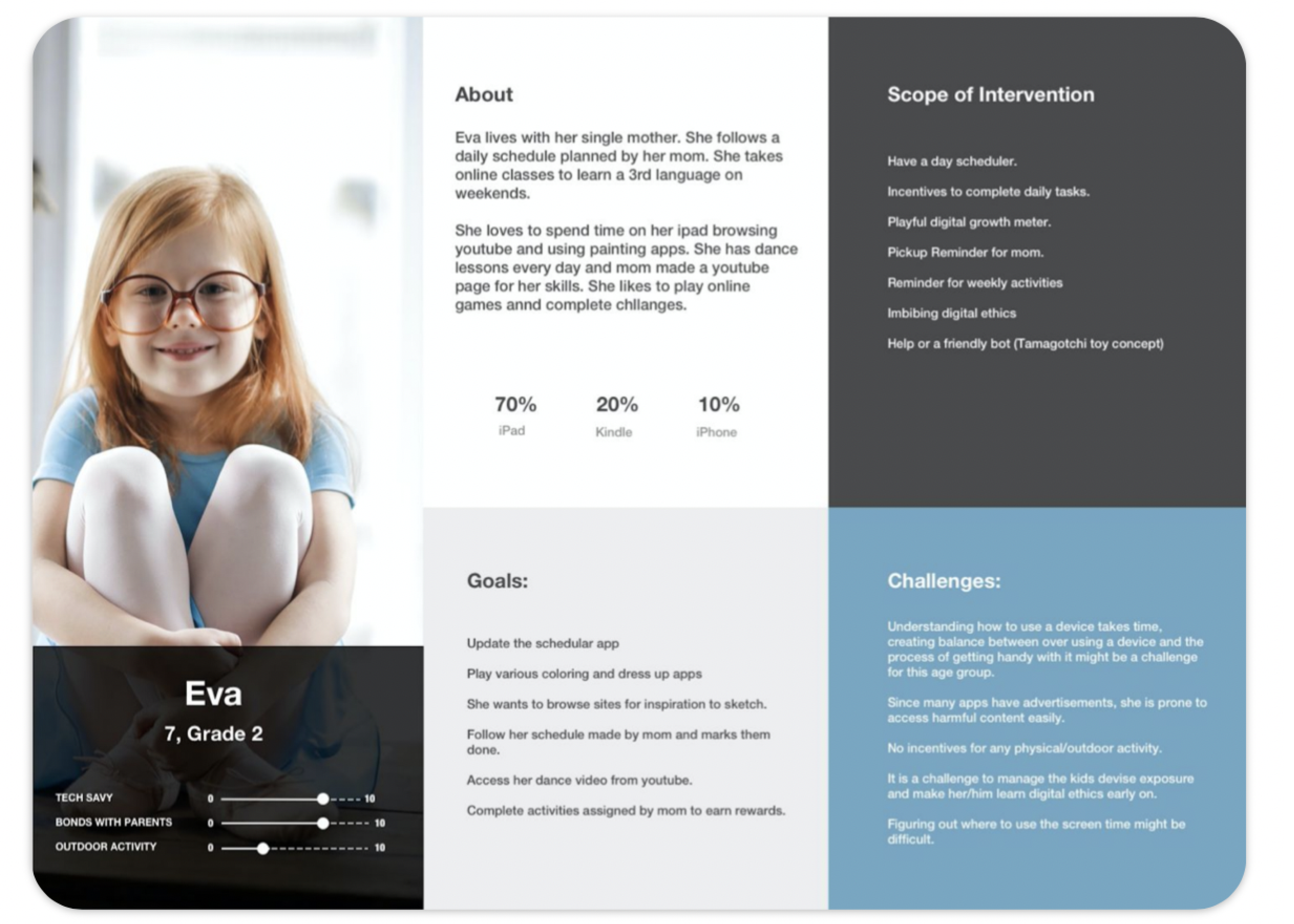
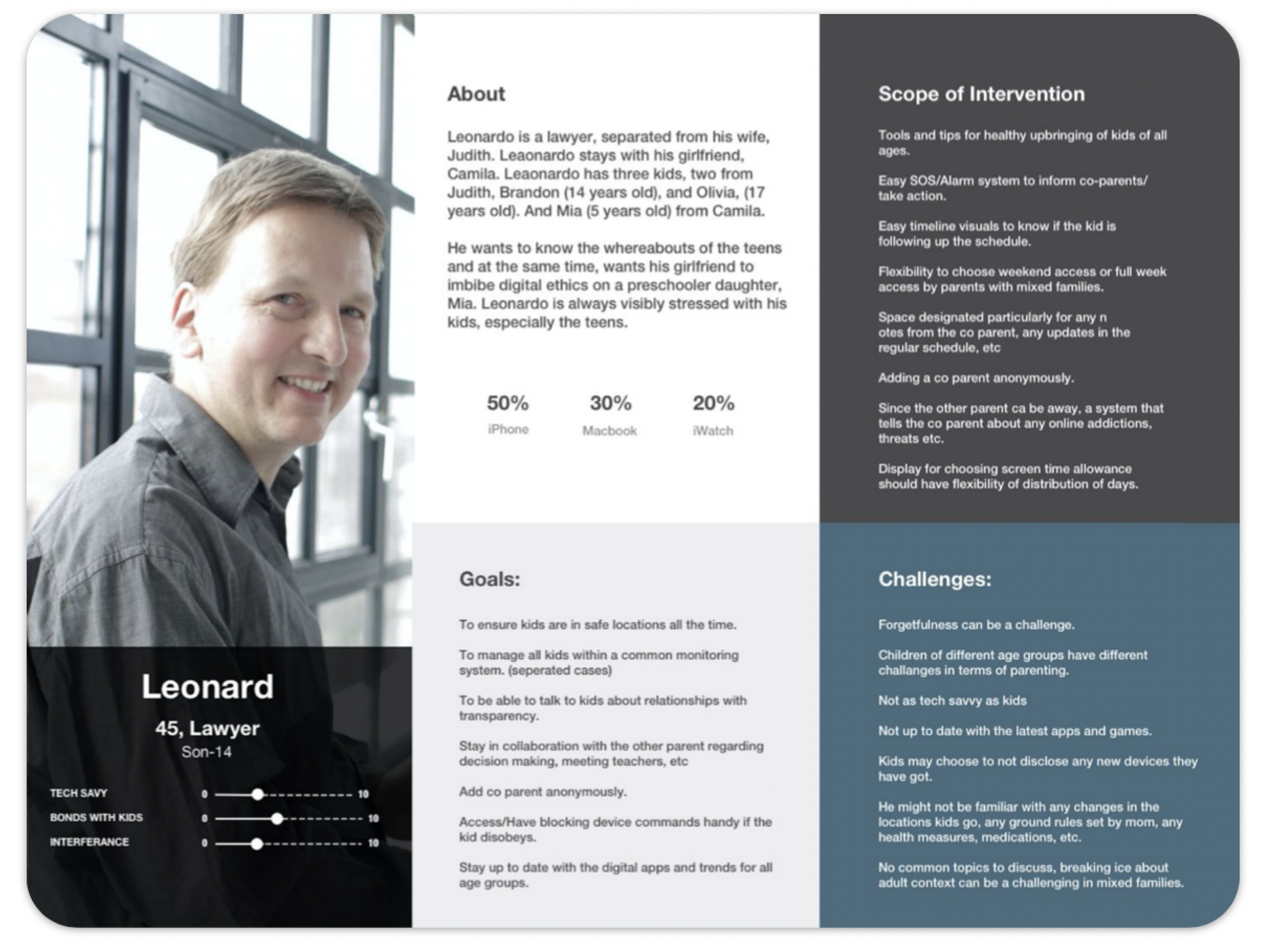
Creation of Proto-Persona Cards: Condensed Information for Workshop Insights.
After the workshop, we gathered and arranged Post-It notes to form proto-persona cards. These cards provide condensed details such as the person’s name, demographic information, a brief biography reflecting their desires and requirements, and the scope of intervention.

Proto- Persona
User Scenarios


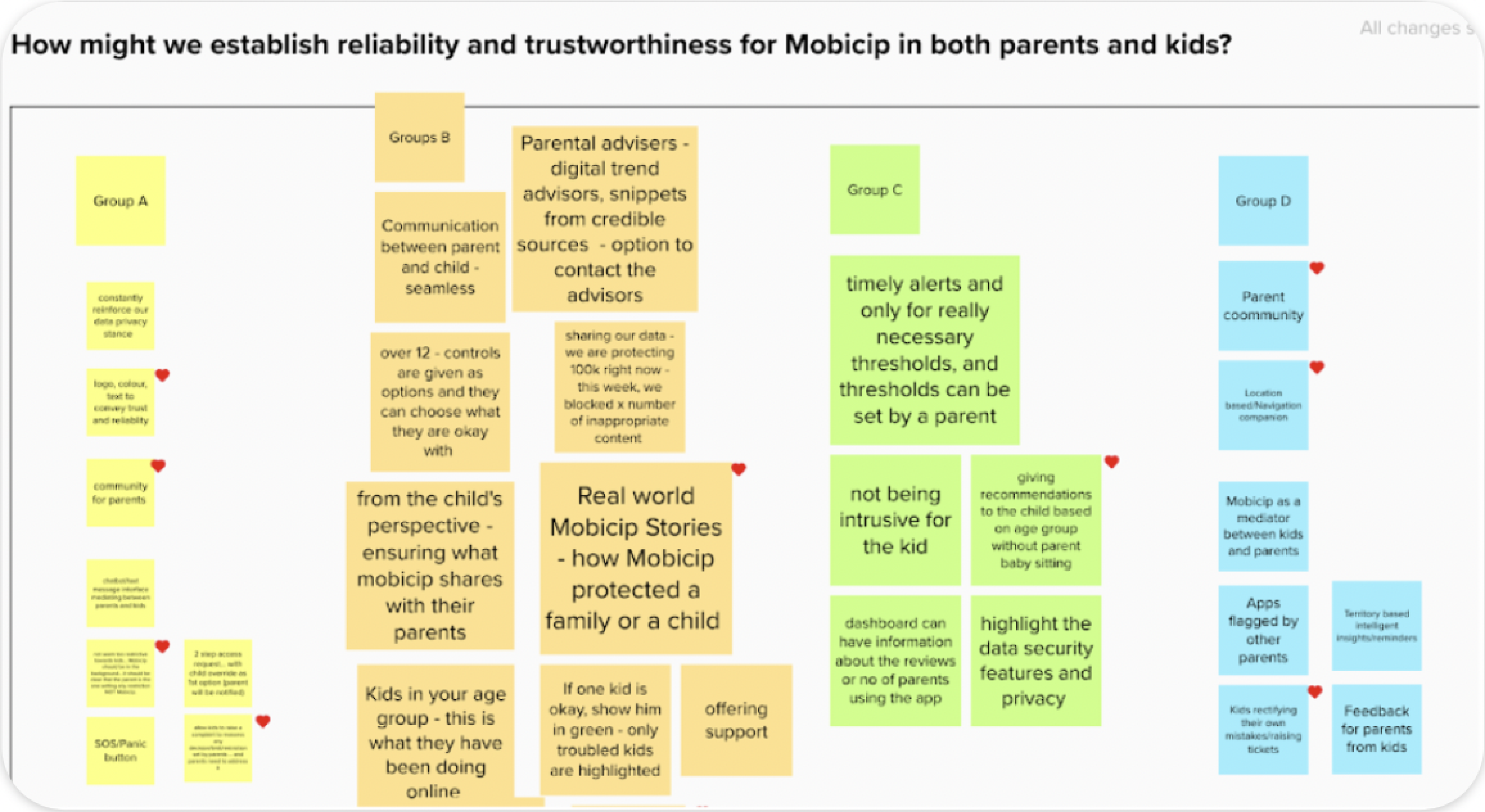
Design Thinking- How might we questions
To articulate the research and bring in answers to our queries,
How might we questions were created addressed to specific personas and their challenges. They were designed in a way that we could get good amount of ideas to solve challenges and intervene new features and methodologies to construct a better product for these users. Following were the questions:
- Child app has nothing in it for children, no engagement.
- There is no child proofing hence children can delete this app anytime from their system.
Information Architecture
Parent App- Mobile
Architecture content guidelines
1. All the red dots are new features (apart from the features of existing app) in work
2. All the text in green colour is a feature of work package 2
3. All the text in blue colour is a feature suggested for work package 3
4. All the text in grey colour and lower case are the deatils of specific features.

Key Features

Social Media Monitoring
- Mobicip with the consent of child lets the parent monitor their social media activities.
- This feature ensure that the children are not facing any threats online like cyber bullying, viewing inappropriate content etc.
- The feature is used ensuring the privacy of the child. Mobicip never reveals content in a flag.It uses tags to identify the area of problem and provide relevant solutions to it.
Screen Time & Schedules
We divided the screen time into two parts
1. FREE TIME (Non productive mostly)
This is for the parents who want to limit yet provide their kids with free (entertainment) time.A parent can choose to set limits, block or allow for the entire day depending on the agenda he wants to plan for day.
2. SCHEDULES
Schedules are for the parents who want their kids to be able to only operate certain apps based on a particular time of the day or activity in a day.

Goals
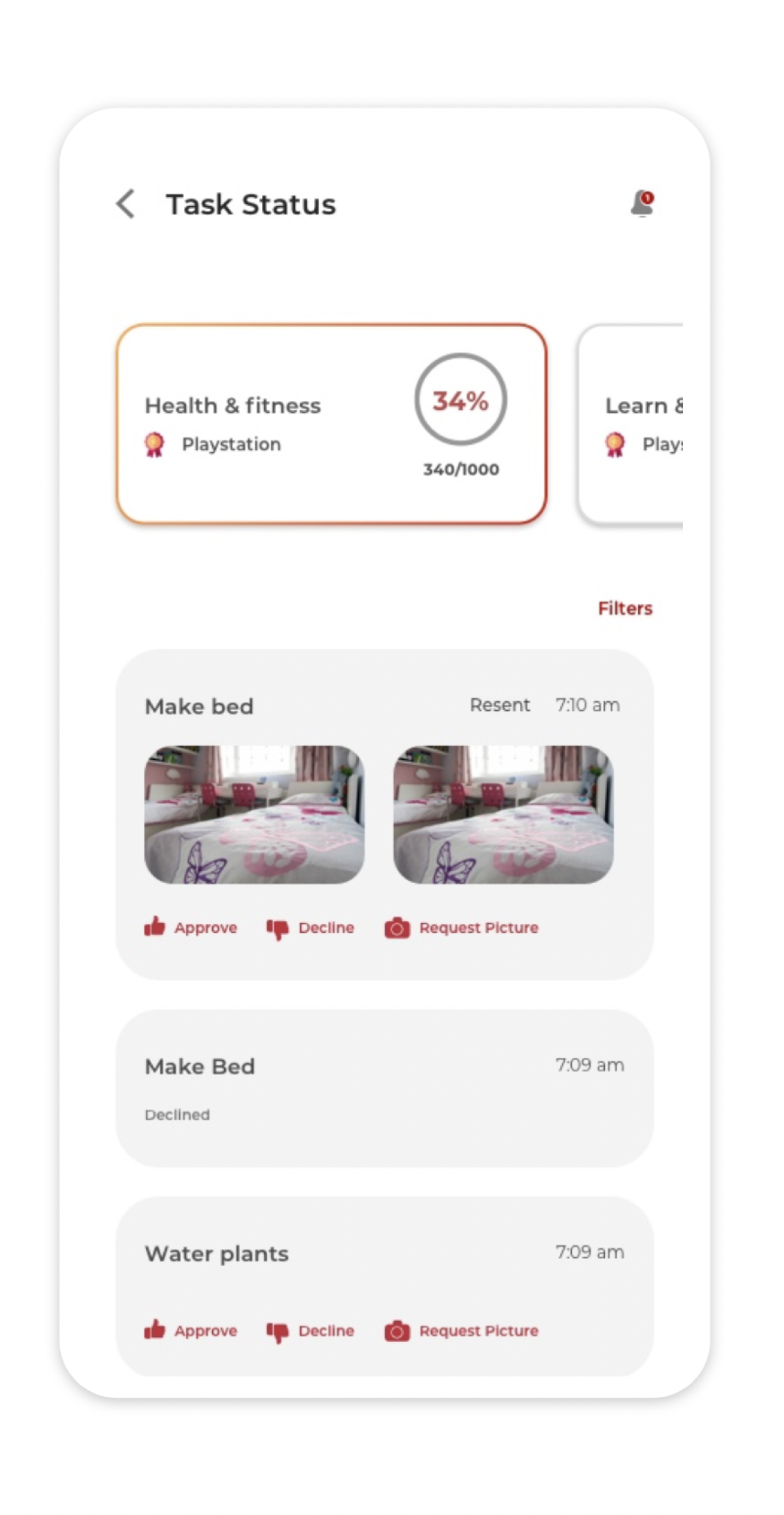
How about assigning tasks and rewarding the kids on completion?
That is what goals do.
The process is simple.
1. A parent chooses a type of goal
2. Chooses/sets tasks.
3. Assign points and time to do the tasks
4. Set a reward and collective reward points to establish completion.
The child does tasks for a routine till the goal gets accomplished and earn rewards.
Parenting
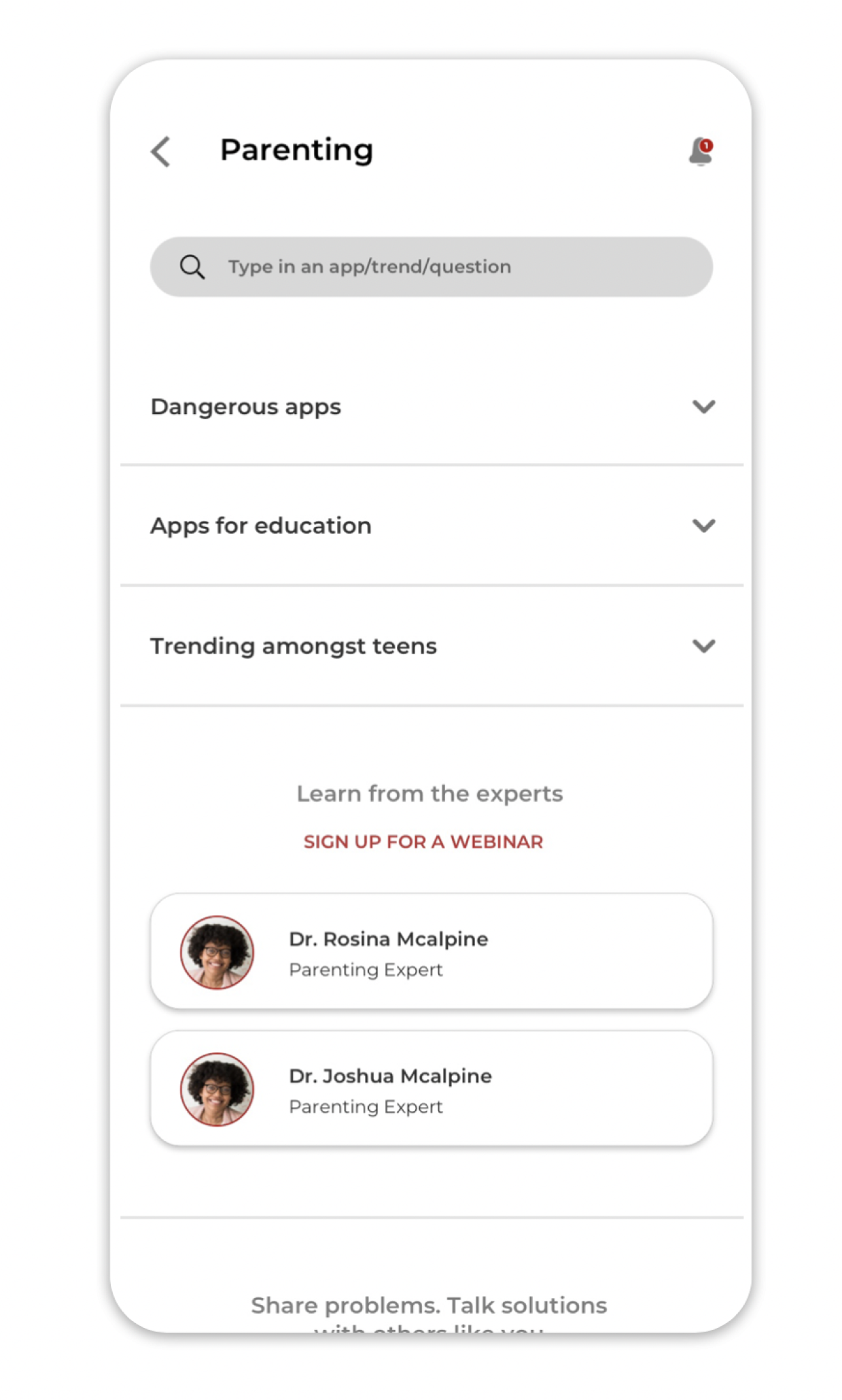
Parenting is a holistic approach taken on the idea of giving a parent whatever he needs to understand his children well. Begining with an
APP LIBRARY to be up to date with the applications that can be used for education, that children use for dating, that can be addictive, etc.
PARENTING COACH to refer to and learn whenever a parent feels stuck in a situation regarding their kid
PARENT COMMUNITY is a link to all the social media pages for Mobicip so that a parent never feels out of place or alone when he can not refer an expert immediately.

Value Effort Mapping
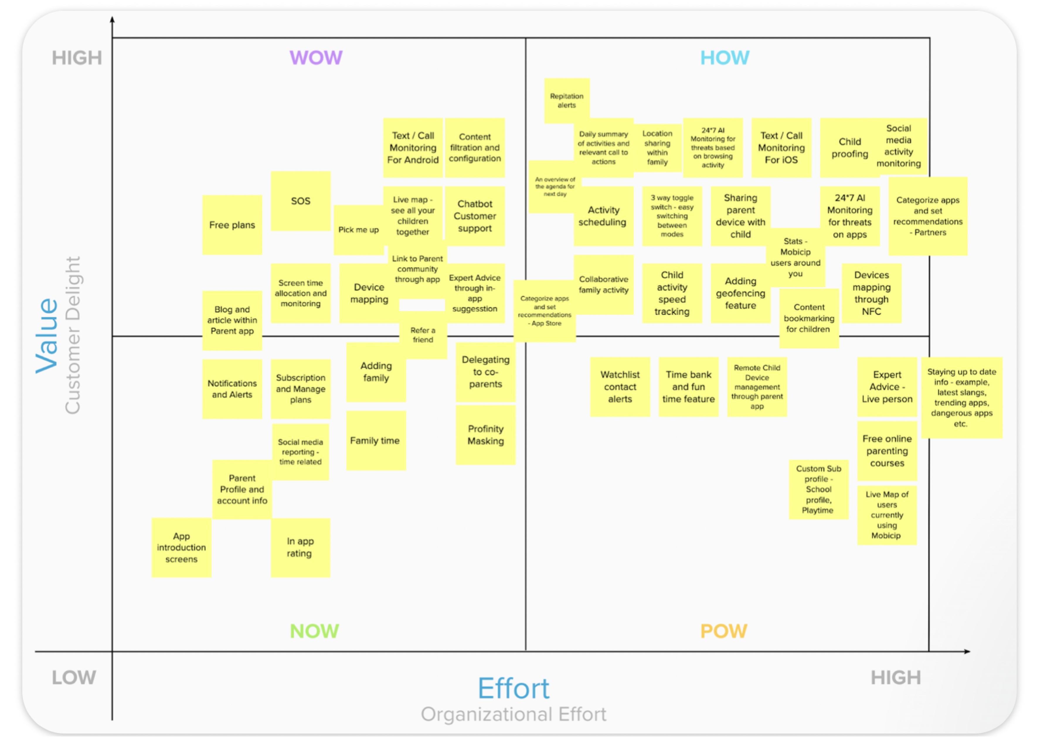
Finalizing features on the basis of value addition and effort
We listed down all the features we derived from How might we questions and did a mapping of time each will take for development and planning against value it creates at a market level.
User Story Prioritization
As a user, what PARENT wants:

As a user, what CHILD wants:


Wireframes
Wireframes were created give stakeholders a base structure of the design and receive feedback on it before moving to the visual design phase.

Visual Design
After receiving feedback from the stakeholder and the team, the final application and dashboard was developed and delivered.
