Case Studies
Experience Transformation
Leading Enterprise CRM system

Challenge
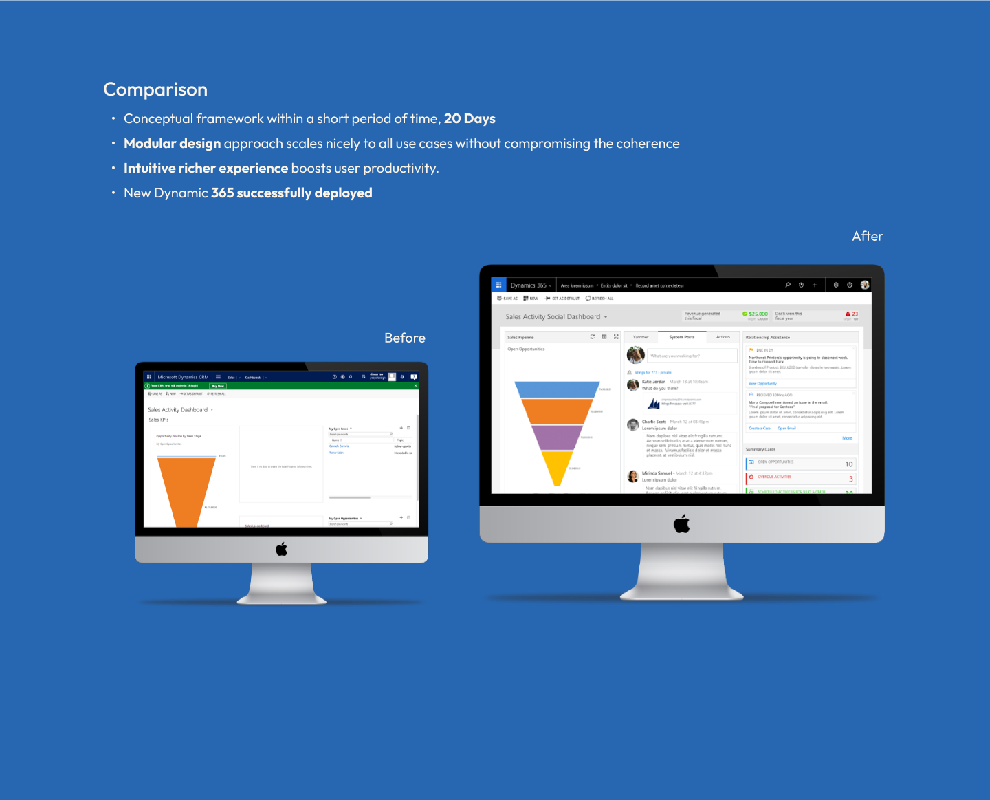
Revamping an outdated design within legacy constraints into an intuitive and responsive experience
The current design lacked visual hierarchy, logical input controls, and a consistent structure. It also had serious usability issues that needed to be addressed within the technical constraints.
High level goal
To improve the user experience for small and medium businesses, as well as enterprise editions in enterprise resource planning (ERP) and customer relationship management (CRM) applications.
Project Approach
From definition to delivery
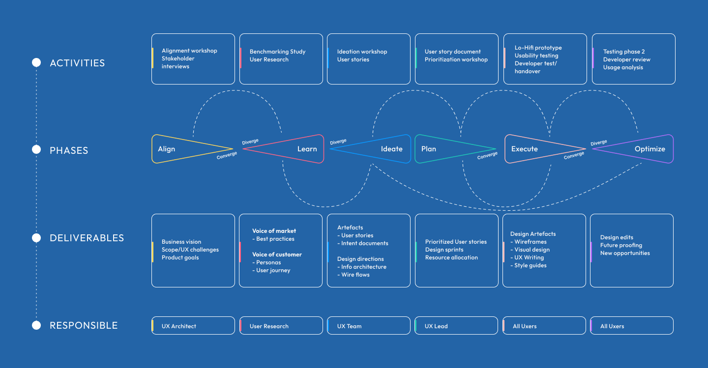

Definition
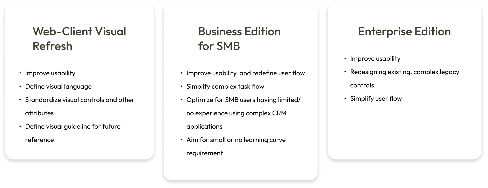
Design Scope

Key Goals
- Web-Client Visual Refresh
- Business Edition for SMB (Small and medium businesses)
- Enterprise Edition

User Segments
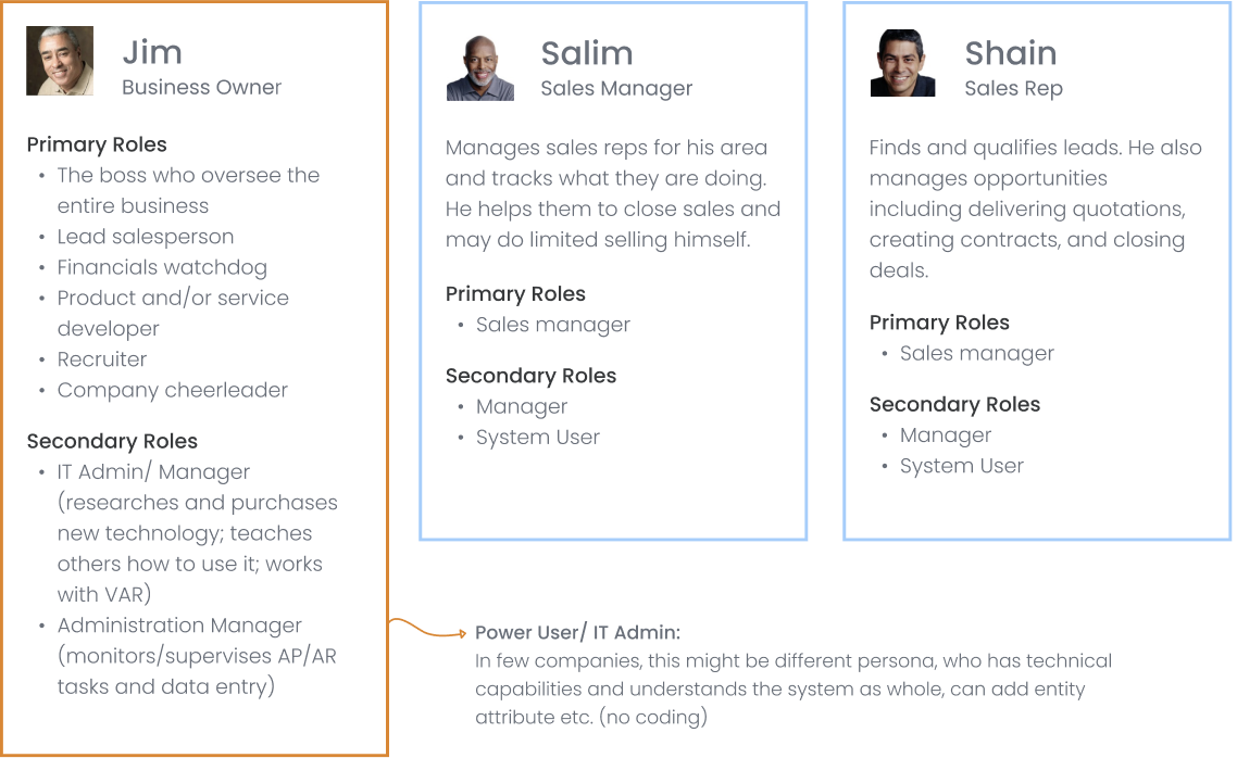
Personas
The personas covered the personality, interests, frustrations, and expectations of three main user types. This helped to empathize with the user and thereby fostered effective ideation.
User Stories
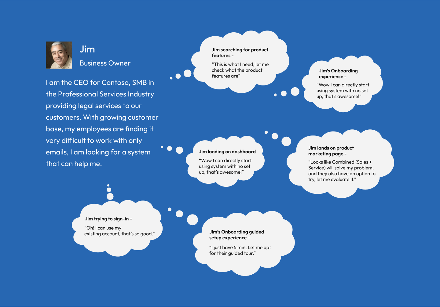
Understanding the needs of the user
As it was important to think from the shoes of the user, we picked out finer details reflecting their desires and requirements. By laying out their natural user journey in the application, we found the potential areas and the scope of intervention.

Brainstorming activities
UI refresh Approach
How might we questions were created addressed to specific personas and their challenges. They were designed in a way that we could get good amount of ideas to solve challenges and intervene new features and methodologies to construct a better product for these users. Following were the questions:
- Find a metaphor for UI refresh
- Don’t change the functionality and behaviour as much as possible
- Tackle known issues such as
- Wrapping and fading of long texts
- Bringing intuitiveness to editable, empty and filled input fieldi
- Use precise grid and visual containers for different groups of information
- Standardise font, font colour to reflect readability, consistency and visual balance
- Tweak the skin to
- Bring in right amount of breathing space between elements
- Design elements/methaphors to reflect the desired behaviour
- Hold related layers of information together
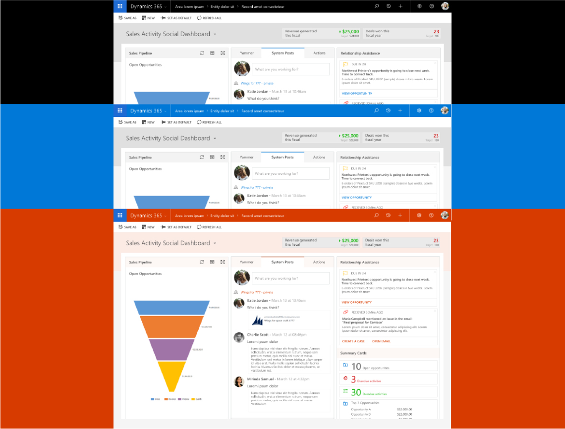
- Allow theme customization without compromising on readability and brandinq
- Where-ever applicable, design to accommodate new design ideas such as “cards”
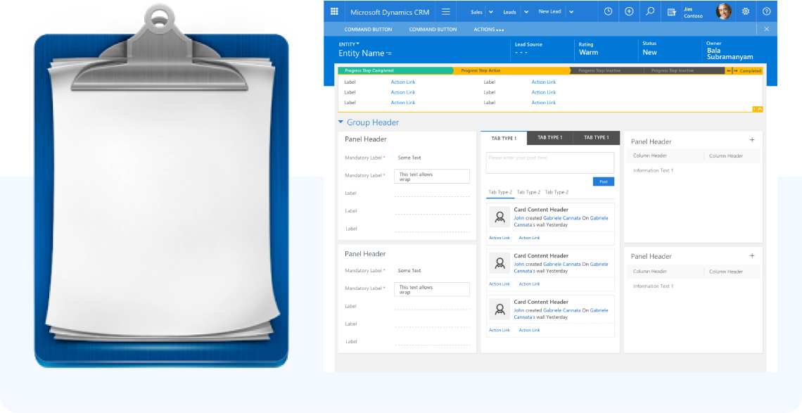
Metaphor
- Clipboard holding documents together
- The blue band on top acts as a clip that binds the entire UI together
- Another container (grey or white) binds rest of the information in the content area
Approach: Standardization
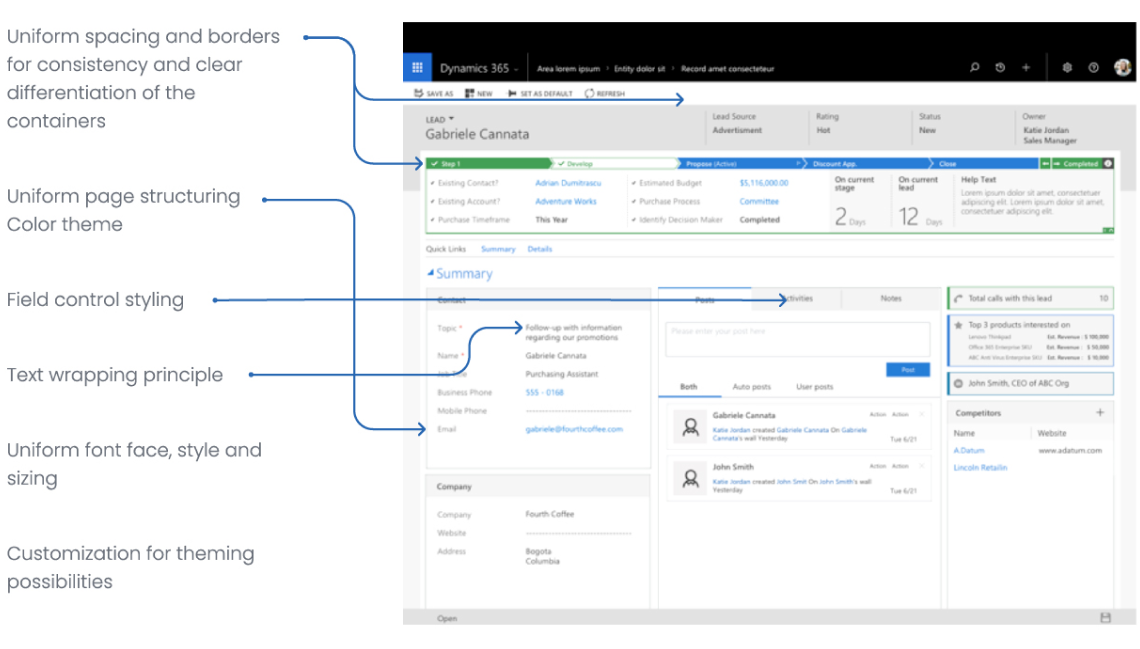
- Uniform spacing and borders for consistency and clear differentiation of the containers
- The blue band on top acts as a clip that binds the entire UI together
- Another container (grey or white) binds rest of the information in the content area
Planning to Execution
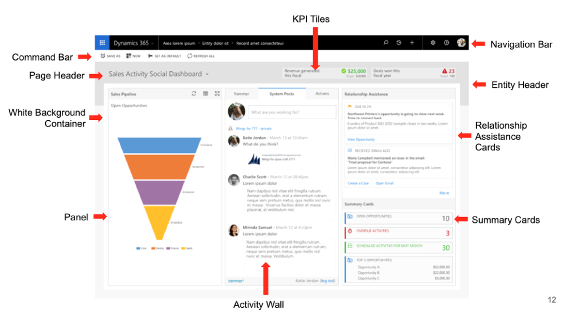
Dashboard Components
The specific components that underwent the redesign are shown below

Design System
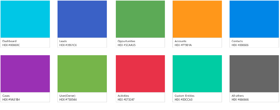
Colour Palette
The existing colour palette was picked from the existing design system created by Microsoft
Iconography

Approach
Theming
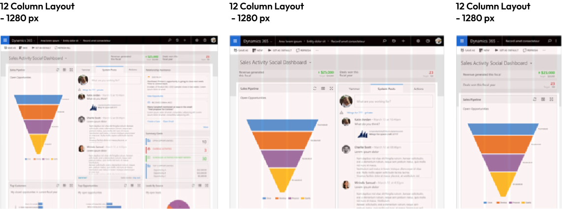
Responsive Grid
