Case Studies
Designing an Engaging Experience Flow for an Endoscopic Device
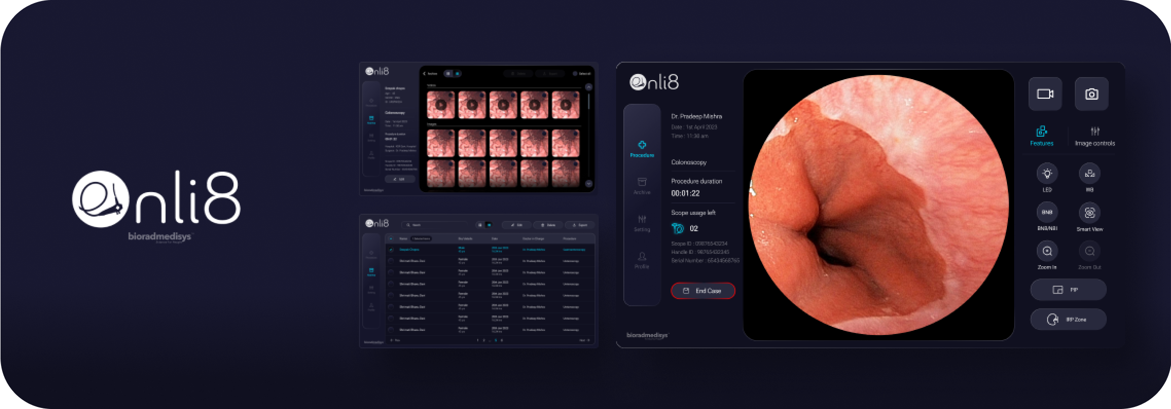
A simple and modern healthcare GUI design revamped for an Endoscope Vision Processing Unit.
Challenge
Outdated enterprise design which was developer friendly as opposed to the user.
Biorad Medisys intended to revamp the UI of video processing unit (a TFT LCD display) of the Endoscope.
The challenge was to incorporate new flows and features into an existing IA and also do a thorough check on usability for the redesign.
High level goal
Creating a simple and engaging experience which cuts down on procedure time and reduces the learning curve.
Project Approach
From definition to delivery
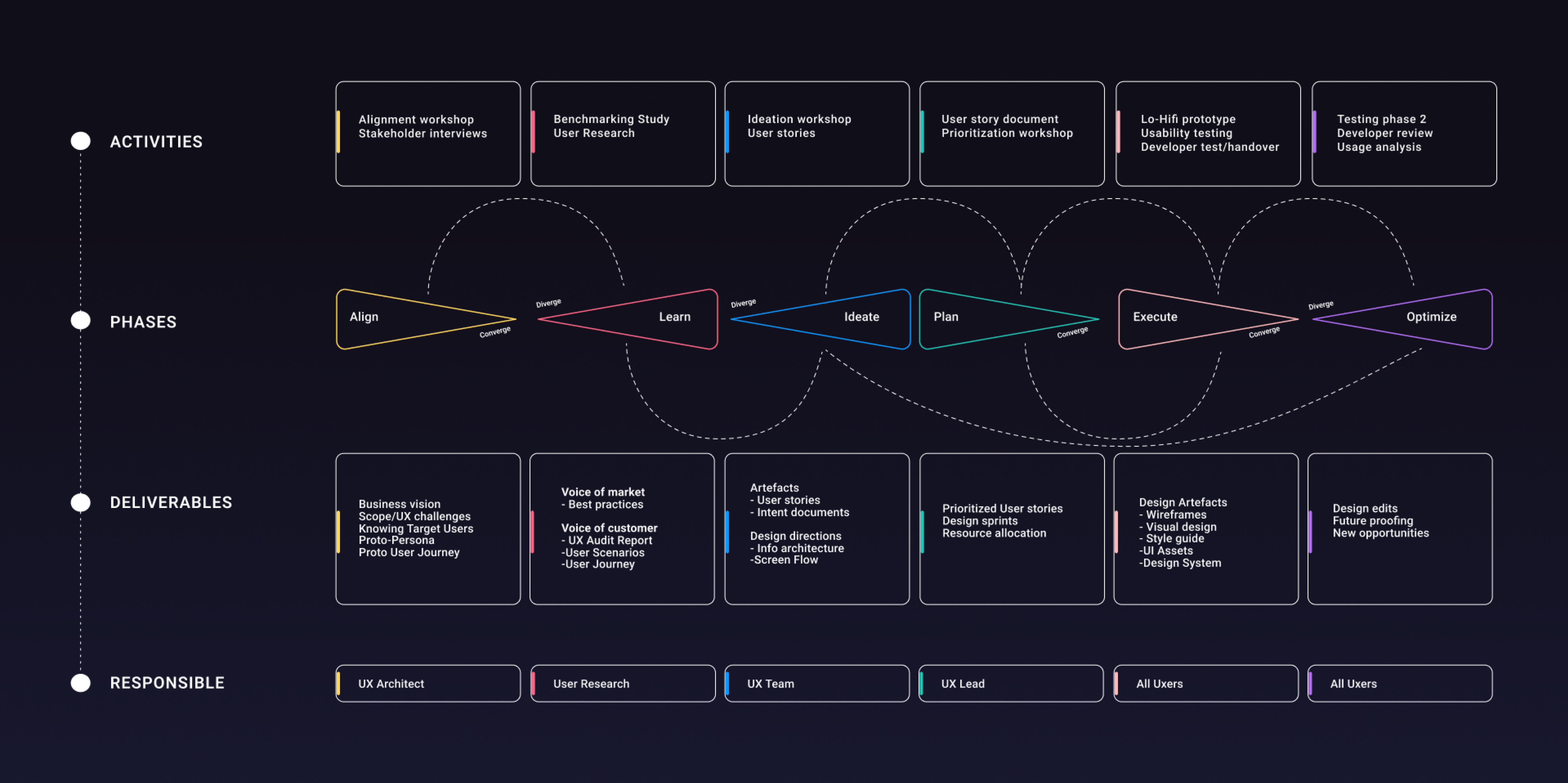

Alignment Workshop
Workshop Expectations
- To achieve consensus between all the stakeholders.
- Understand the business goals (long term and short term).
- To gather all the existing knowledge about the product and to understand the user/market segment
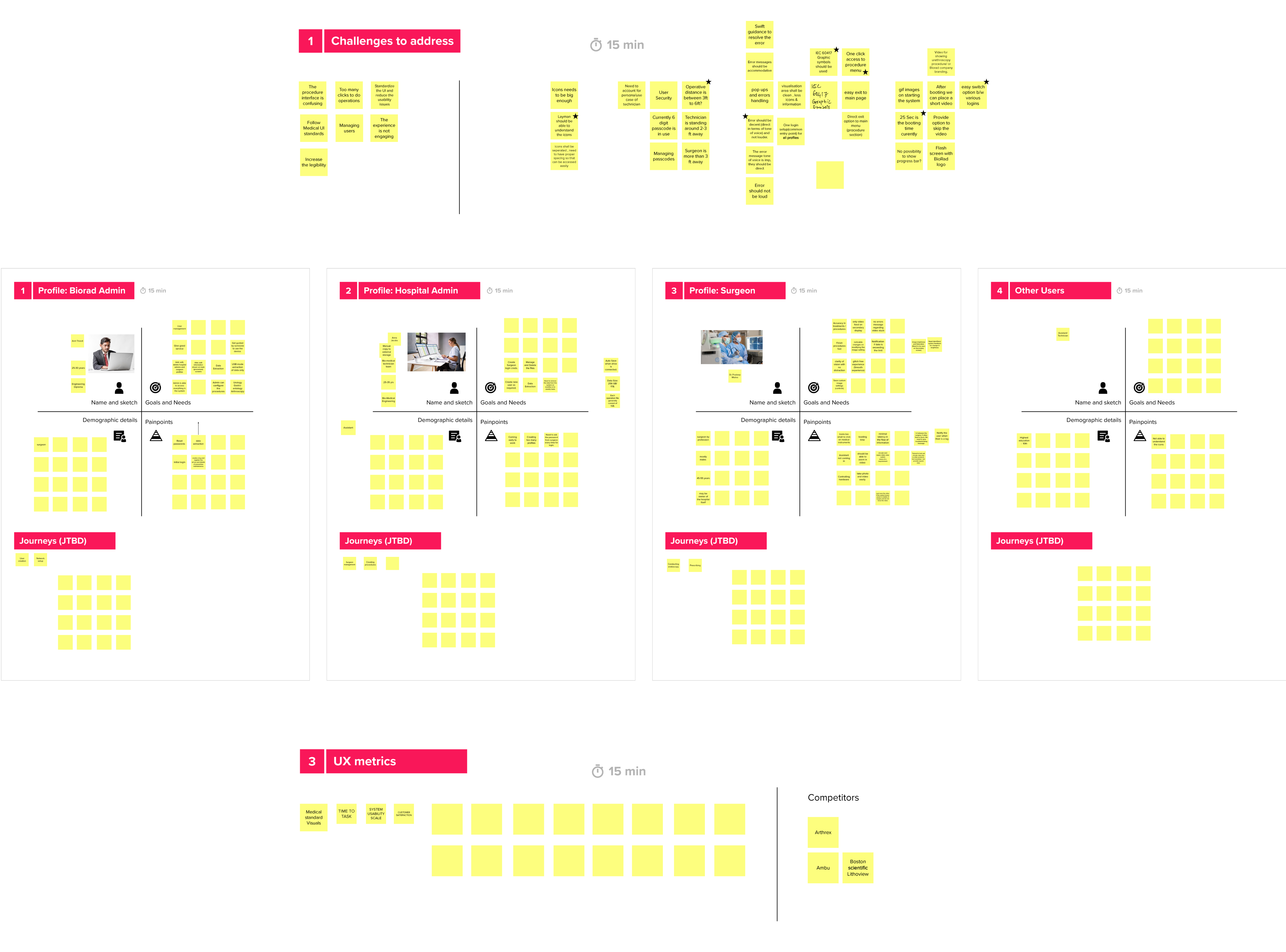
Workshop Insights
Business Vision
Design and craft the experience of using the Video Processing Unit (VPU) of an endoscopy machine during endoscopic procedures for a range of user types.
Task Approach
Implement design consolidation and standardisation across the product with the objective of making it easy for multiple user types to use current products and reduce cognitive load.
Key Challenges
- UI harmonisation
- Design to fit the operating system, procedure environment and user type
- Smooth navigation
- Error states and guidance
Success Metrics
- Reduction in time for task completion (cutting down on procedure time)
- General customer satisfaction for each user type (related to website builder issues).

Benchmarking
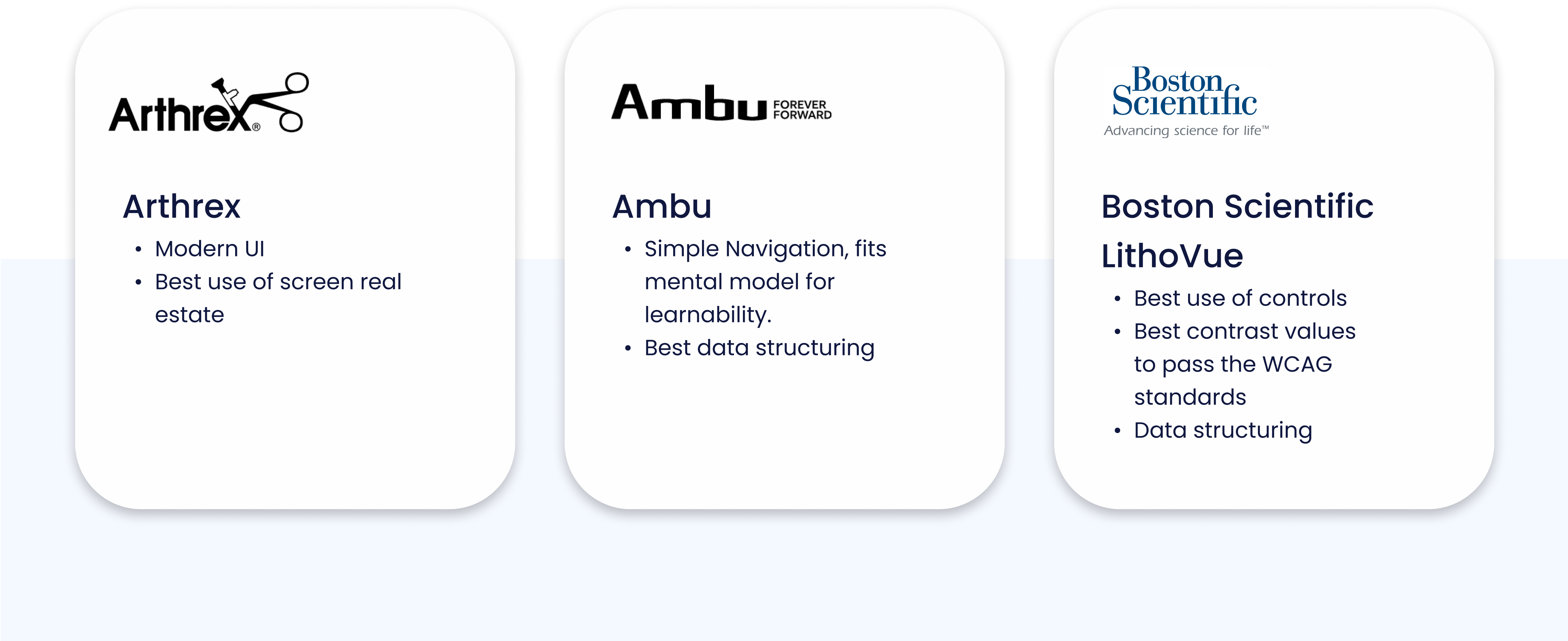
Competitor Study
We studied some of the leading market competitors of Mobicip and gathered their best attributes. As a result we were able to compare mobicip with these brands and calculated where we stood and how far we had to go.
Expert Audit
Existing System
We conducted a UI audit of the existing product to determine the scope of improvements and absolute must do’s in the first sprint. The audit was based on four criteria: Presentation, Navigation, Interaction, and Content.

Presentation Review
- Layout wasn’t well-balanced. Had visual complexity without a clear visual hierarchy.
- UI was untidy, and Inconsistent.
Navigation Review
- Levels of navigation were few; which was advantageous for quick access.
- Some Menus and controls were hidden within unrelated content buckets with no signifier to point out it’s access point.
- No guidance to show how to navigate to different sections.
Interaction Review
- Interaction patterns were inconsistent and created a huge learning curve.
- Some controls were missing proper feedback, signifiers and lacked proper affordance.
Content Review
- Many controls lacked labels for clarity.
- The tone of voice is inconsistent throughout the platform, which impacts the brand identity.
User Segments
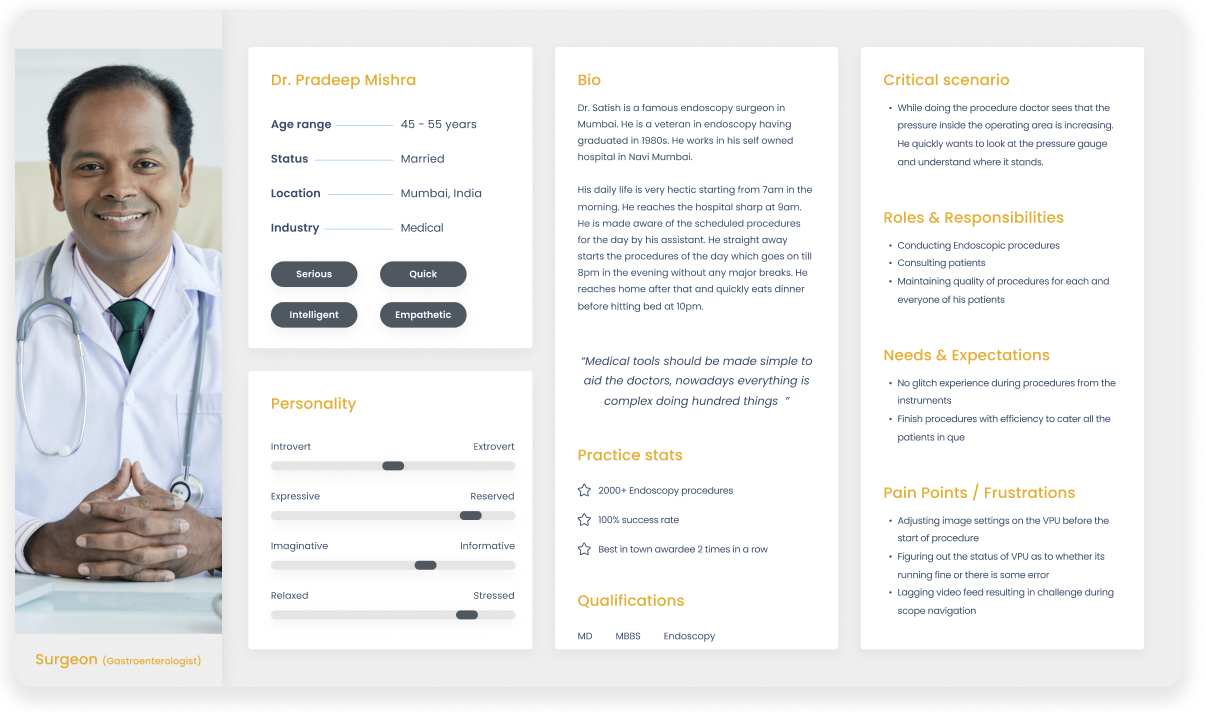
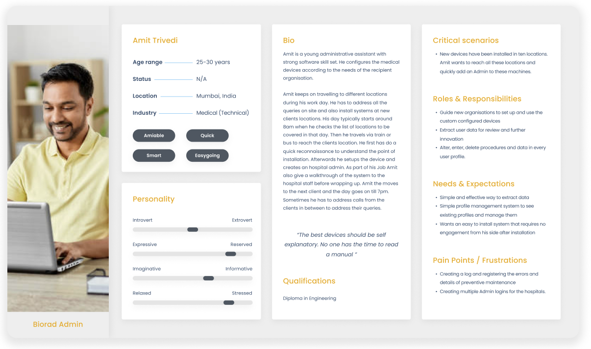
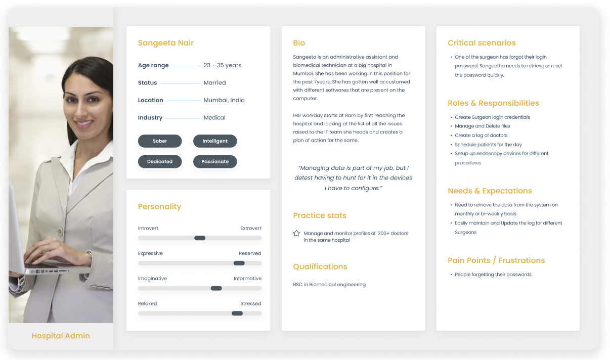
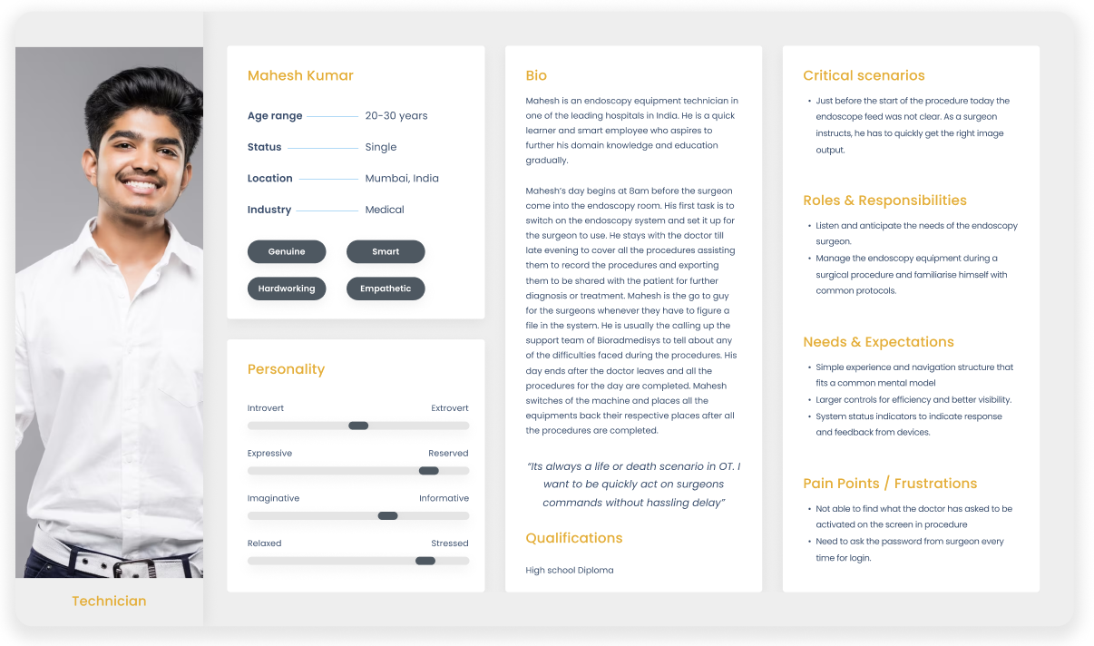
Creation of Proto-Persona Cards
All the inputs from the workshop were collected and organised into post-it notes to create the proto persona cards. This provided us with better direction and scope for our project.
Proto-Persona

User Scenarios
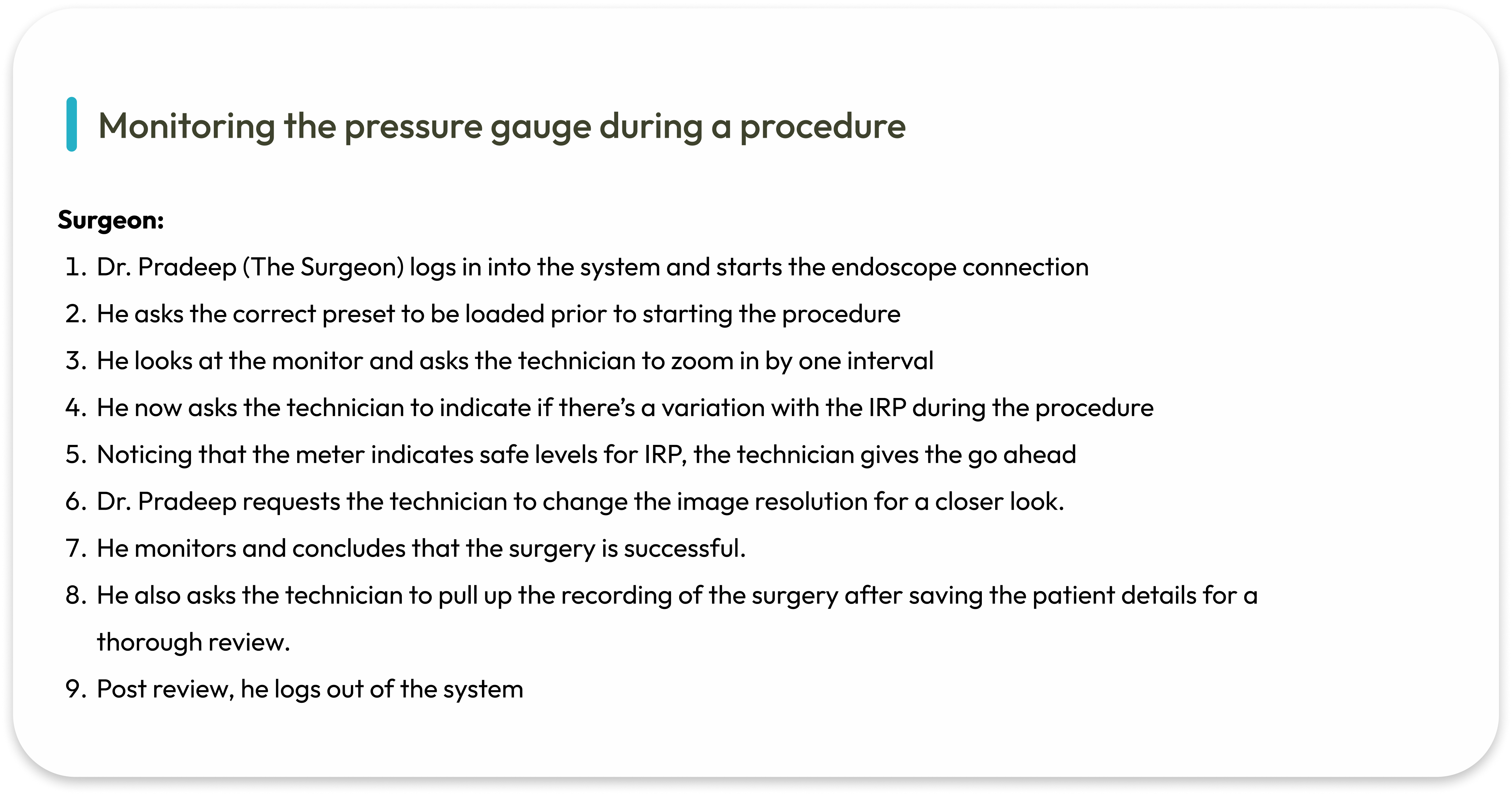
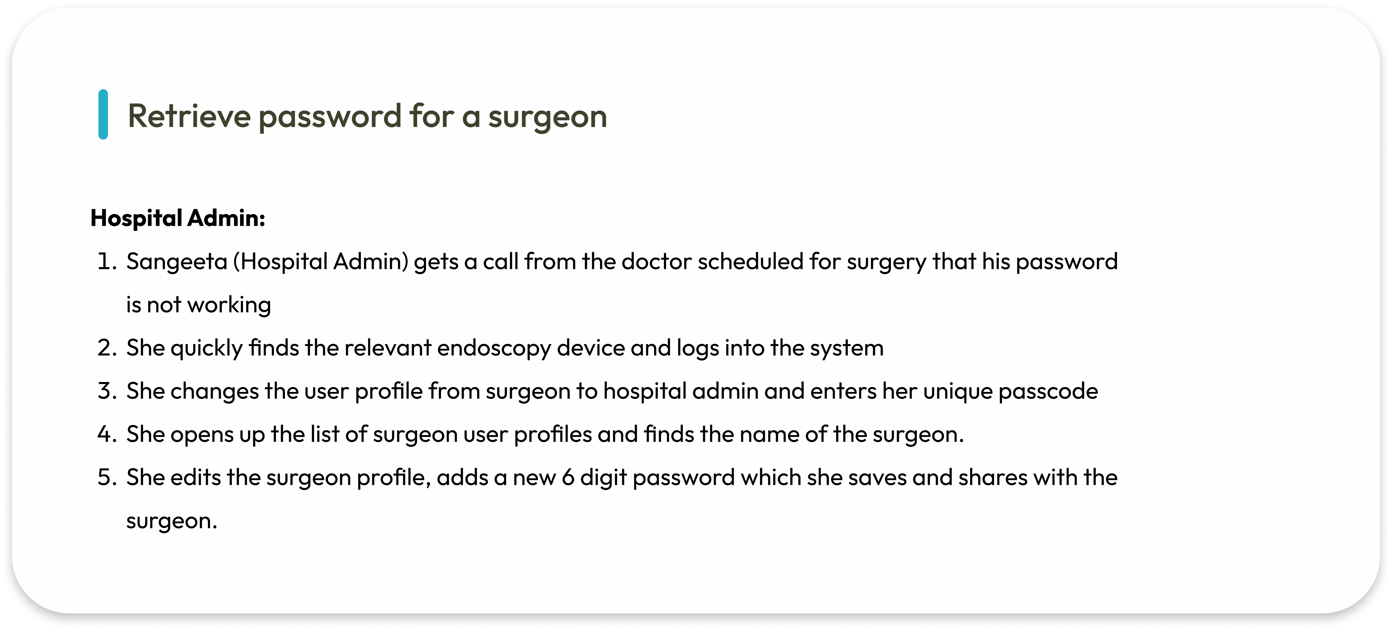
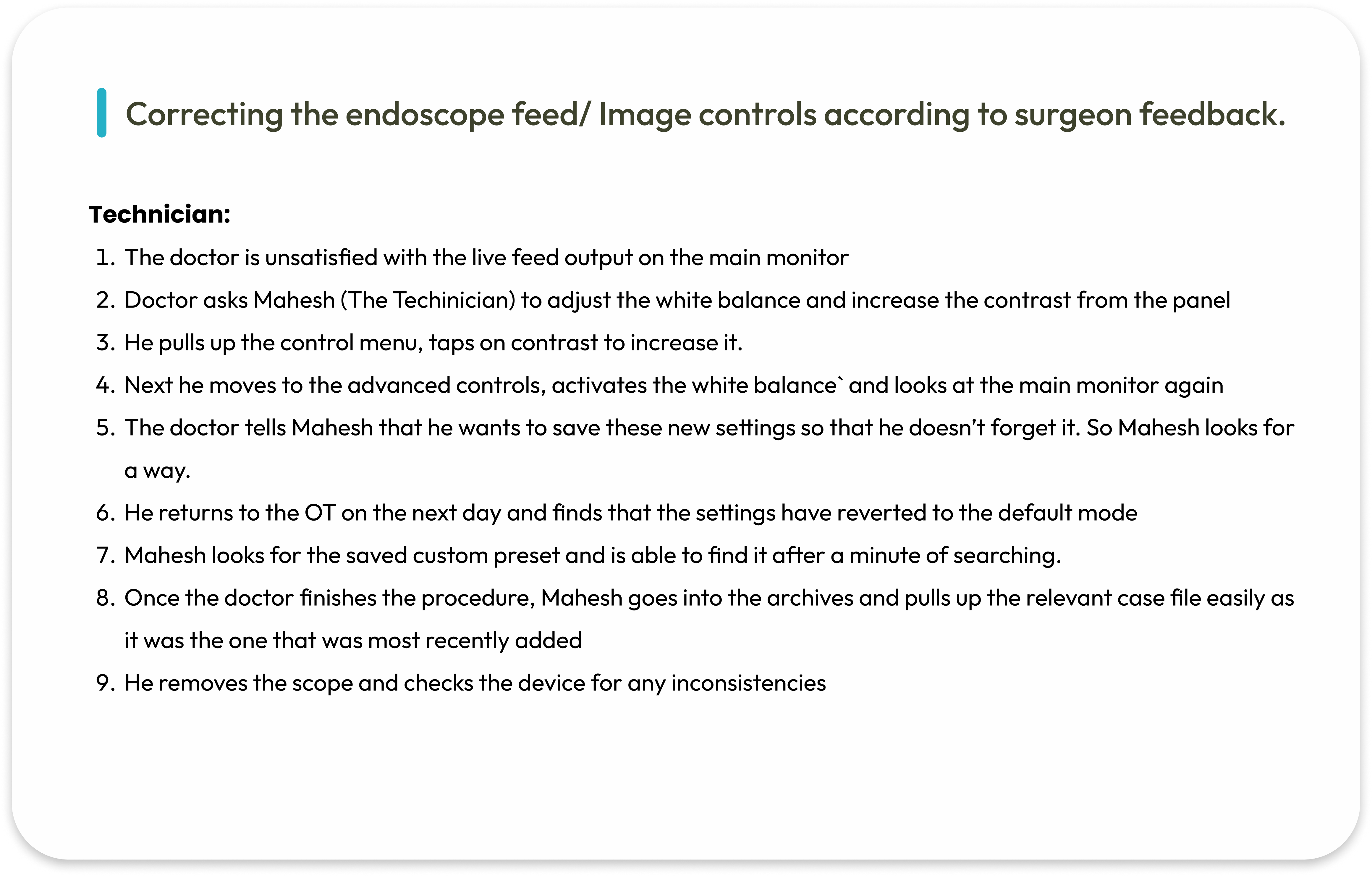
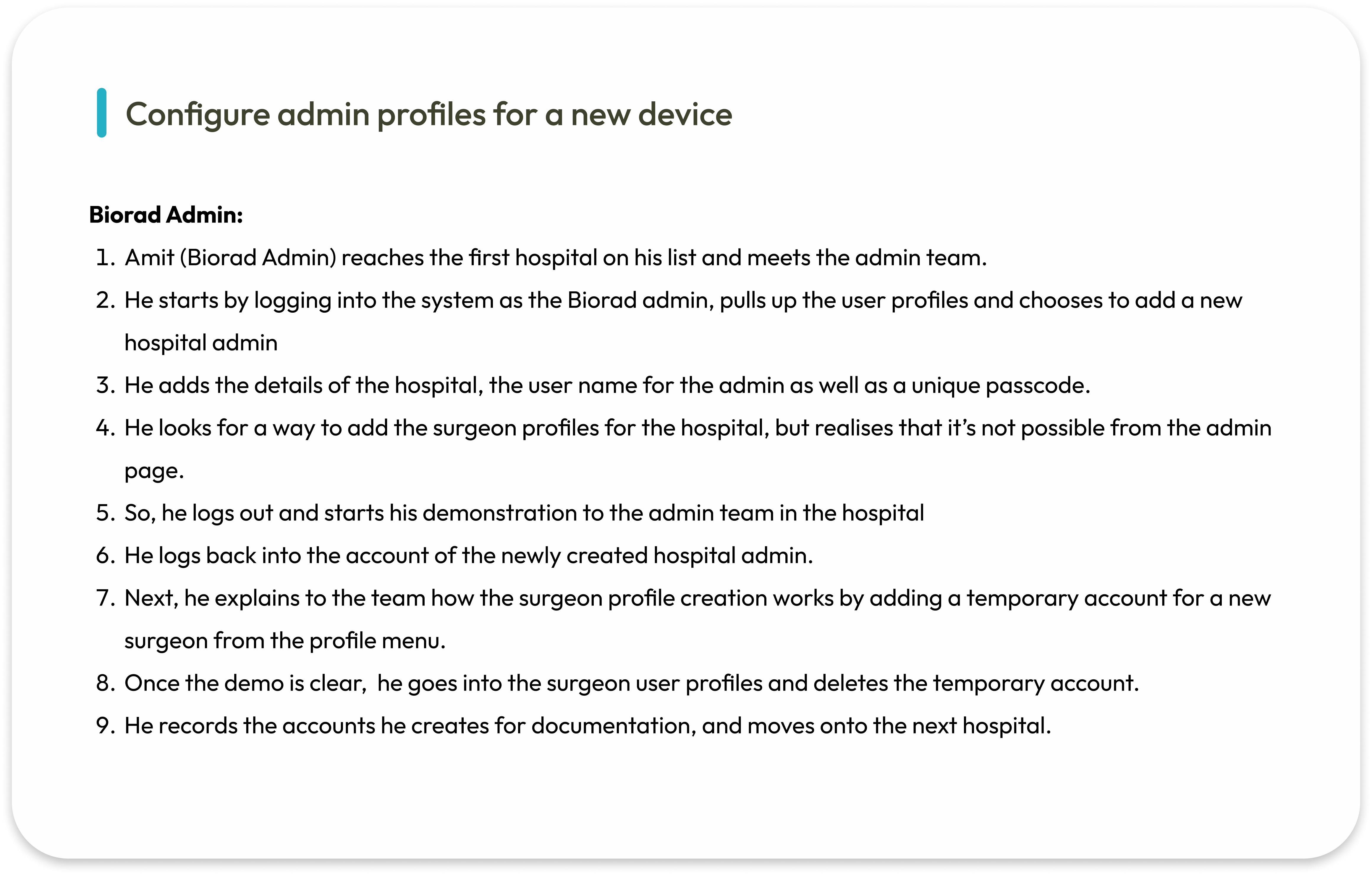
Information Architecture
To articulate the research and bring in answers to our queries,
We explored and created the Information Architecture for the device. Objective was to map out the information clearly and then design a flawless navigation framework for an effortless experience.


Wireframes
Wireframes were created to give stakeholders a base structure of the design and receive feedback on it before moving to the visual design phase.
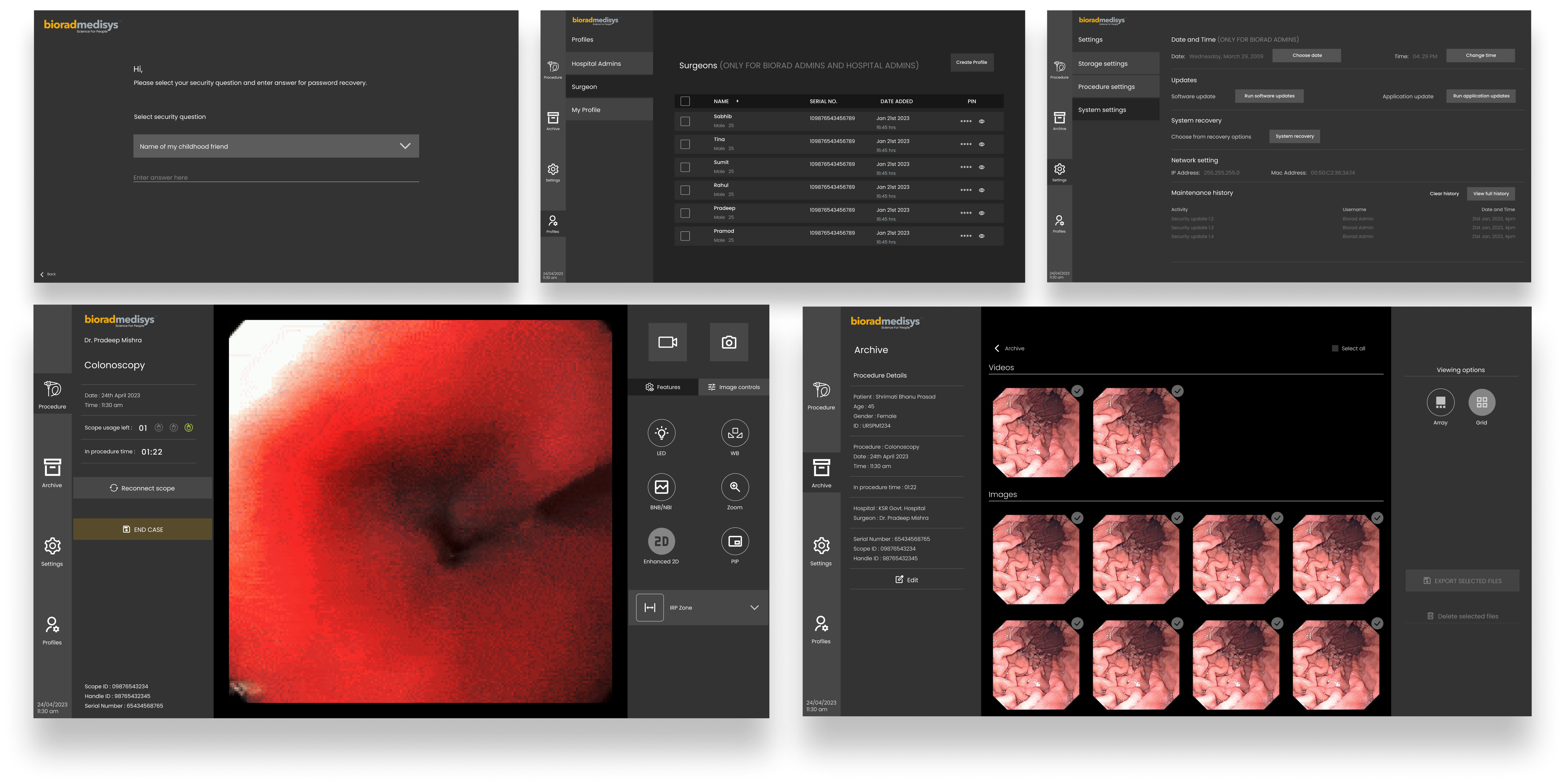
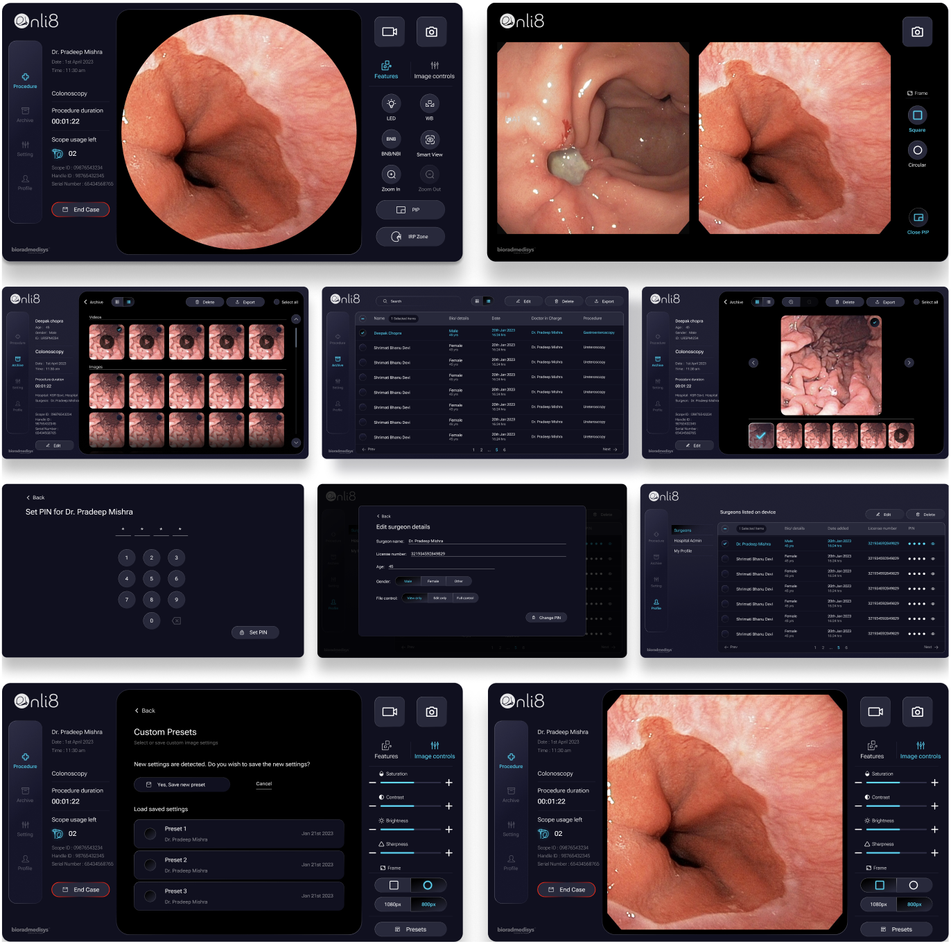
Visual Design
After receiving feedback from the stakeholder and the team, the final application and dashboard was developed and delivered.
Design System
A hands-on library that provides interaction design patterns to be used across the website. It not only promotes consistency but also makes it easier to improve and maintain elements as needed.
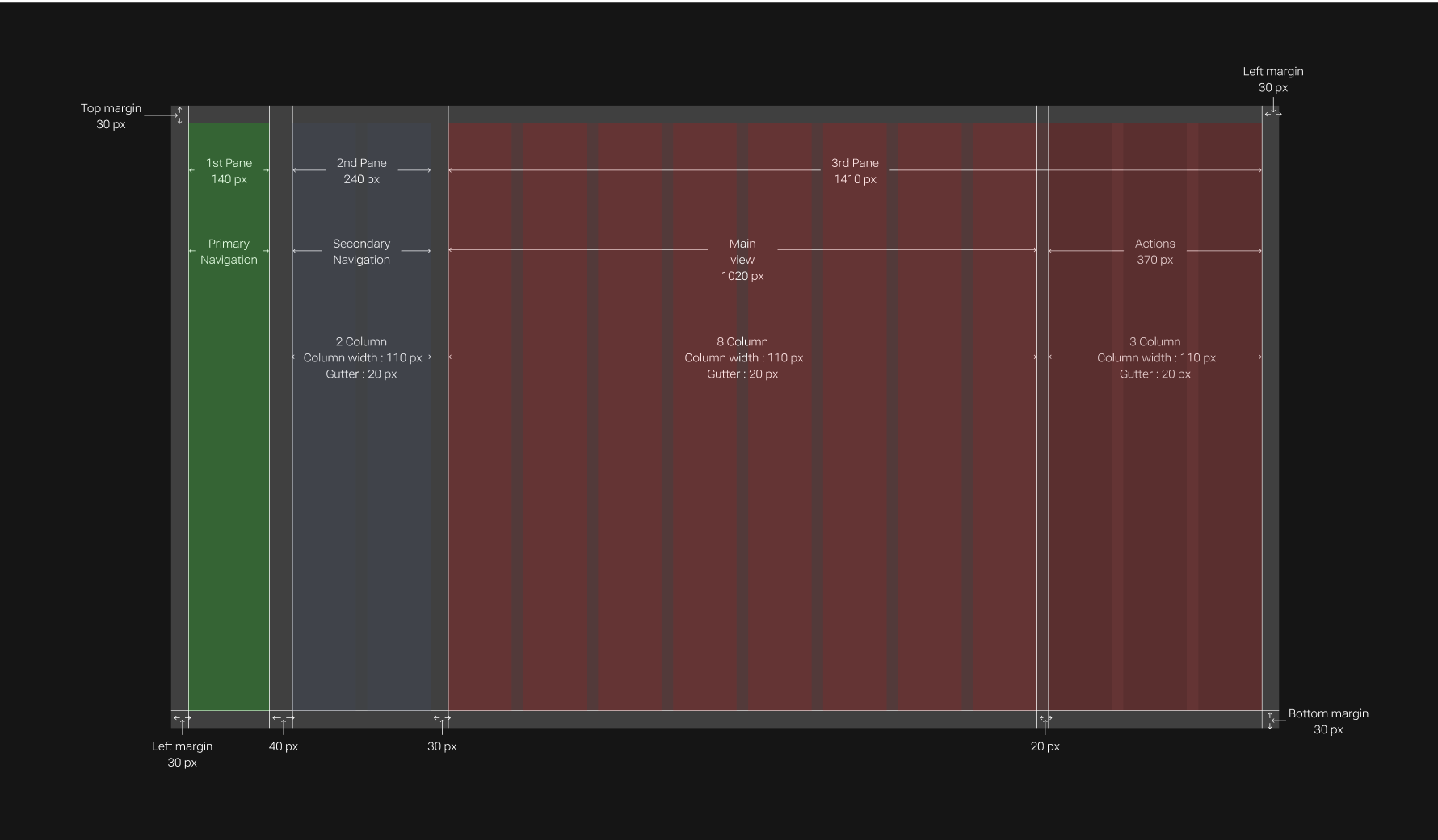
Grid and Screen Segmentation
Why 12 column grid is used for our design?
- The reason behind taking the number 12 is, it’s the most easily divisible among reasonably small numbers.
- It’s possible to have 12, 6, 4, 3, 2 or 1 evenly spaced columns. This gives tremendous flexibility over a layout.
Typography
- Roboto Flex was designed to be highly scalable, adaptable, customizable, and optimizable.
- It has a huge range of weights and widths across optical sizes, plus additional capabilities for fine-tuning.
- Being a comprehensive family font makes it a great choice for web design.

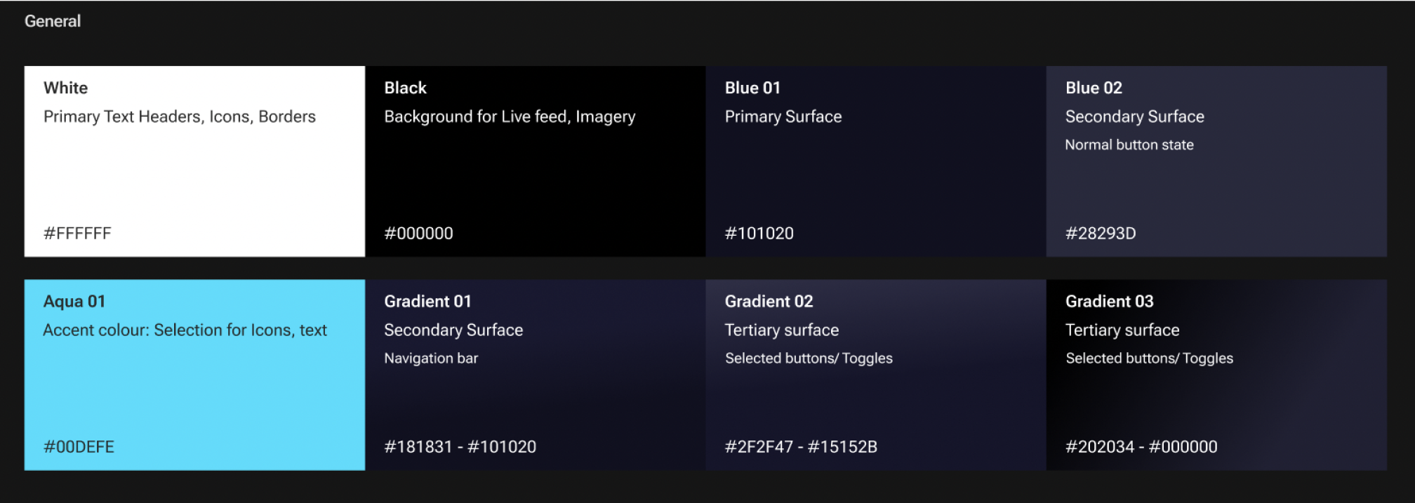
Colours
- The primary colour is the dark blue that has been used consistently for the background theming.
- The dark theme was specifically chosen to optimise the visuals in a dark surgical environment and to save battery life.
- The colours were chosen with the WCAG standards in mind.