Case Studies
Designing a mobile app for Bajaj
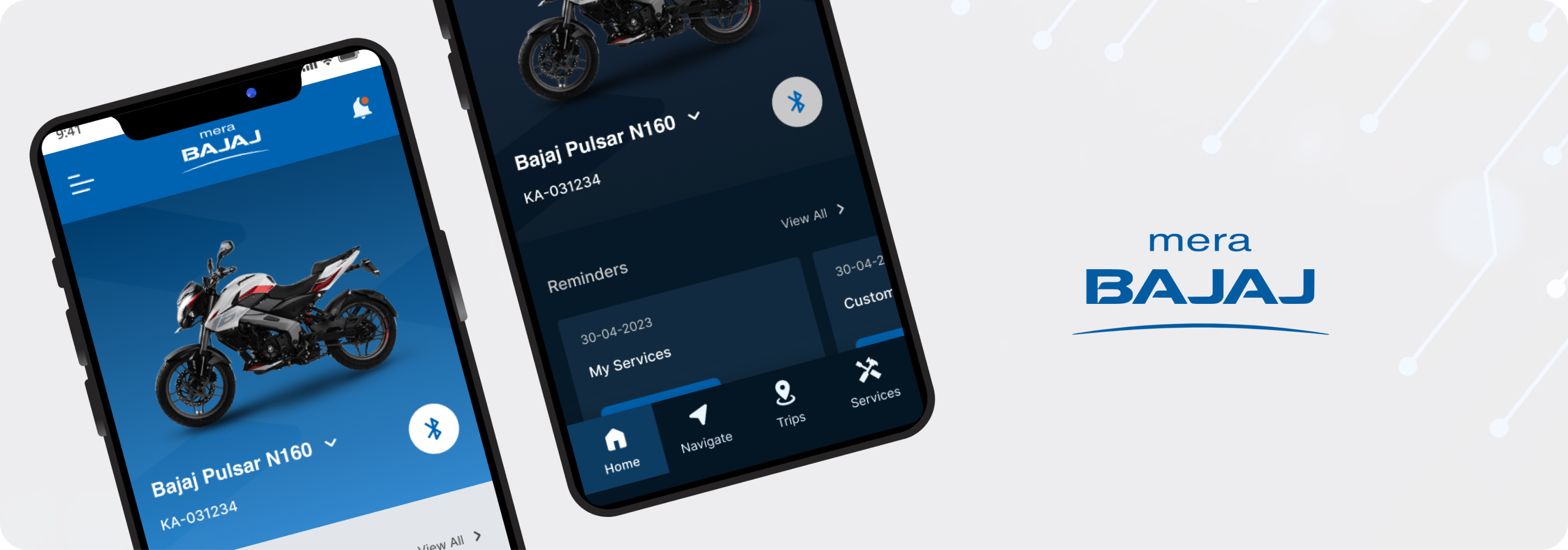
An application to enhance the after sales and riding experience of Bajaj motorcycle owners.
Challenge
Outdated mobile app design at the prototype stage.
Bajaj had created a prototype for the after sales and riding experience of it’s customers. The prototype lacked modern visual design and user experience.
High Level goal
Revamping the existing prototype to give a modern and enriched visual design with elegant and smooth interactions for an upmarket feel.
Project Approach
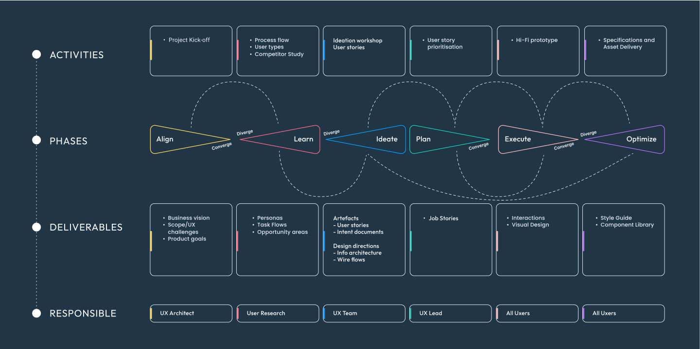
From definition to delivery

Existing Prototype
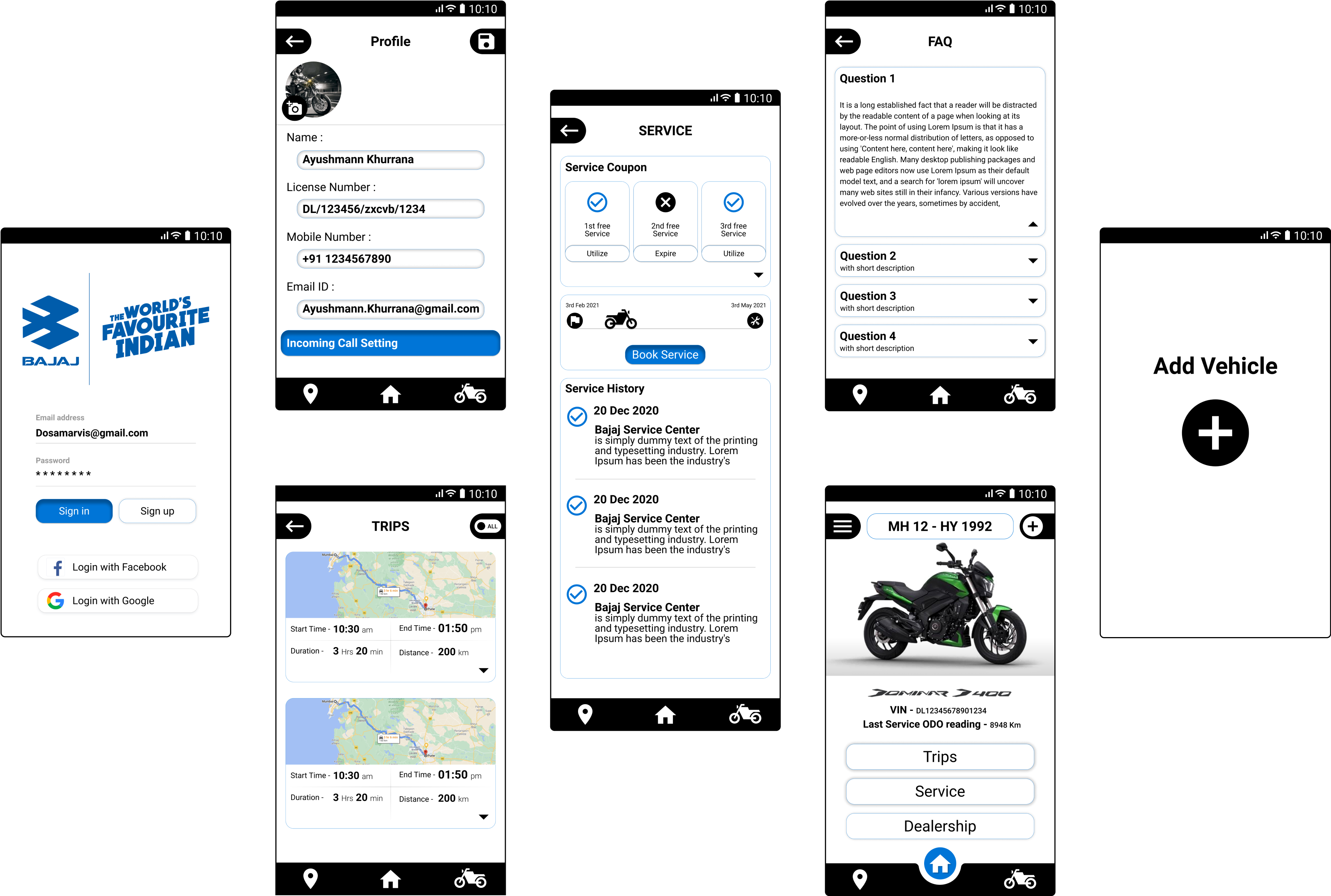
The existing prototype that was provided.
Benchmarking
Competitor Study
We conducted an in-depth study of the visual design and app flows of multiple competitors.

- UI design is appealing.
- Extensive loading time and lag on updating app and data.
- Offers a variety of features to utilise.

- Over complicated navigation system.
- Errors are not informative.
- Overload of data in few modules.
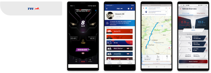
- Navigation feature is glitchy.
- Errors are not informatives.
- Connection to Bluetooth either fails or takes too much time.

- Feature rich, like riding log but data is not being recorded.
- Connection to bluetooth fails most of the times and even if it connects, the connection is unstable.
- Captures wrong location details.
User Segments
Creation of Proto-Persona Cards
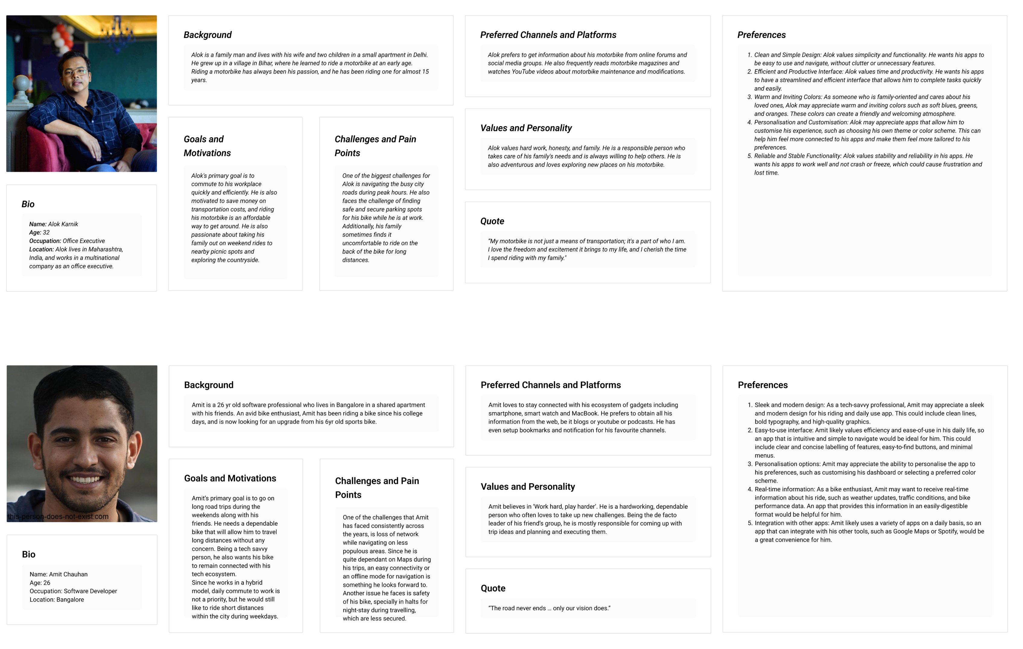
The personas encompassed the goals, pain points, fears, and aspirations of different user types. This enabled us to empathize with the users and generate effective ideas.
Proto- Persona

User Scenarios
User Stories
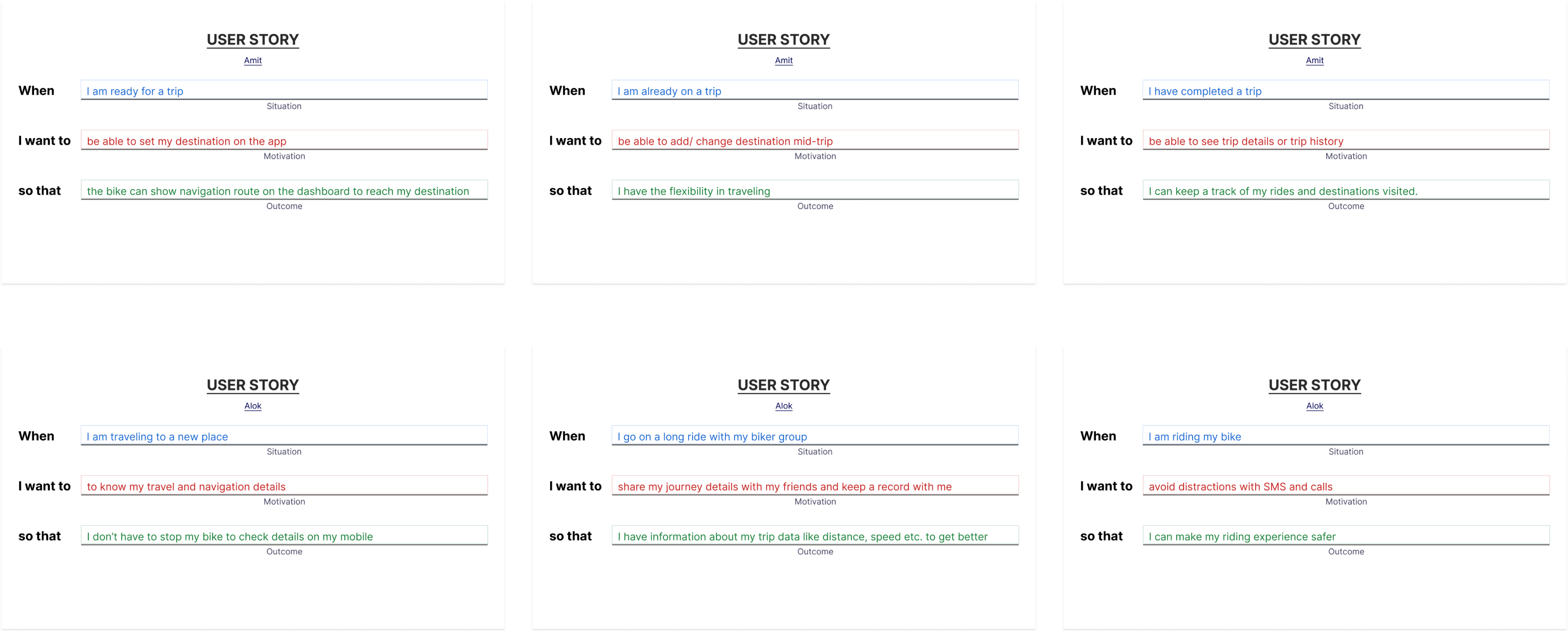
Personas capture user attributes, while user stories bridge the gap by defining user intent without neglecting user attributes. This approach leads to refined feature requirements in user stories.
Trips and Riding

Information Architecture
To articulate the research and bring in answers to our queries,
The information architecture was carefully planned and designed to ensure seamless organisation and navigation of information within the system.

Lo-Fi Wireframes
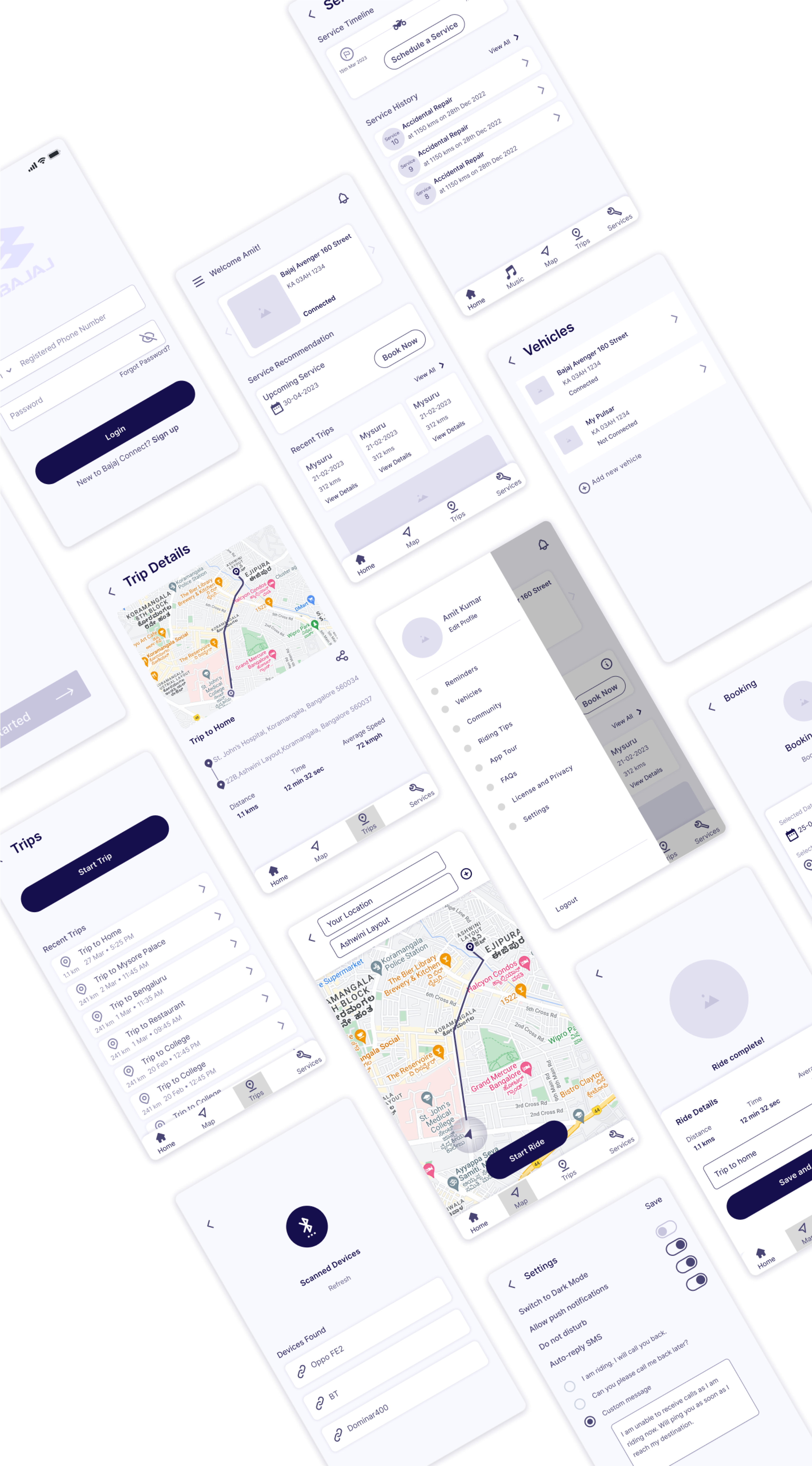
Low-fidelity wireframes were created to provide a basic visual representation of the app’s layout and functionality, focusing on structure and content placement rather than detailed design elements.
Visual Direction
The visual direction was established to define the overall aesthetic and design style of the app, including color schemes, typography, imagery, and other visual elements, in order to create a cohesive and engaging user experience.
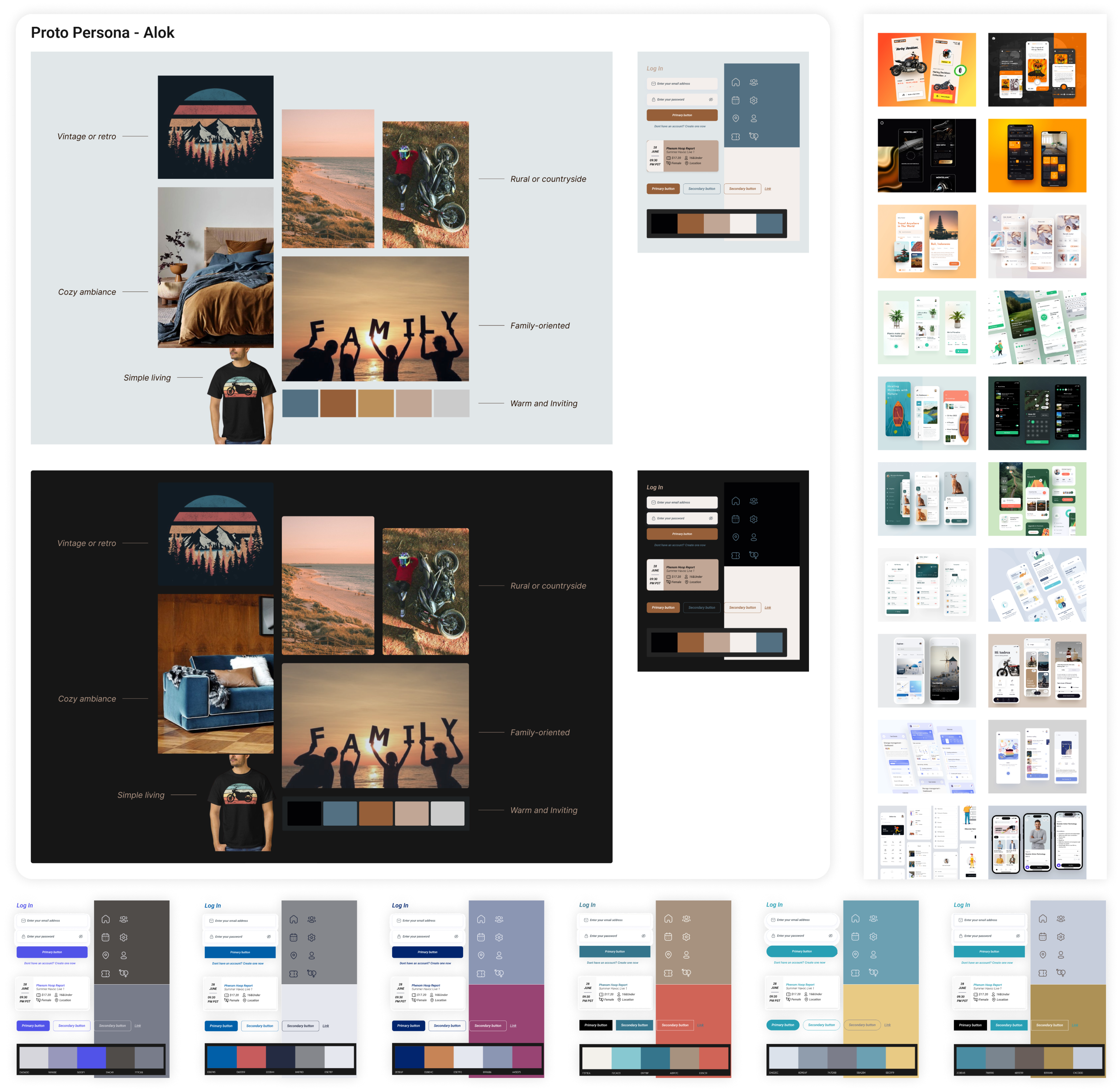
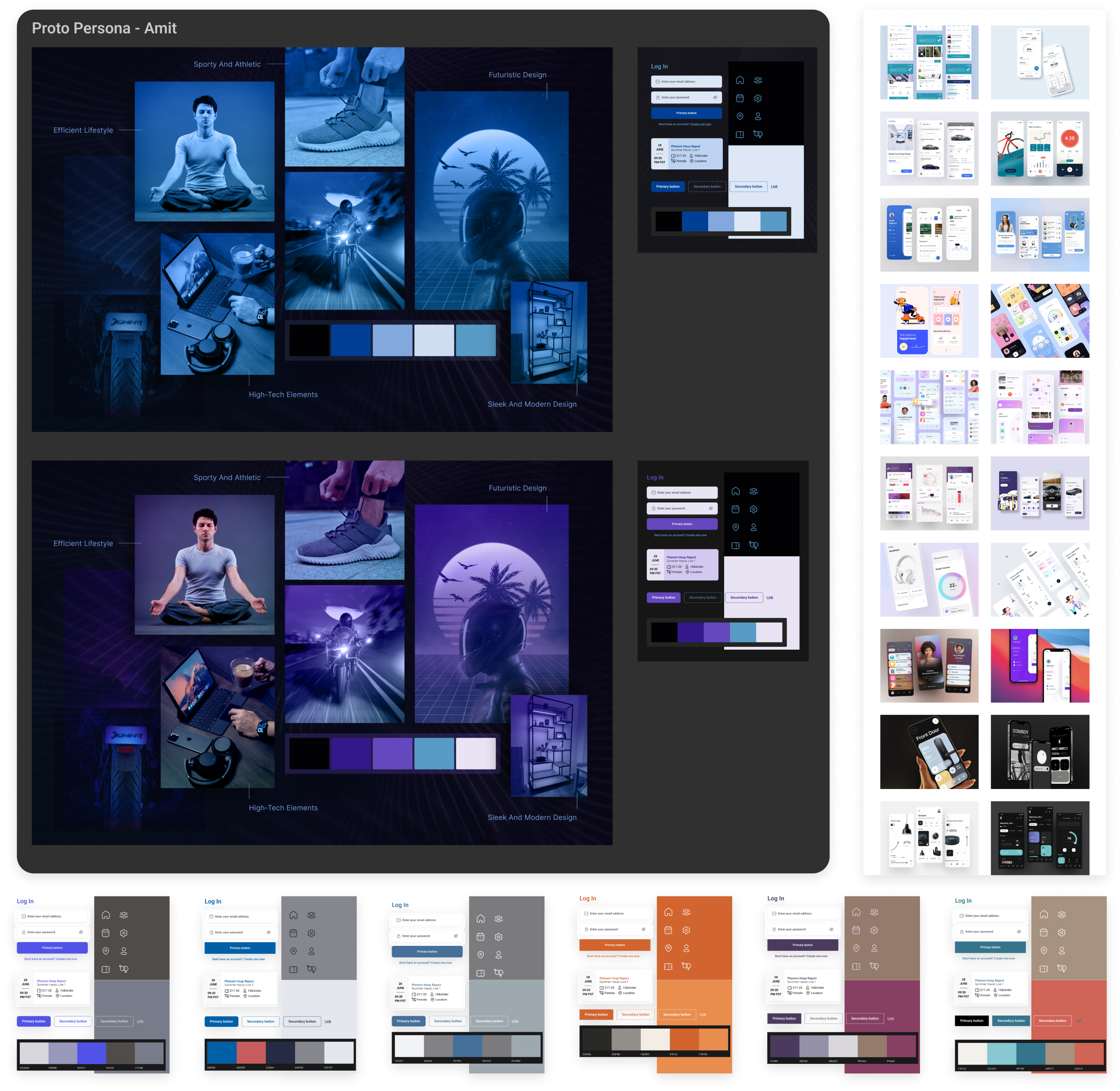
Design Explorations
A creative exploration and iterative process enable us to explore a wide range of design options, experiment with various layouts, typography, colour schemes, and visual elements. This approach allows us to discover the most effective and visually appealing design solutions by continually refining and iterating on our ideas.
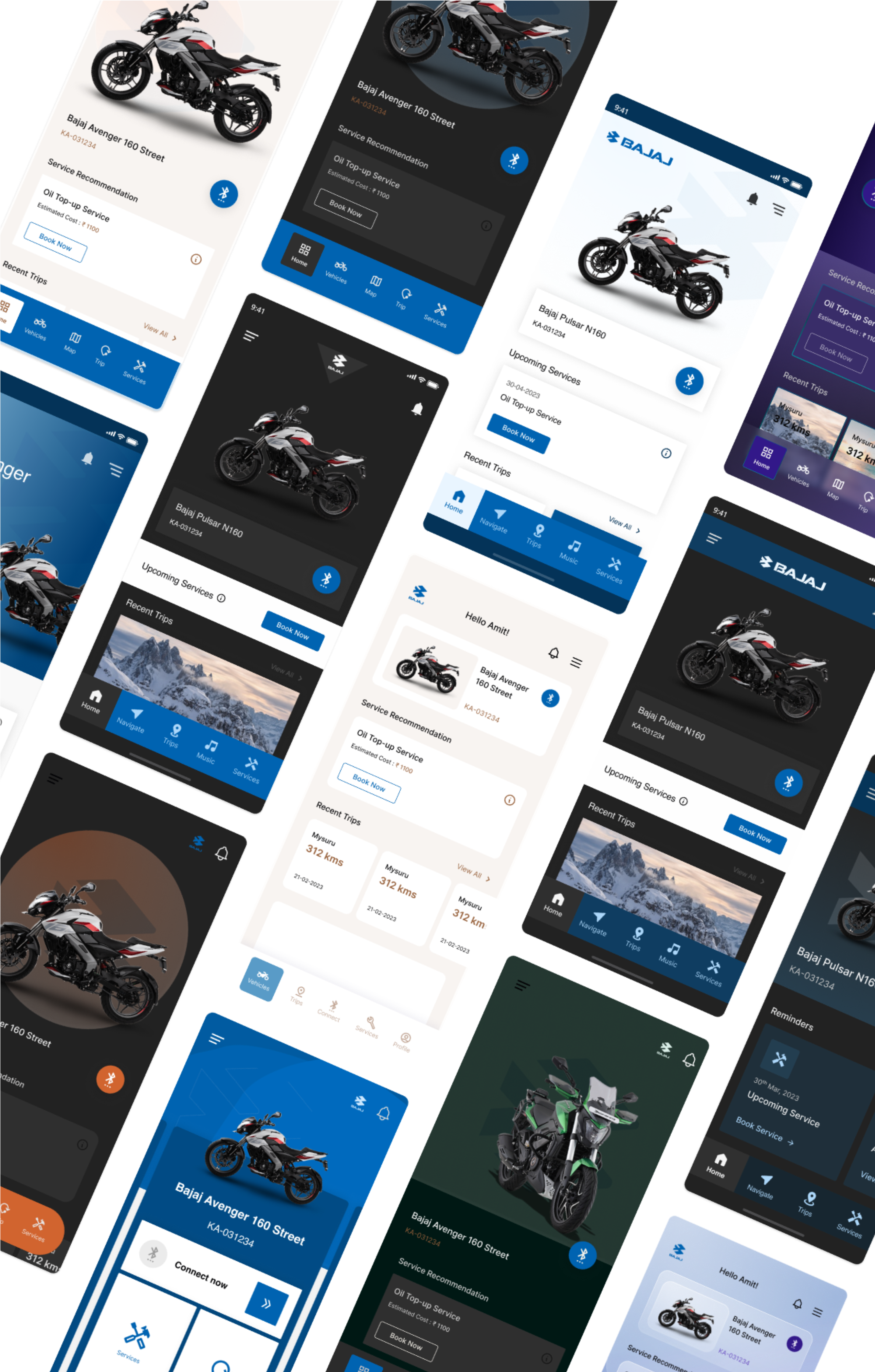

Hi-Fi Mockups
High-fidelity mockups were created to present a detailed and visually polished representation of the app’s interface. Mockups were created for both light and dark mode.


Style Guide
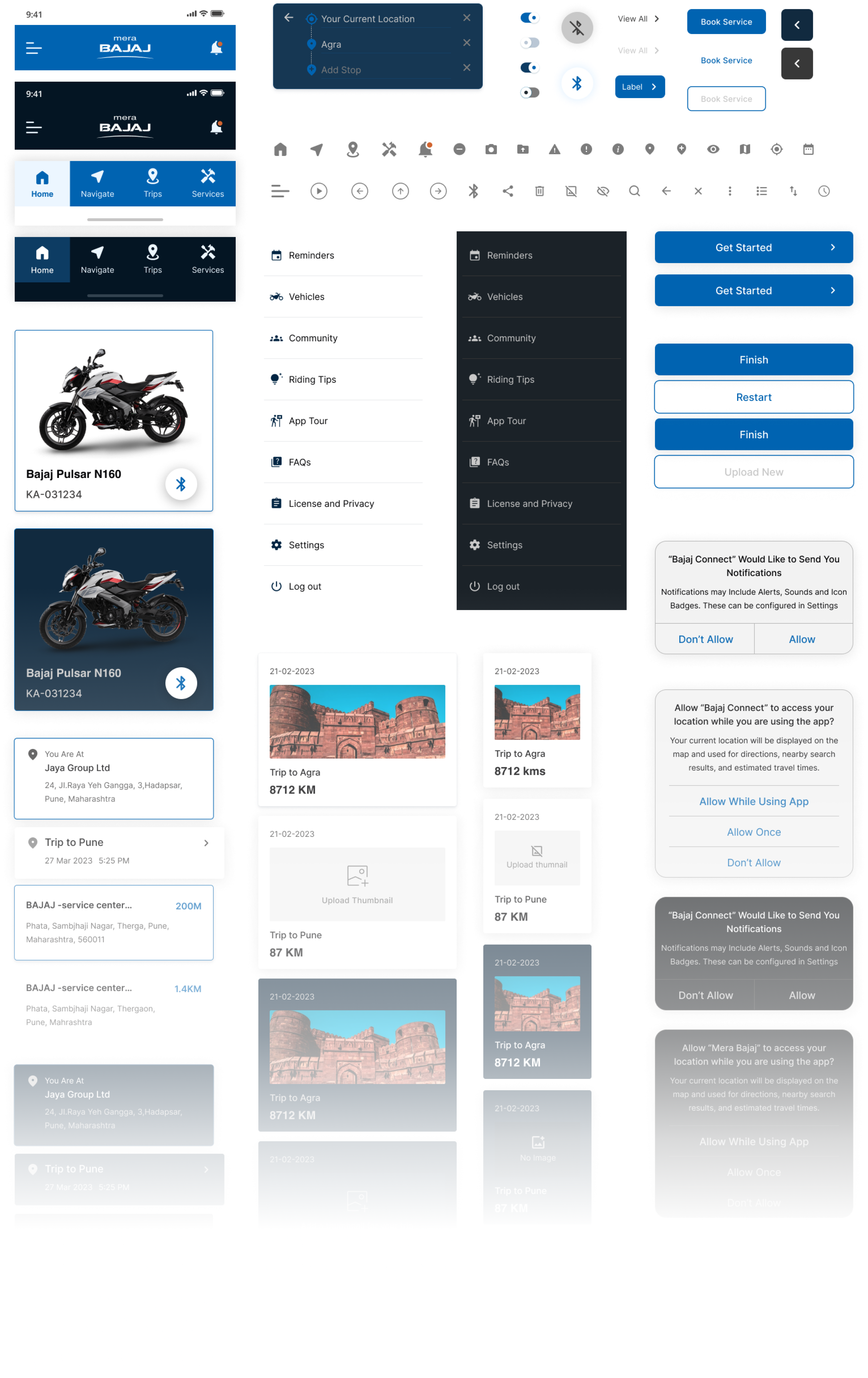
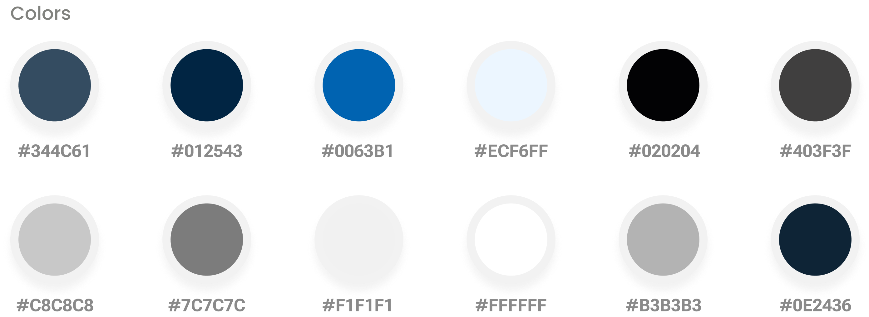
A comprehensive style guide was developed for maintaining visual consistency throughout the app, including standards for typography, color palette, iconography, spacing, and other design elements.

Component Library
A component library was developed to establish a repository of reusable UI components, including buttons, forms, cards, navigation elements, and other interface elements.
