Case Studies
Designing an ENote Application
An application that converts hand written notes to digital text, takes notes directly on pdf, takes hand written notes for reading and reviewing of documents and provides paper like reading and writing experience.
Challenge
Creating the visual design and prototype for a Digital Notebook Application.
Designing the visuals and experience of the application to replicate the look and feel of paper as closely as possible. This application will be utilised for reading documents and textbooks, as well as for sketching and note-taking. Our aim is to provide users with a seamless and immersive paper-like writing experience.
High Level goal
To craft an engaging experience for the digital eNote taker that closely resembles the real note-taking experience with pen and paper.
Project Approach
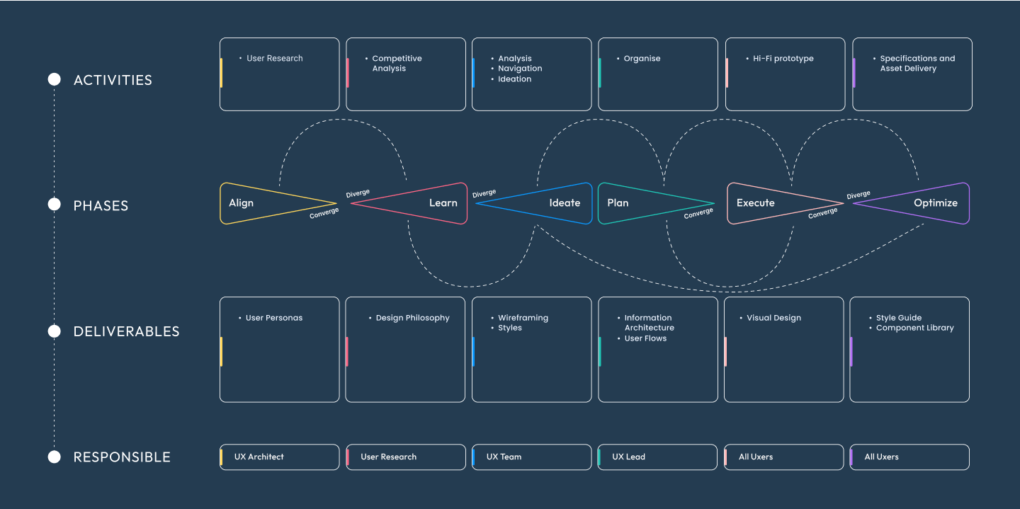
From definition to delivery

Align
Problems
- Fragmented information
- Carry too many books
- Archaic system and interfaces
- No accuracy
- Limited battery
Solutions
- Personalized experience
- Quick, easy simple durable
- Accurate data logging
- Reduces trail of papers
- Translate handwritten to text

Benchmarking
Competitior Study
There are 2 direct competitors i.e. Remarkable 2 device and Boox Nova 3 device. We did deep analysis for both the competitors devices.

Design Philosophy
Make the eNote taking experience real, and extremely responsive with intuitive controls using known visual metaphors for easy recognition and recall.
Think: ideate, mental models, sketches, storyboards
Make: wireframes, UI design, mockups prototypes
Check: stakeholder and user feedback
User Segments
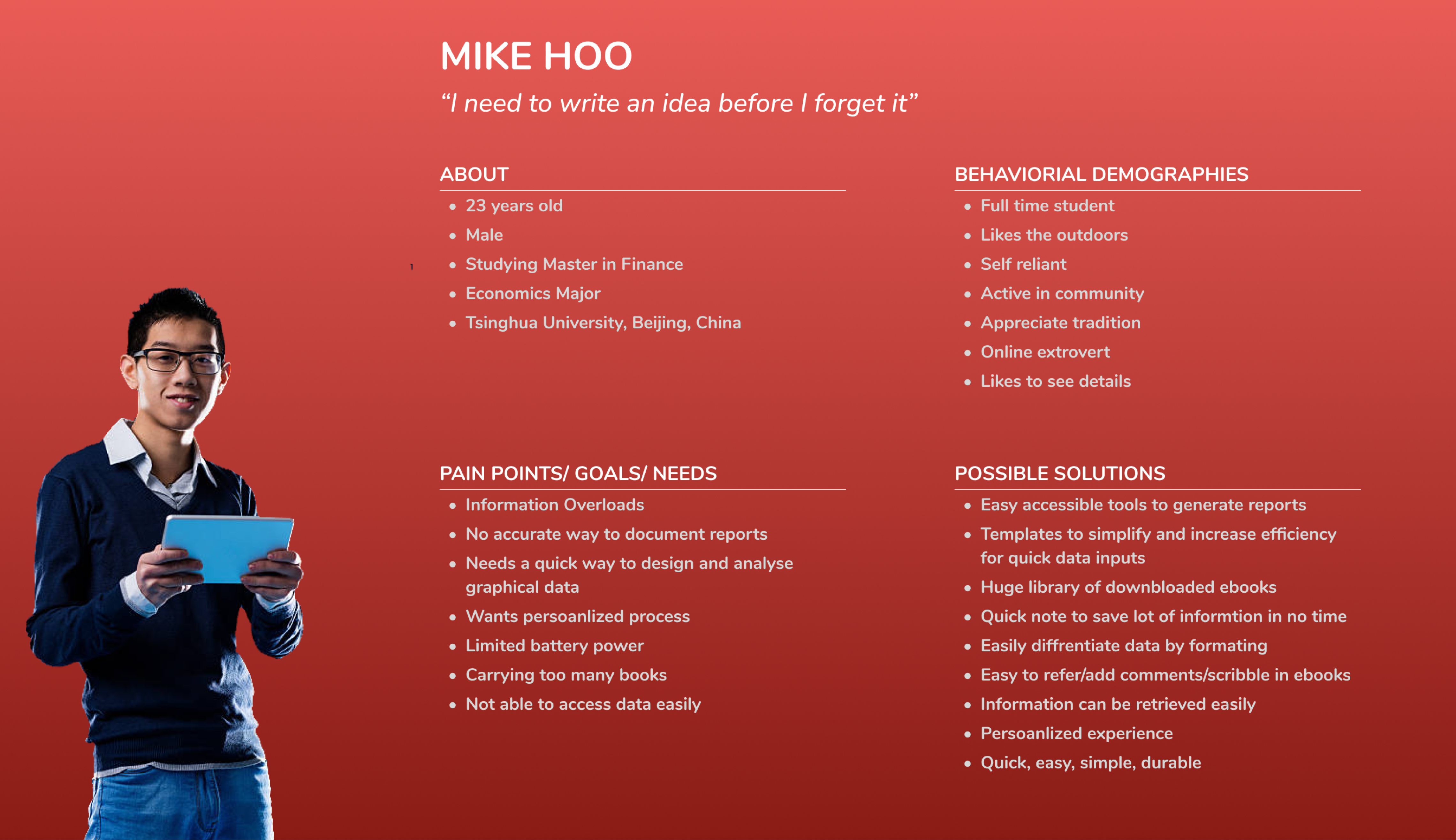
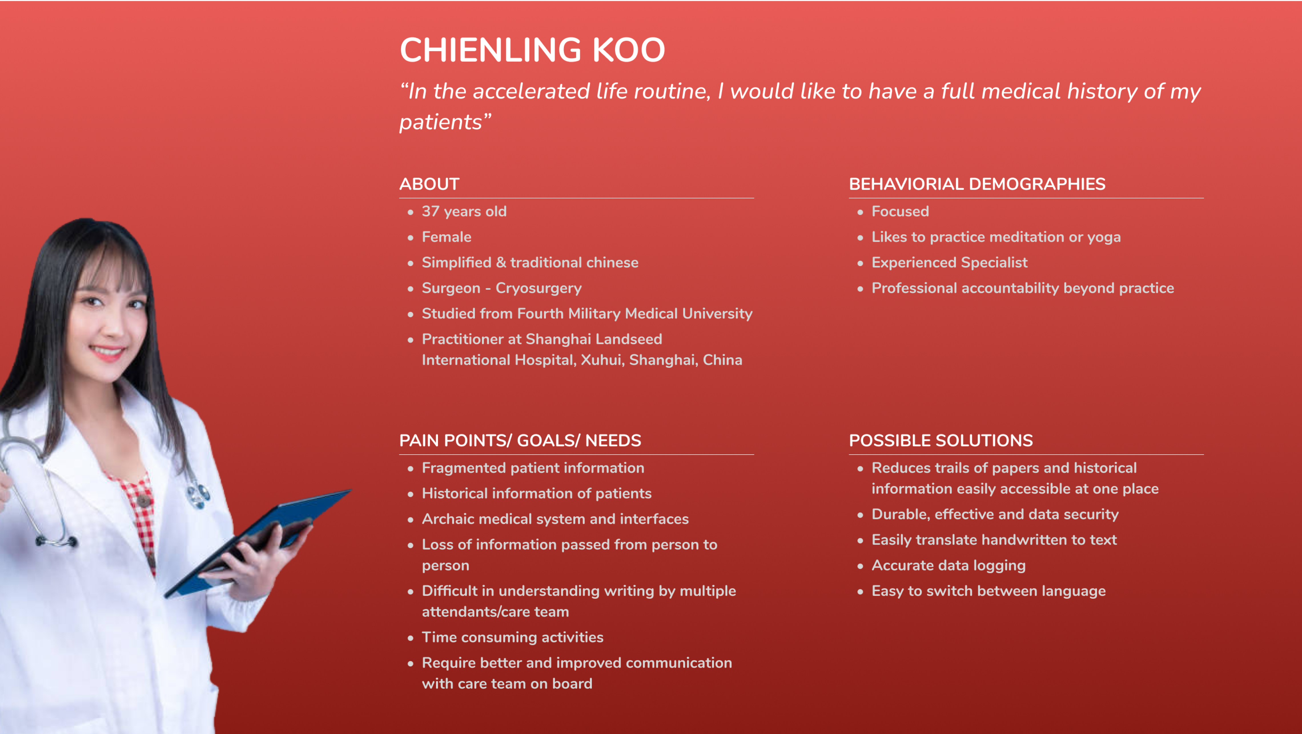
Creation of Proto-Persona Cards
All the inputs from the workshop were collected and organised into post-it notes to create the proto persona cards. This provided us with better direction and scope for our project.
Proto- Persona
Student Perosna
Doctor Perosna

User Scenarios
User Flows
By depicting the whole process, we can identify how the user is navigating and see if they meet their needs.
Also, by creating the user flows, we know the steps a user takes to complete that task. It helps us make a clear way for the user to achieve its goal


Information Architecture
Creating a foundation for efficient user experience
Optimize and organize the structure, helping users navigate to find and process the information they need.


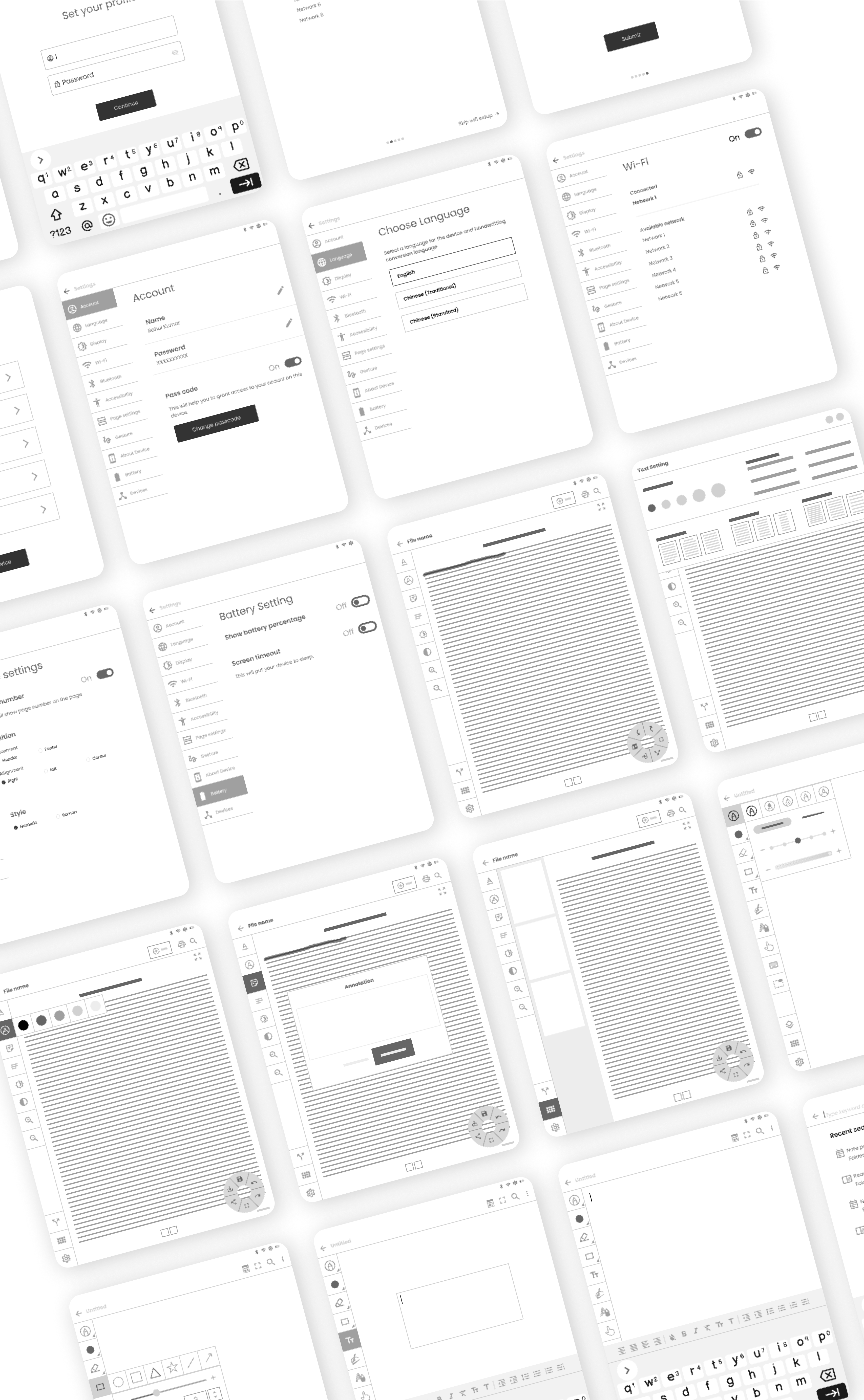
Lo-Fi Wireframes
Low-fidelity wireframes were created to provide a basic visual representation of the app’s layout and functionality, focusing on structure and content placement rather than detailed design elements..
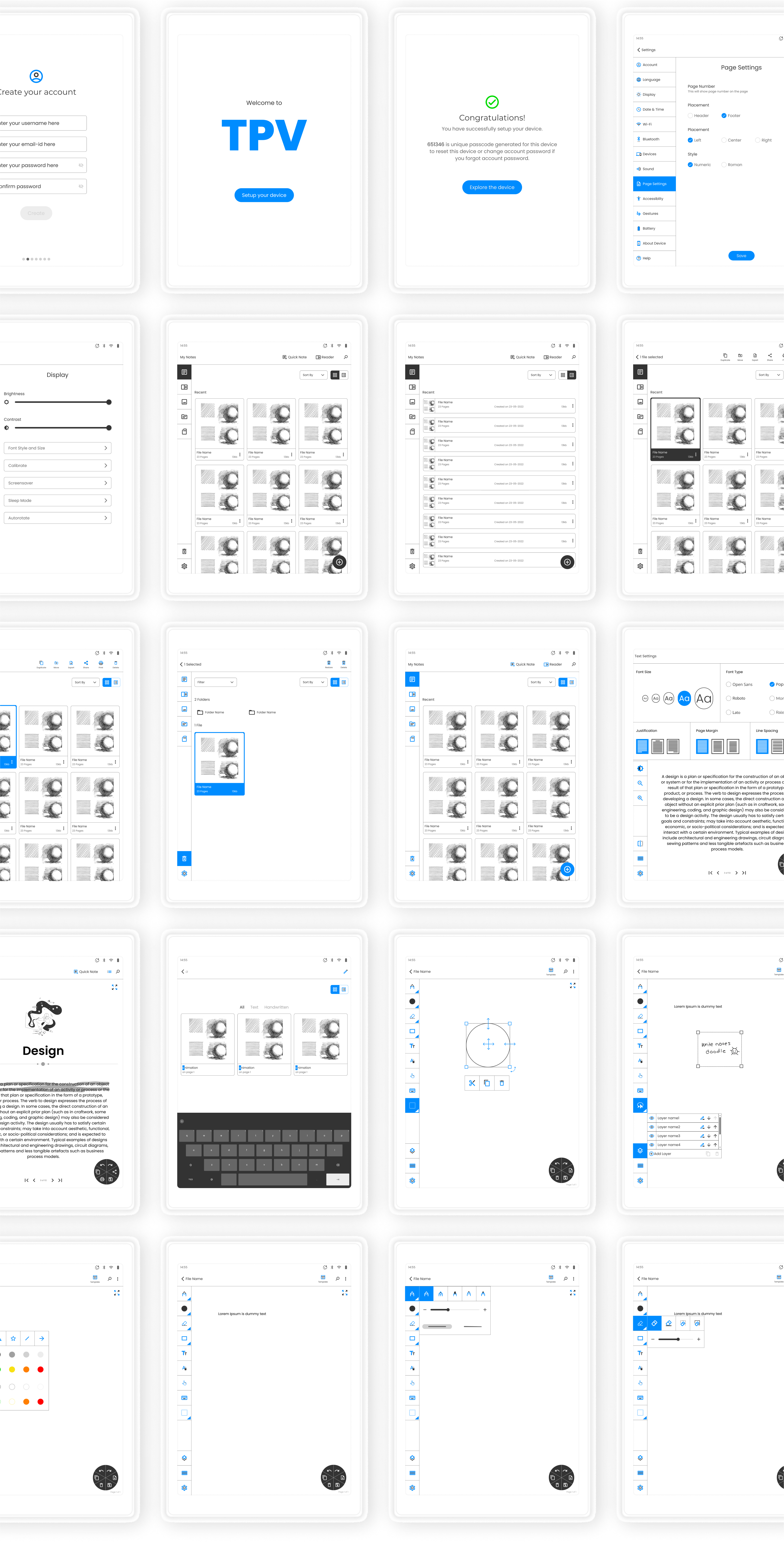
Hi-Fi Mockups
High-fidelity mockups were created to present a detailed and visually polished representation of the app’s interface.

Design System
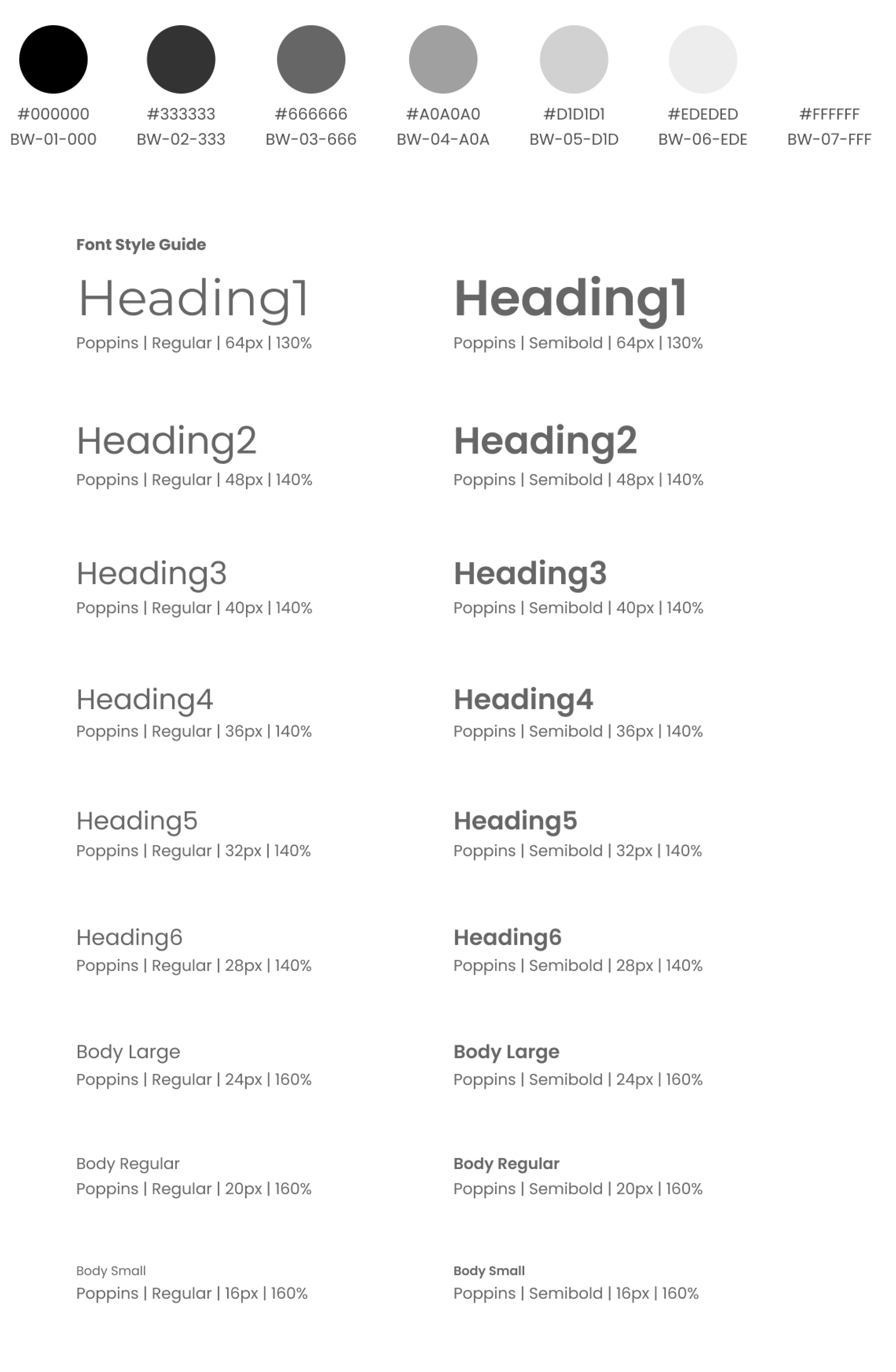
A hands-on library that provides interaction design patterns to be used across the website. It not only promotes consistency but also makes it easier to improve and maintain elements as needed.
