UX Index
Are you better than the best? Measure and benchmark your UX with Northstar.

‘Is Our UX Good?
PeepalDesign’s Northstar UX benchmarking framework takes the guesswork out and give you an objective assessment of where you stand with respect to the best!
Users Tested
Apps/Mobile Web tested
Growing
Rapidly...
A key premise of an iterative UCD process is the constant need to change for the better.
Unless we measure, we will not know how far we have to go!

UX benchmarking is a quantitative measurement approach that aims to clarify by how much a combination of factors contribute to the overall experience of the product.
Why Project Northstar?
When benchmarking, it is important to adjust the examined solutions to fit your own objectives, requirements, and resources.
Northstar – our UX Measurement & Benchmarking framework is geared towards providing the most comprehensive and detailed assessment of the product’s experience. It is always focussed on driving a positive improvement in the UX of the product.
Thorough
Pragmatic
Change-oriented

Our Methodology
A benchmark quantifies how usable the experience is using a combination of task-based and
study-based metrics that describe both what users do and what they think about the experience.
Here are some of our metrics:
1. Measuring Attitudes
UX Benchmarking involves measuring attitudes and behaviors. Measuring attitudes tell us how users feel about their Experience.
Key metrics :
- Usability
- Learnability
- Usefulness
- Personalization
- Desirability
- Immersion
2. Measuring Behaviours
Using behavioral metrics helps us to identify how users behave on the app/website and optimise the experience accordingly.
Key metrics :
- Task Success Rate
- Task Completion Time
- Error Rates

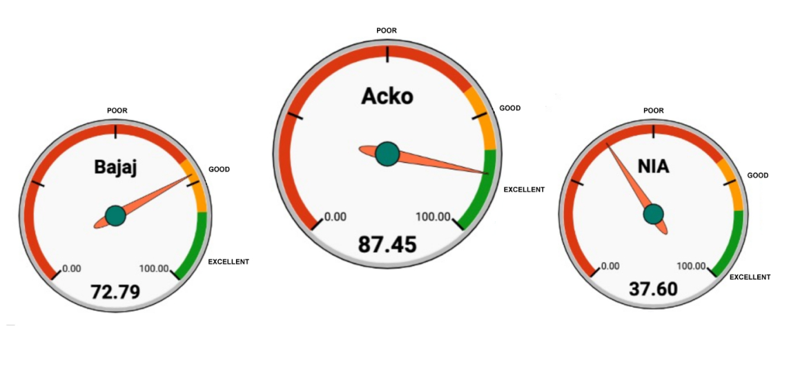
Northstar UX Index

Industries we’ve covered so far
Valued clients. Enduring partnerships.


UX Benchmarking in Action: Case Studies
Deep dive into our case studies to learn how we save lives, drive efficiency, and help users get the best out of technology everyday and every minute.

UX Benchmarking in Action: Case Studies
Bombarded with customer feedback on too much whitespace and unstructured layouts, we were approached to redesign the interface and interactions of a legacy CRM product. Within legacy dev constraints, Peepaldesign team revamped the UI and interactions. The new experience was launched within 9 months of engagement.