Case Studies
Human Resource and Payroll Management Suite.
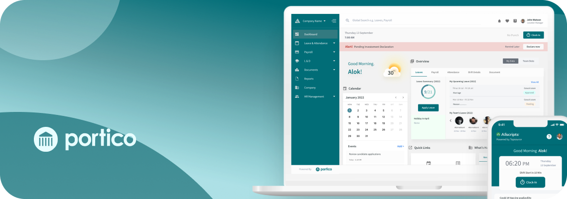
Portico is a secure, web-based, fully-hosted application suite customizable to meet client requirements. The suite includes document archive, HR and payroll, expense management, recruitment, eLearning, and payments processing. It has tiered user levels for employee access to their own data, manager’s access to venue data and senior manager access to all company details.
Challenge
To enhancing efficiency and user experience: Overcome time constraints, prioritise key information, embrace mobile-first approach, and personalise cohort dashboards
The app has been developed organically by developers, solely focusing on meeting the specific requirements of their clients. However, they have been unable to dedicate sufficient attention to user experience. This has led to significant challenges faced by their app, prompting them to approach us for assistance in enhancing its overall user experience.
High level goal
To elevate app engagement and drive business growth by prioritising user-centric design, delivering personalised interactions, and enhance the overall user experience.
Project Approach
From definition to delivery
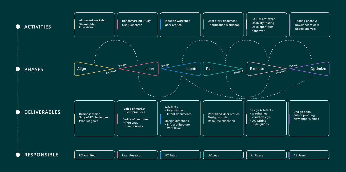

Alignment Workshop
Workshop Expectations
- To achieve consensus among all the stakeholders.
- Understand the long-term and short-term business goals,
- To gather all the existing knowledge about the company (customer reviews,
- perception about company, challenges)
- Identify current and expected user segments.
- Understand stakeholders aspirations, fears and hopes from the UX intervention.
- To discuss any benchmarks or design inclinations, if any.
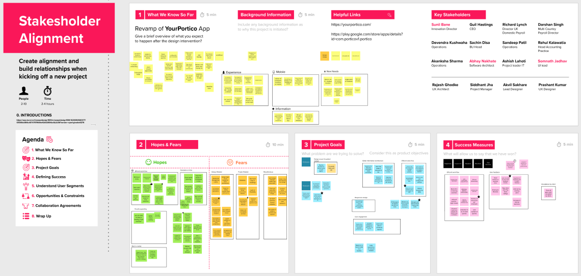
Workshop Insights
Product Goals
- Provide a consistent experience across all modules.
- The design should offer a robust platform to managers, enabling them to manage and analyze data efficiently.
- The revamped user experience should help reduce customer queries by 50% related to completing task flows and overall experience.
Success Measures
- Reduce customer support queries.
- Increase referral business.
- Increase app store and Play Store ratings.
- Reduce training time.
Scope
- Portico management has proposed a two phase approach, clearly stating the modules to be addressed in each phase. They also expect a mobile first approach.

Expert Review
Task Agenda
The purpose of this document is to highlight existing usability issues in the PORTICO MOBILE APP and suggest improvements to enhance the app’s functionality from a usability standpoint. The goal is to improve the effectiveness and efficiency of the system.

Findings
- Inconsistent design – all screens look different, confusing users.
- The overall design (look and feel) lacks contrast and a fresh colour palette.
- Information architecture needs be improved.
- Accessibility issues – Font styles lack impact, and the distribution of weights throughout the design is unclear.
- Effective navigational tools like tabs, hover tooltips, in-app guides are missing, making it difficult to use the app smoothly.
- Hand-holding assistance is missing.
- There is a lack of contrast between the foreground and background, resulting in low readability.
- A loader appears on every action, which creates a negative user experience.
- Use of inconsistent and complex icons. Icons can be simplified.
- No search bar option is available.
- Number of clicks can be reduced to complete a task.
- Navigation can be improved with better IA.
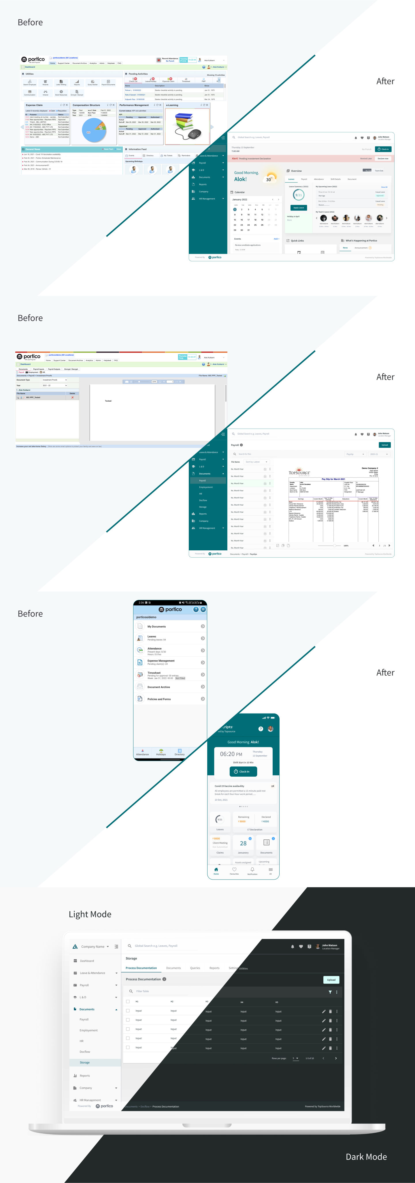
- The entire look and feel of the app appears dull and outdated.
- Visual weight should be given to prioritize the compare button, whether primary or secondary.
- The use of infographics can improve the presentation of information.
User Segments
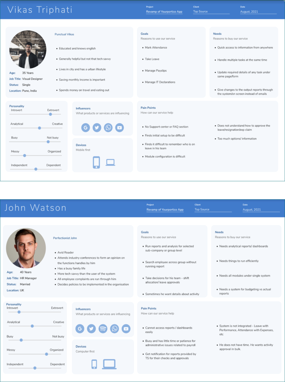
Creation of Proto-Persona
The personas covered the goals, pain points, fears and goals of two main user types. This exercise helped us empathize with the users and ideate effectively.

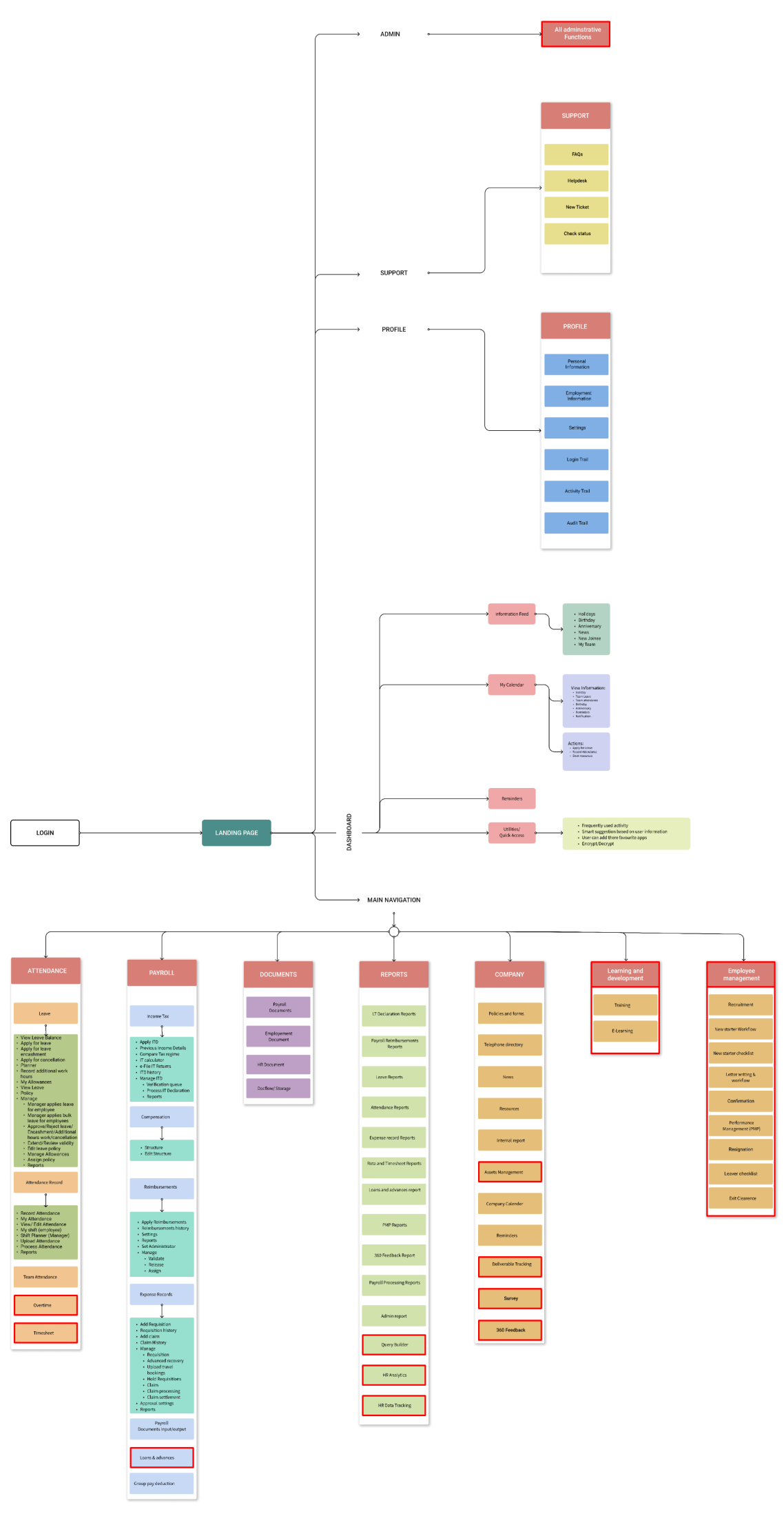
Information Architecture
It is designed to organize and categorize information in order to improve usability, findability, and enhance the overall user experience within the system.

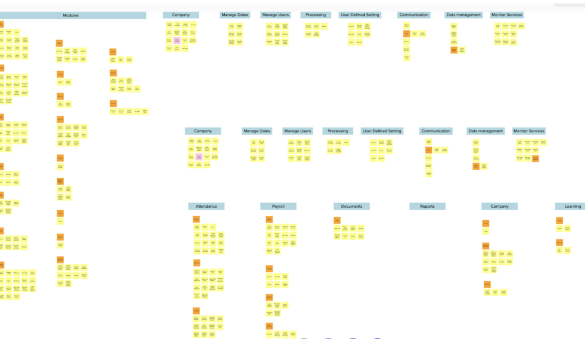
Card Sorting
This helped us to focus on organising, structuring, and labelling content in an effective way.
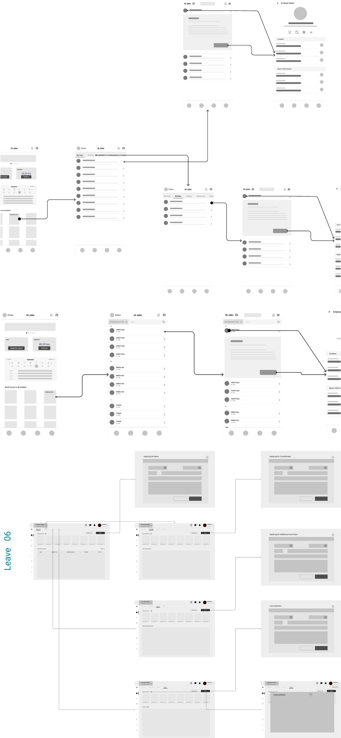
Wireflow
Wireflows visually represent user flows and interactions, combining wireframes and flowcharts. They aid in planning and designing user experiences by illustrating navigation paths and screen interactions.

Wireframes
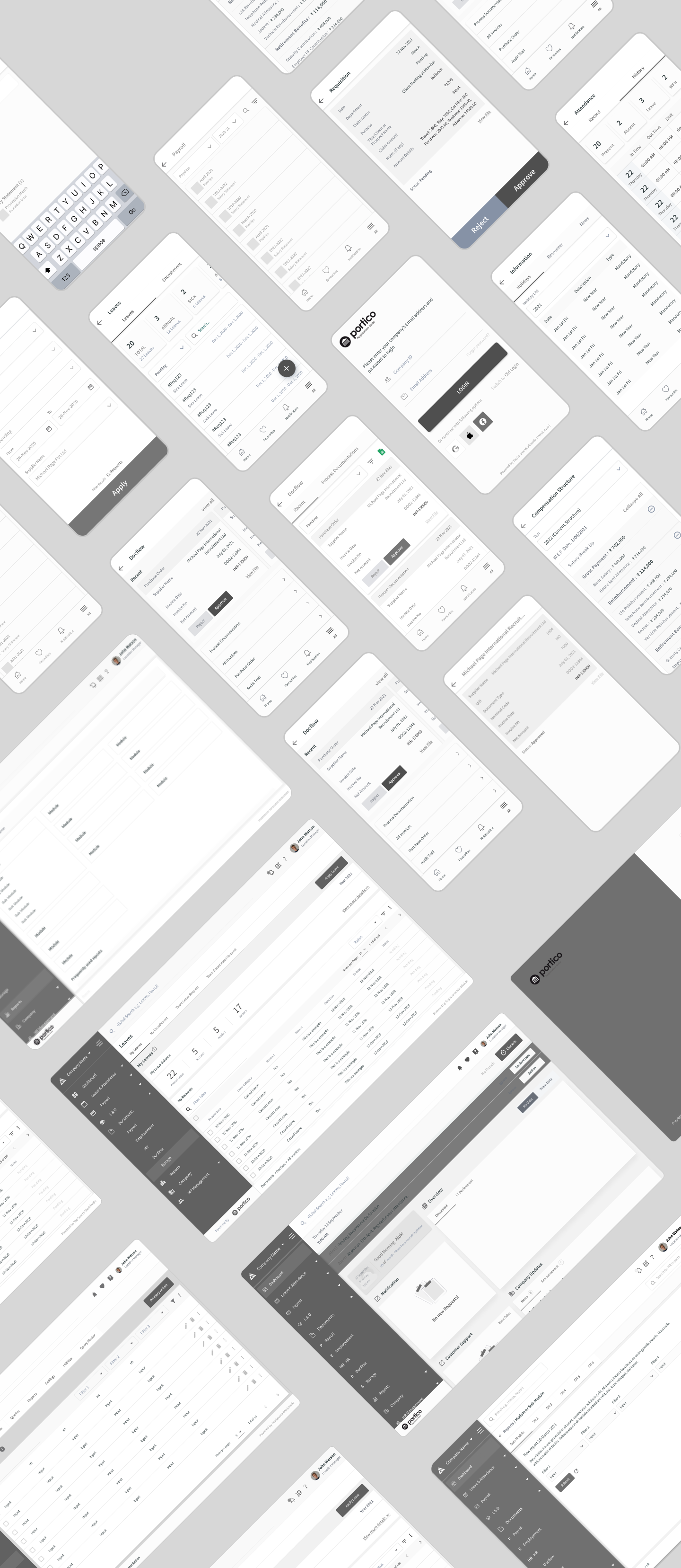
Wireframes were created to provide stakeholders with a foundational structure of the design and to receive feedback on it before proceeding to the visual design phase.
Style Guide
The next plan of action was to create colour palettes and typography that would help communicate the brand’s identity and also give the product an exciting feel.


Visual Design
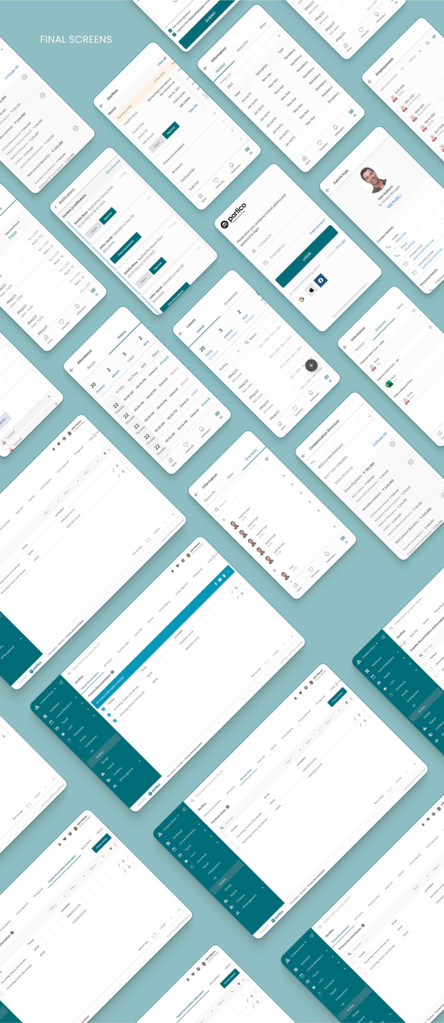
A high-fidelity prototype was developed for each flow, incorporating the brand color palette and considering usability factors. This prototype provides a convenient way for users to learn and engage with the product.
